ТОМА GROUP
New brand
New brand
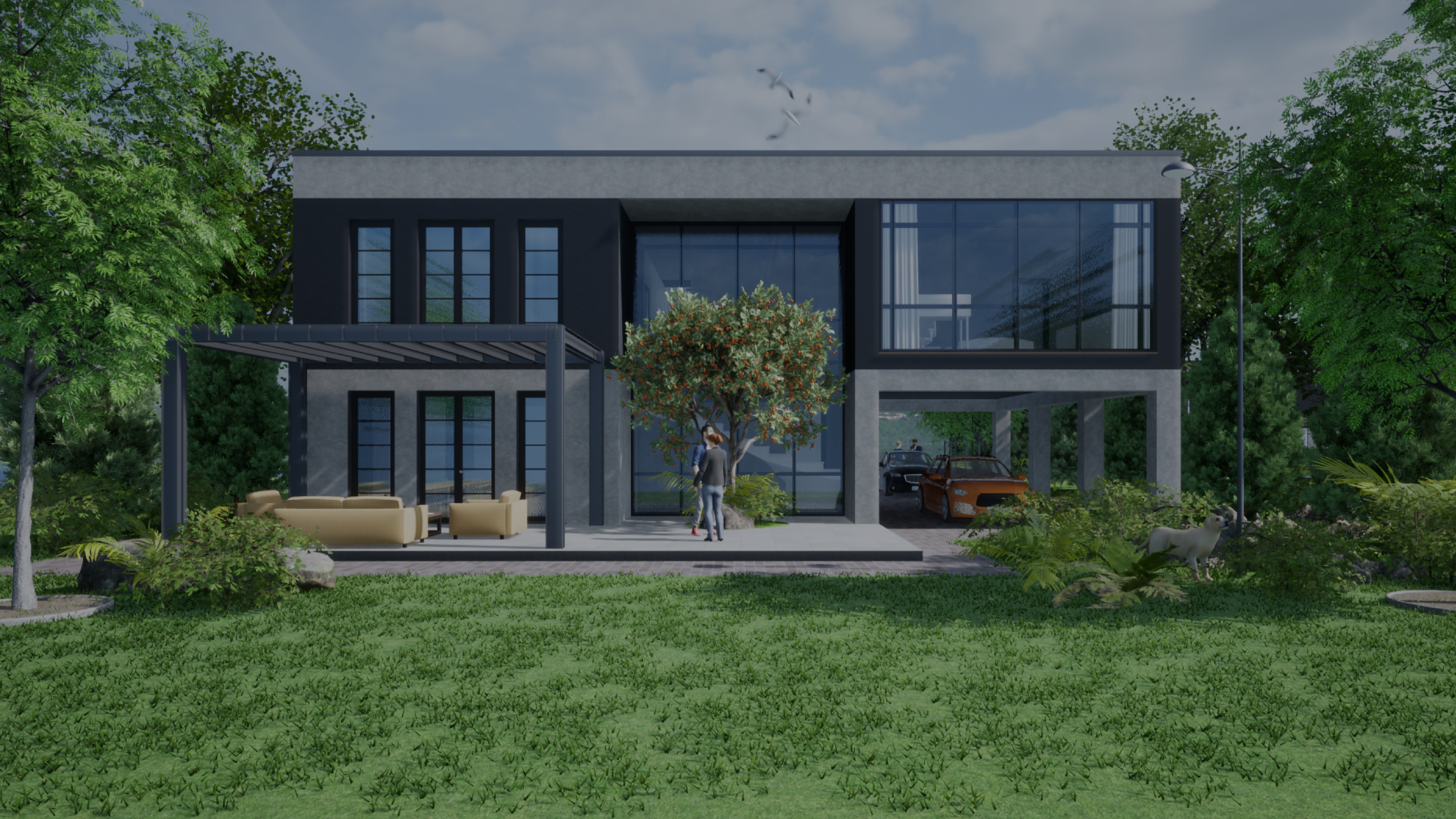
TOMA GROUP is a Ukrainian group of companies established with a focus on the production of polystyrene concrete and the implementation of modern construction technologies. They offer contemporary, energy-efficient solutions for both commercial and residential construction projects.
TOMA GROUP embodies cutting-edge technologies by adapting construction processes to meet new requirements, following the principles of the constructor. Their mission is to create a new home for every Ukrainian resident.
To conduct a comprehensive rebranding initiative for a group of companies, encompassing every aspect from in-depth market research to the creation of a visual and verbal identity.
First and foremost, we conducted market research to identify companies working with similar technologies in the construction industry. This research allowed us to develop a comprehensive strategy and identify the unique strengths. In our case, the primary advantage was the T-technology, which currently has no counterparts in the market. This technology involves creating building components and assembling them into a complete space, enabling TOMA GROUP to provide comprehensive solutions for various projects and implement them quickly.
This distinct advantage guided the development of verbal identity and brand platform. The archetype of TOMA GROUP has been designated as the Caregiver because their work revolves around care, support, mutual assistance, altruism, protection, and the provision of quality living conditions. The slogan underscores the simplicity of the technology, drawing an analogy to a construction set – As Easy As Putting Together a Construction Set.
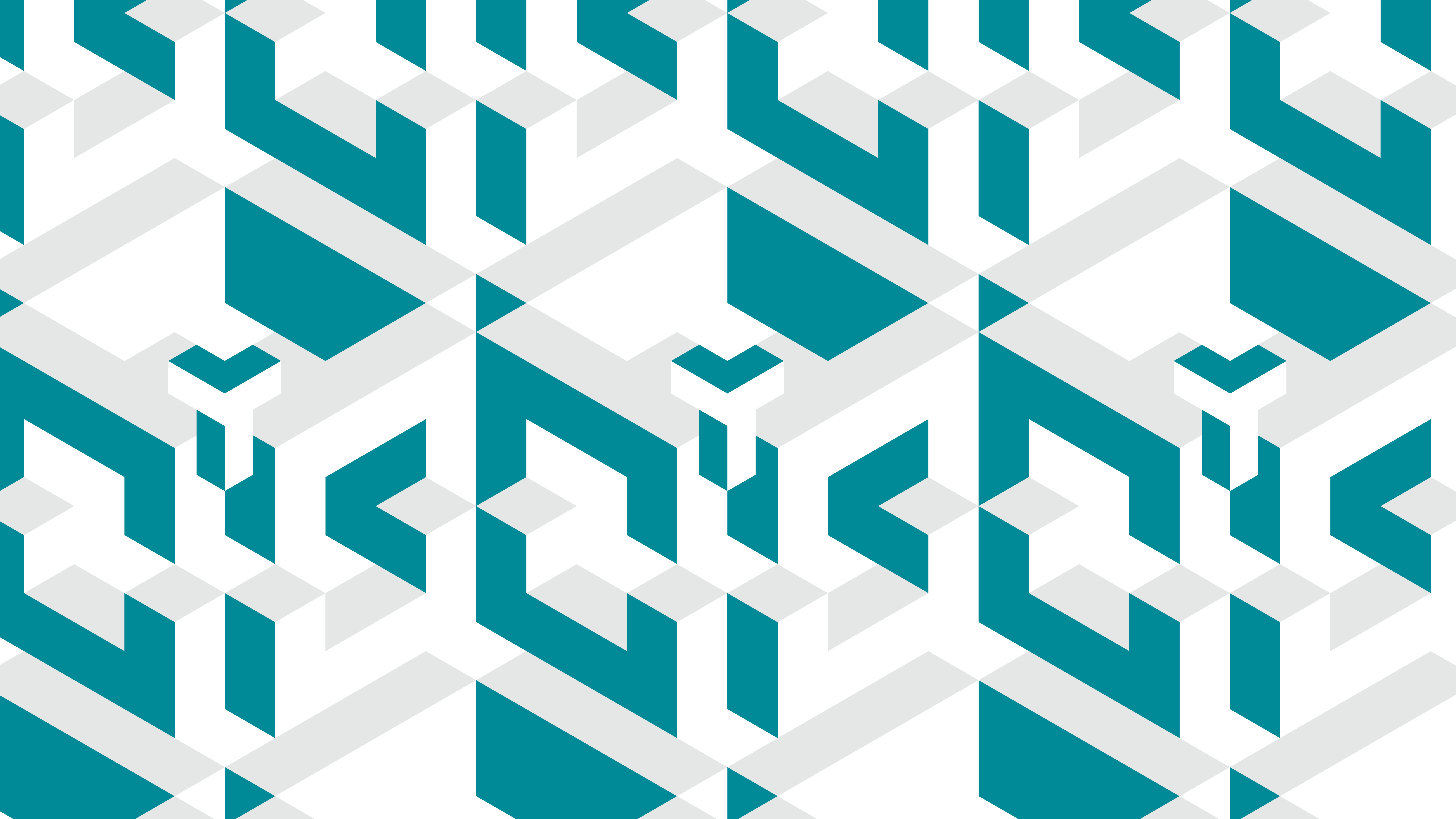
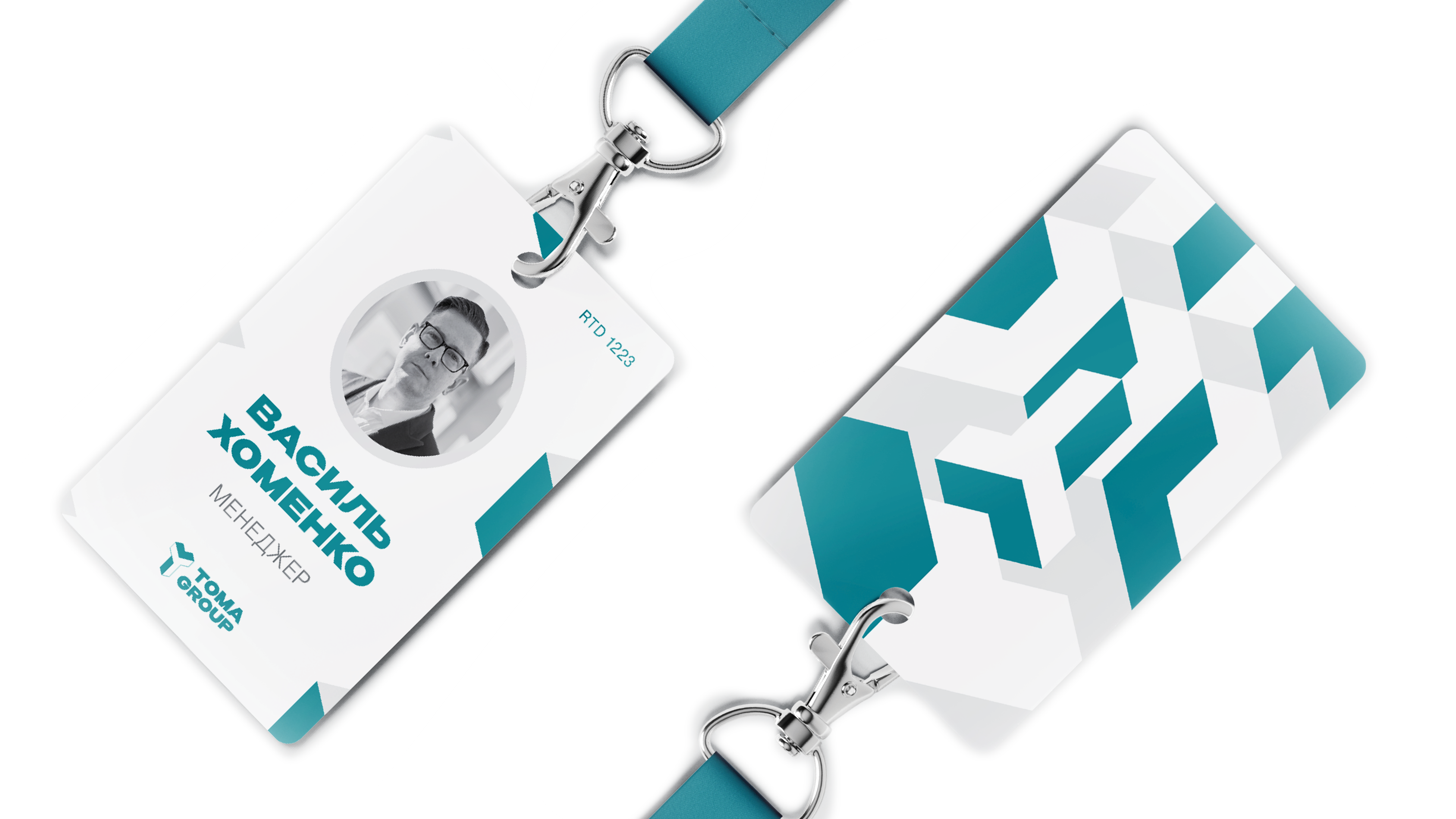
In visual identity we incorporated the concept of modularity and artistically depicted the story of T-technology, which involves the manufacturing of building components and their assembly into a unified space. Similar to how blocks are assembled to form a single structure, TOMA GROUP's visual elements can be rearranged to create various shapes.
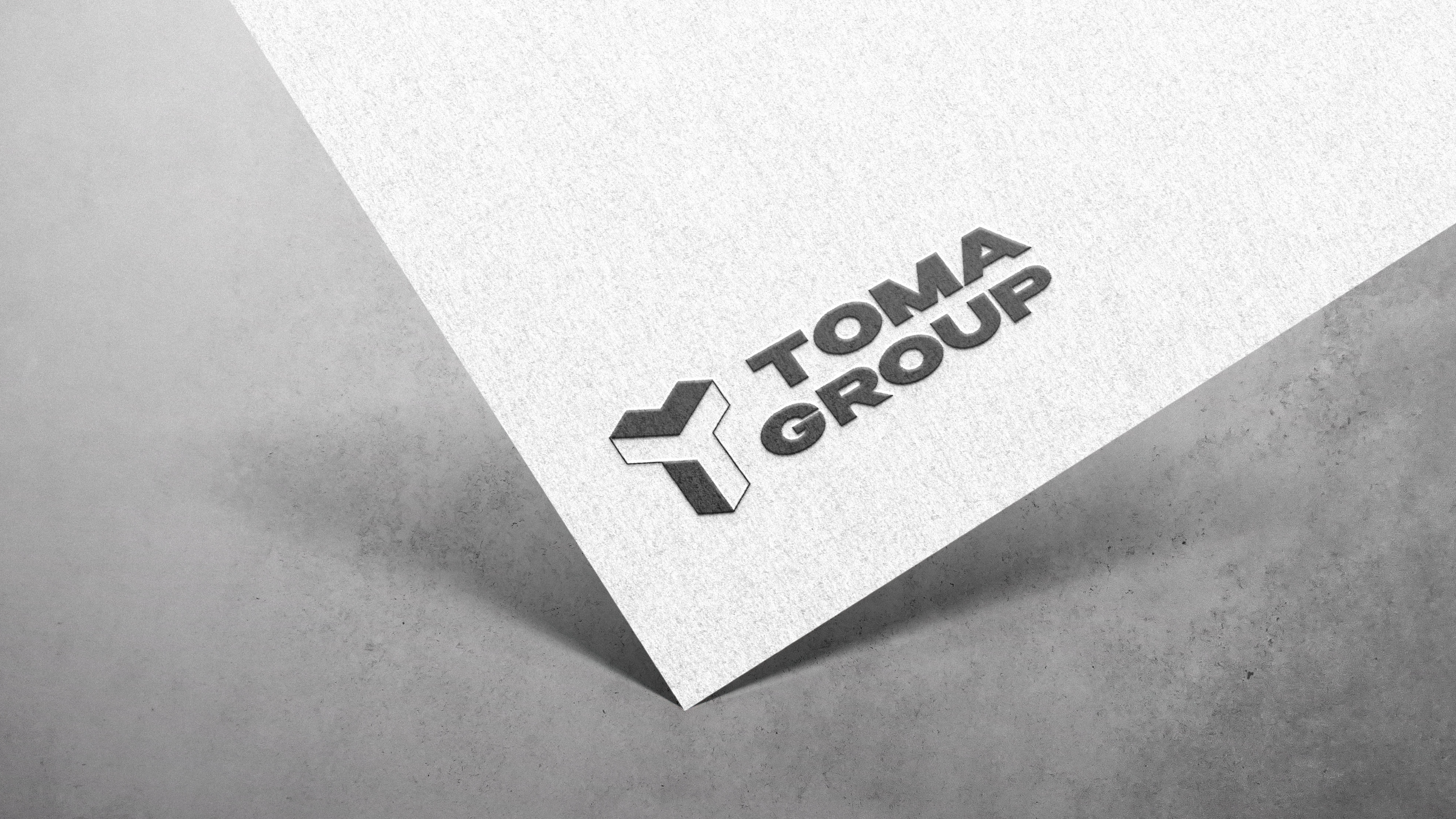
The logo is a composite one, comprising both font and graphic elements. Within it, we have merged the letters T and G — the initials of the company name. The logo's shape is presented in an isometric projection, symbolizing a house composed of three essential elements: foundation, walls, and roof. Primary colors include gray, white, graphite, and turquoise.
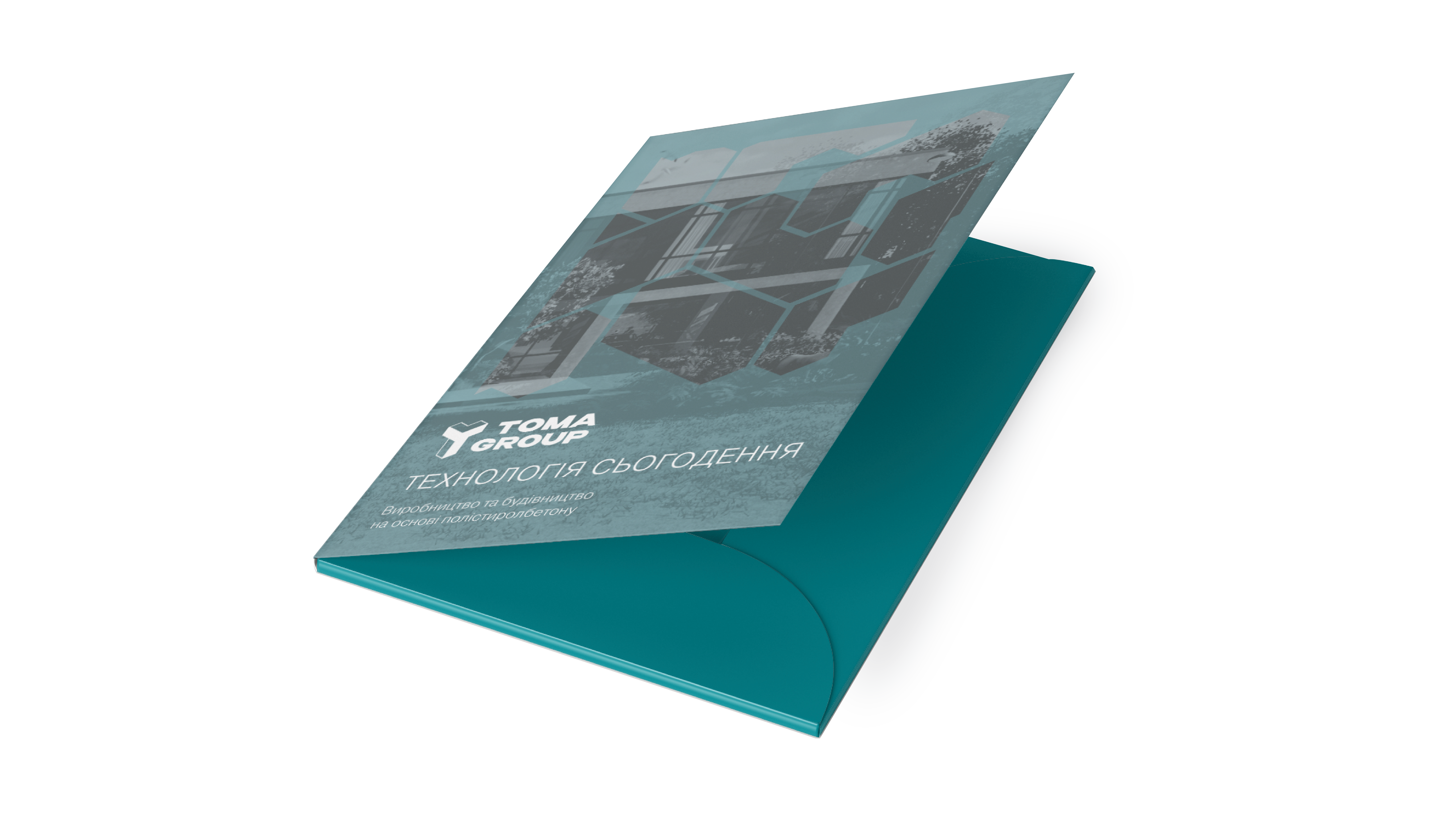
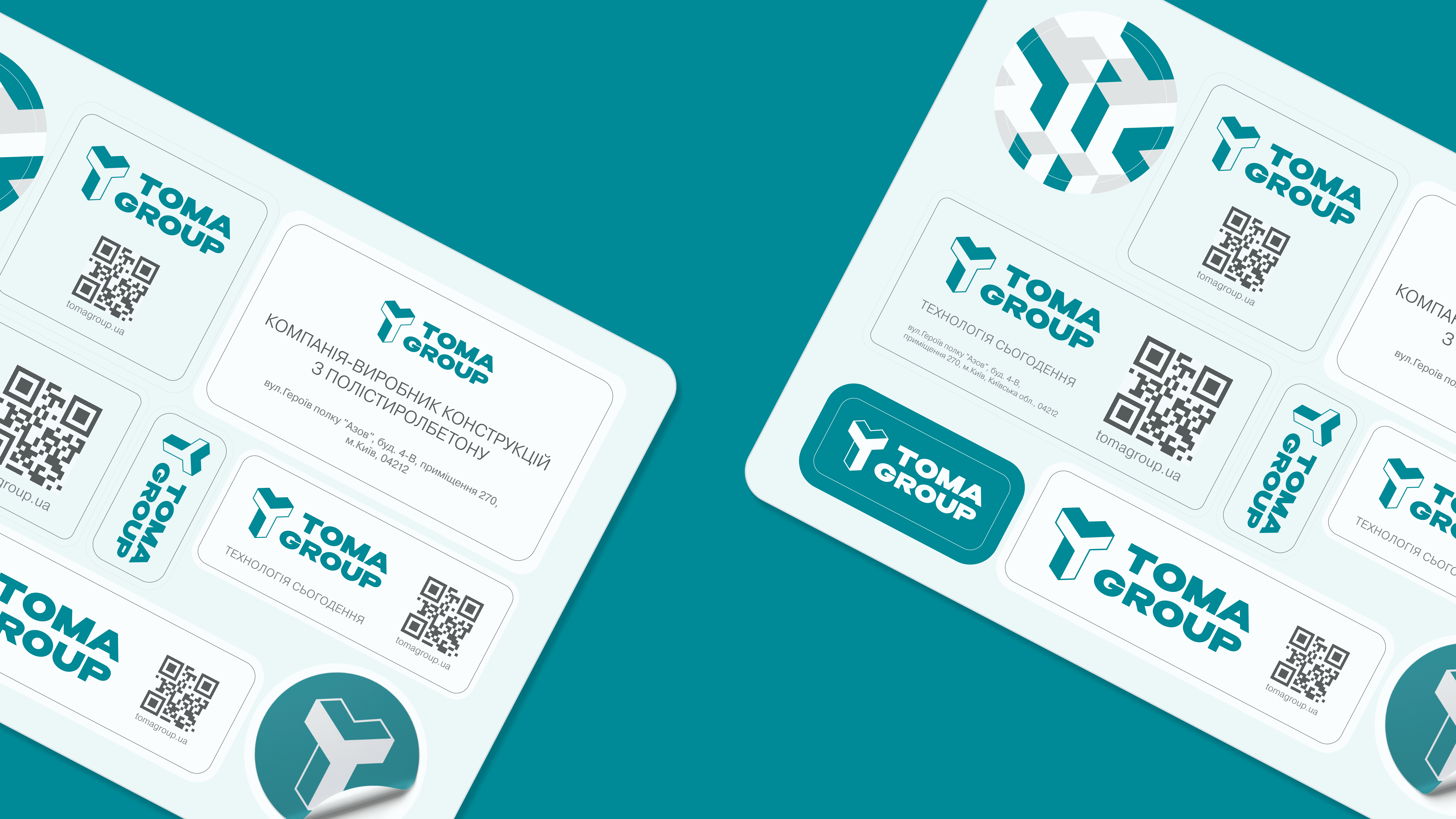
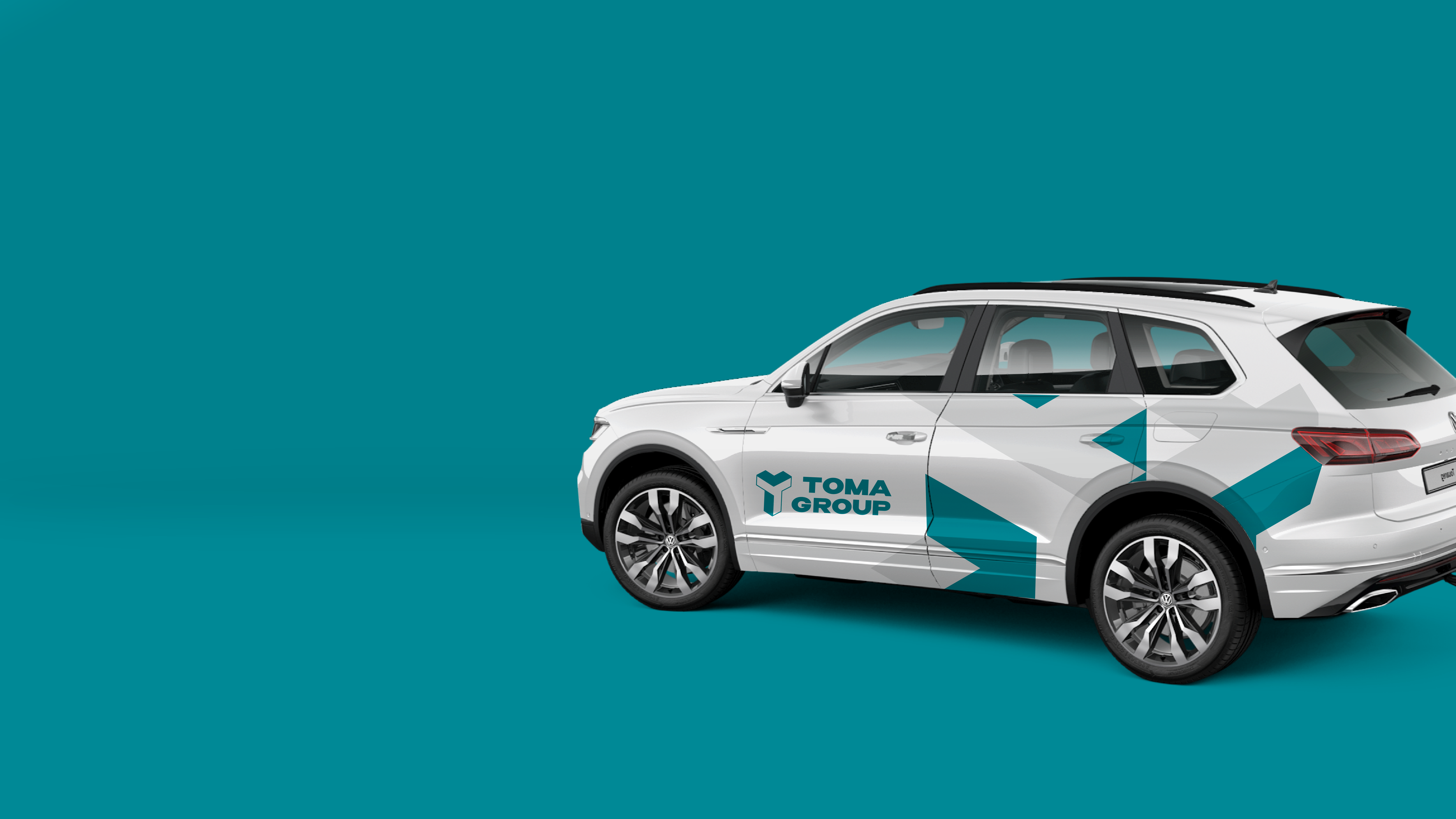
The final phase of our branding effort involved designing various advertising media. We have demonstrated how our visual and verbal identity can be applied to a range of elements, spanning from business cards and brochures to vehicle branding and social media content.


