AMBY
New brand

New brand
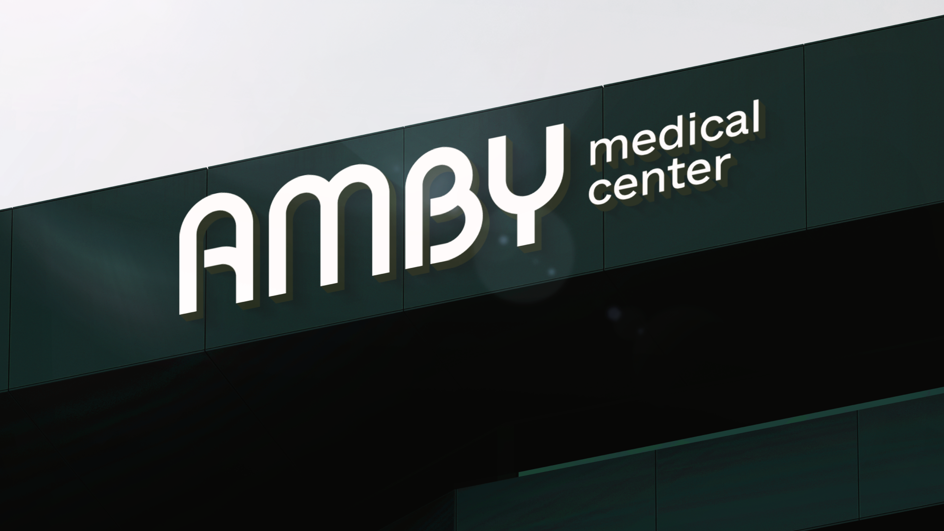
AMBY Health Center — a new healthcare hub in the heart of Dnipro. Services offered: family medicine, cardiology, rehabilitation, therapy, surgery, endocrinology, pulmonology, rheumatology, oncology, pediatrics, neurology, psychotherapy, diagnostics, dermatology, urology, mammology, gynecology, proctology, plastic surgery, orthopedics-traumatology.
To create a brand platform, substantive verbal expression of the brand, and an expressive system of visual identity.
During the development of the verbal expression of the brand, we concluded that the main value we want to preserve for the center's clients is time. This became the foundation of the company's Big Idea:
”In a global sense, medicine is meant to enrich a person's time for well-being. Living longer, fuller, and better lives is what doctors around the world strive for. The personnel at AMBY are no exception. We safeguard the time of our clients: both their future and present.”
Thus, we formulated the following message: ”AMBY - modern, caring medicine with a sense of new realities. As the world speeds up, processes accelerate, and people feel the need to live life consciously and purposefully. Our purpose is to safeguard your time: both future and present. The future - so you can feel good tomorrow and for many years to come. The present - so you don't waste moments of life. Our system is designed to minimize wait times for appointments with doctors, expedite bookings, or optimize everyday situations.
At AMBY, you can confidently entrust us with the most important things in your life - yourself and your family. Our team solves tasks promptly and effectively. The philosophy of AMBY begins with a firm decision to set an example in the field of medical services.
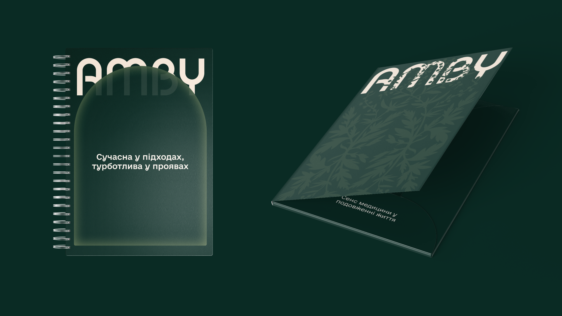
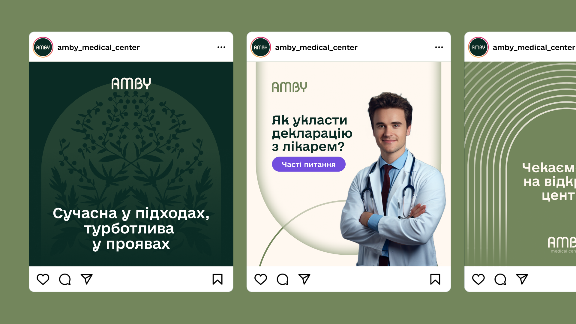
Taking care of oneself is natural. Preventive medicine becomes our shared reality. We are here so you can harness the potential of technologies and, under the guidance of our experienced specialists, peer into the future for the sake of your health. AMBY: modern in approaches, caring in manifestations”.
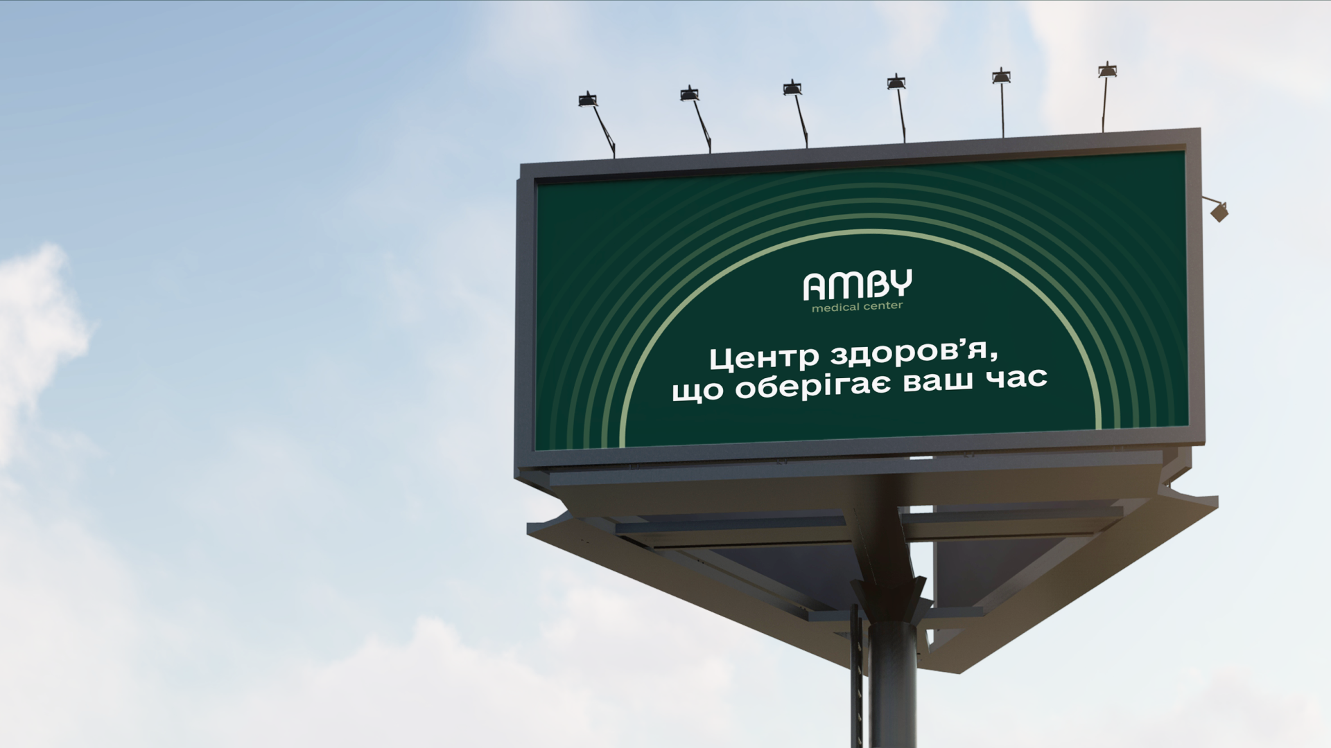
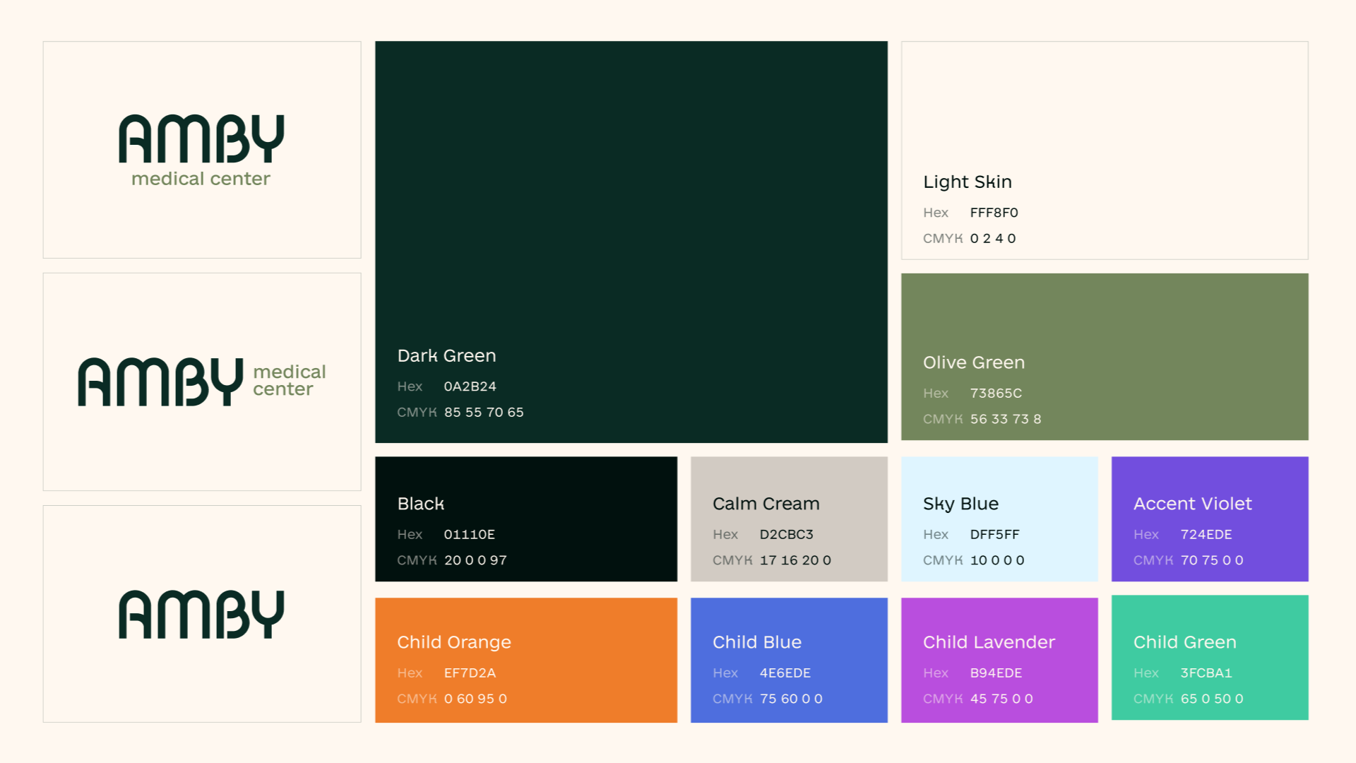
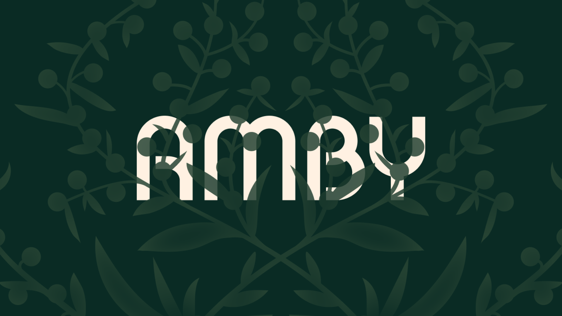
In the visual identity, medical centers typically use typical symbols for the niche: family, hands, cross, light blue shades. We tried to move away from typical symbols. That's why we chose an arch as the main formative element, symbolizing care. This idea formed the basis of the company's logo, which features smooth, rounded lines.
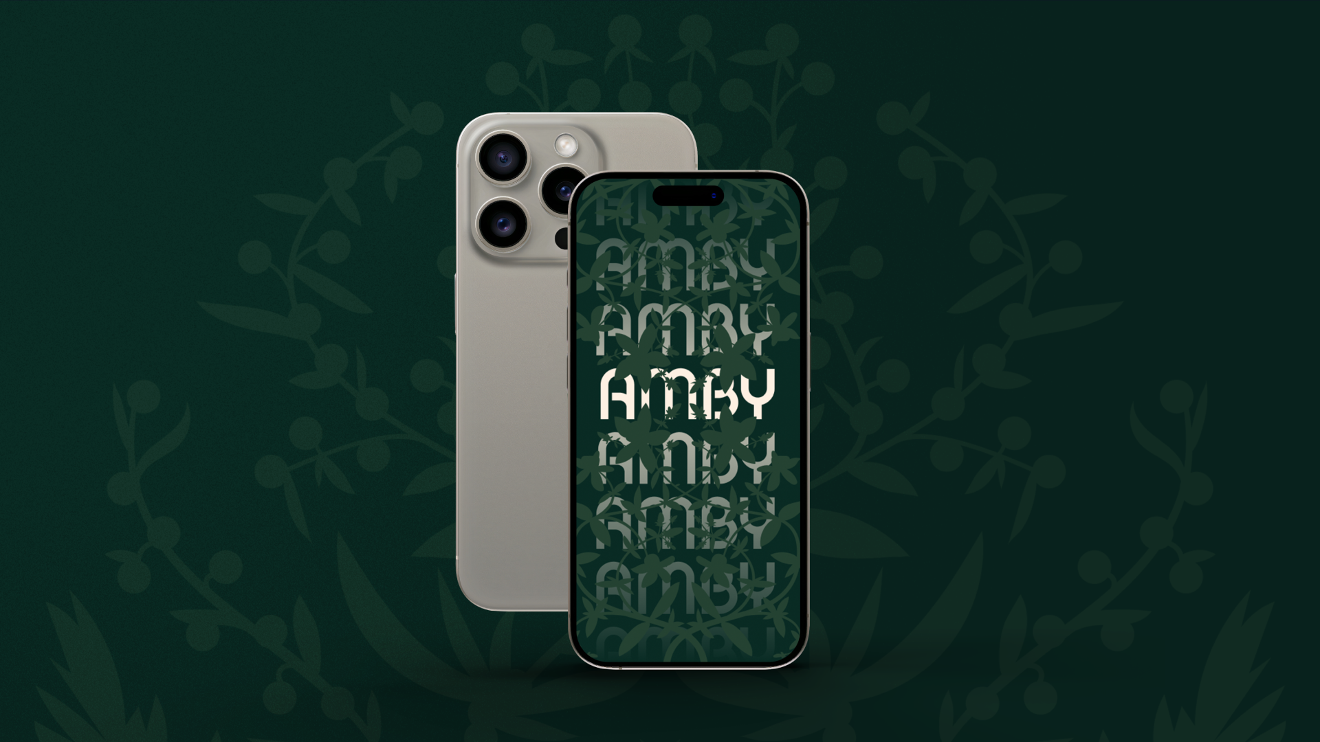
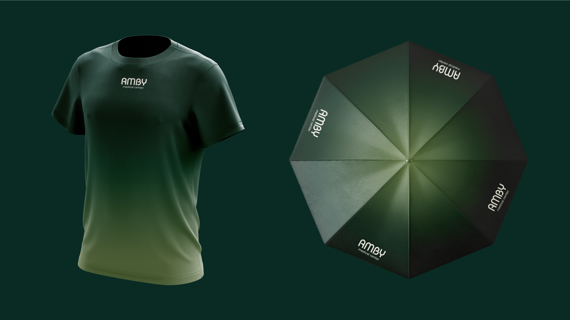
When developing the palette, we drew inspiration from the colors of nature as a symbol of longevity, therefore, we chose a saturated dark green as the base and, contrasting it, warm white. Additional colors are also shades of green: pine and olive.
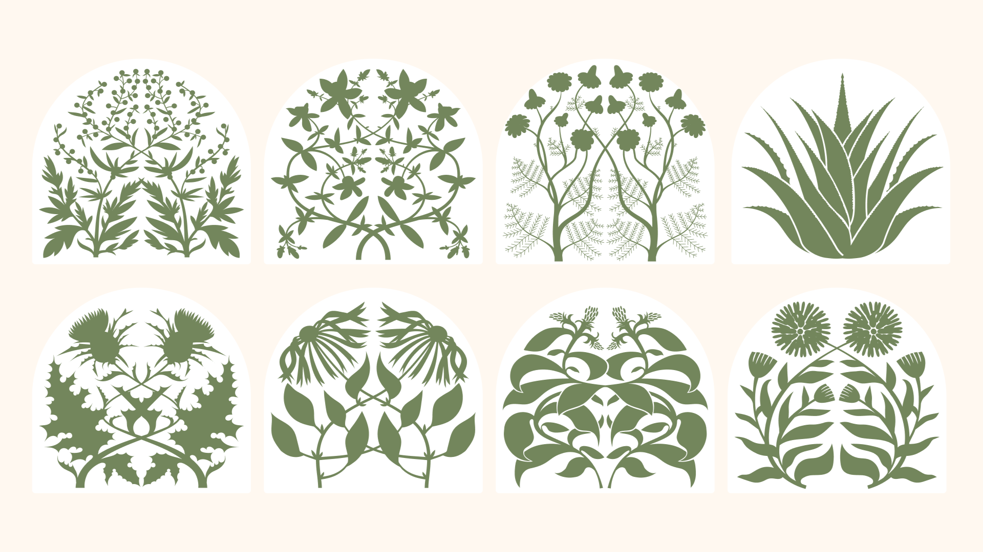
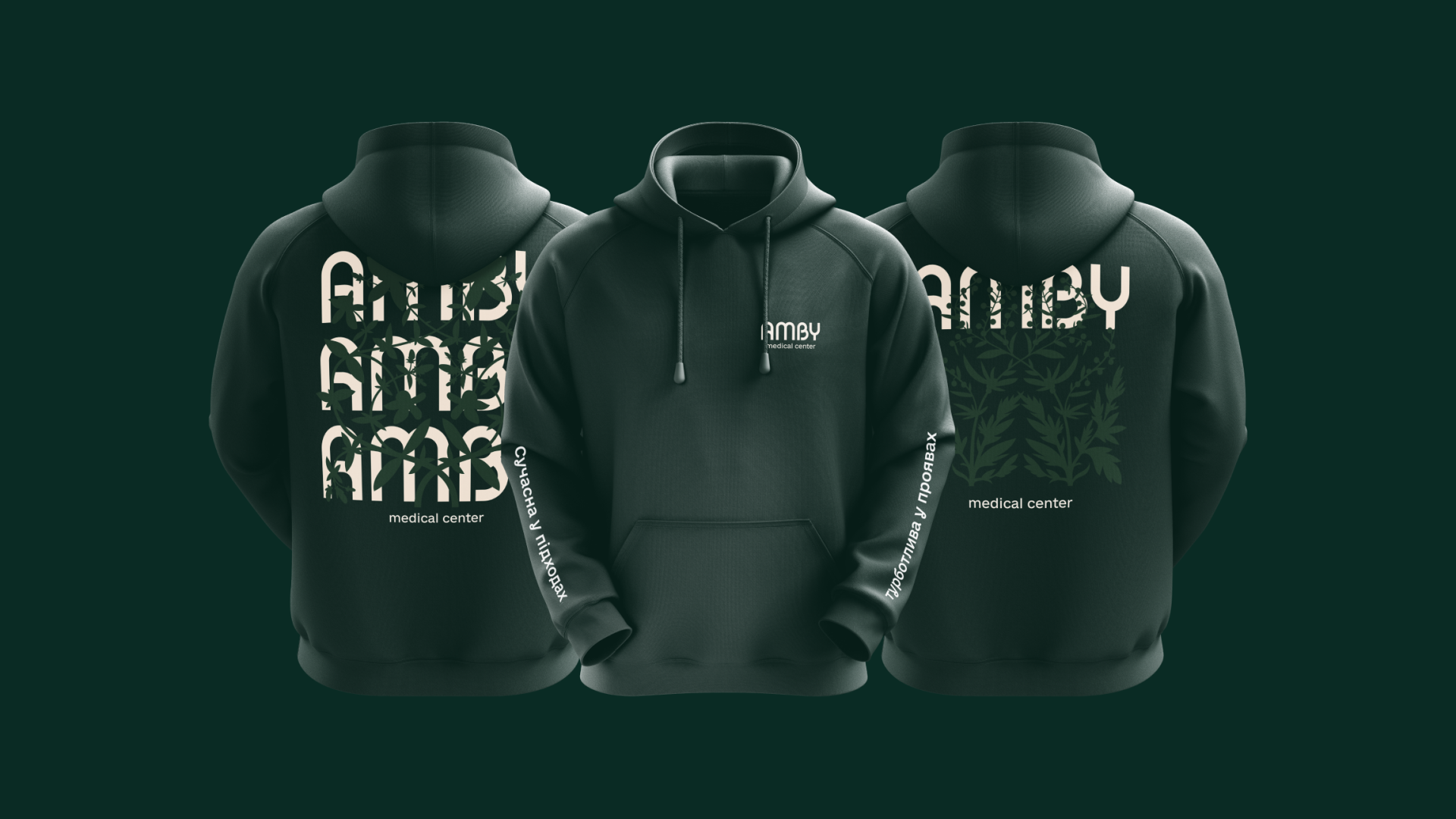
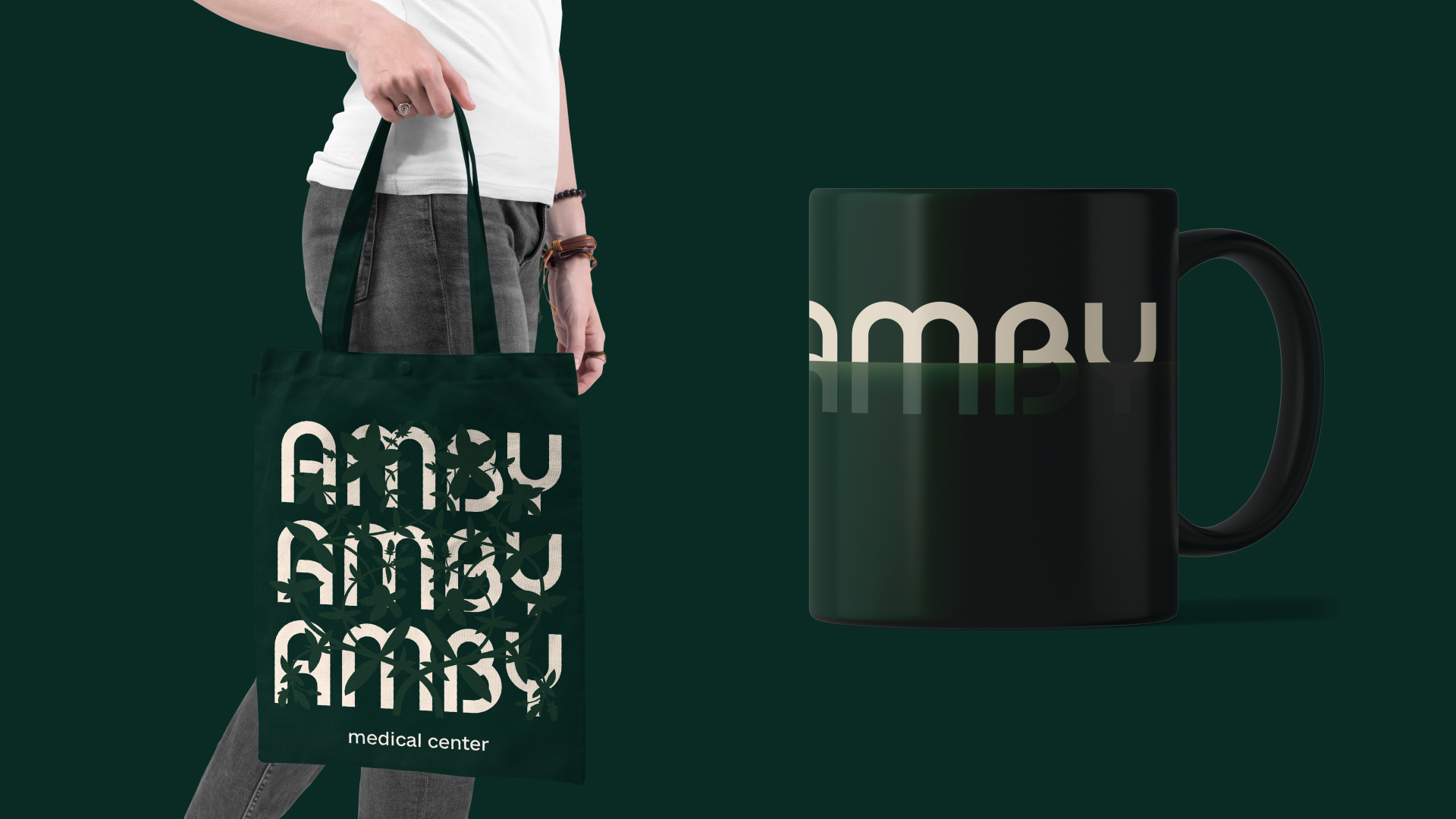
This concept is further developed in additional identity elements — aesthetic illustrations of the most common medical plants: wormwood, St. John's wort, chamomile, aloe, milk thistle, echinacea, stevia, and calendula.
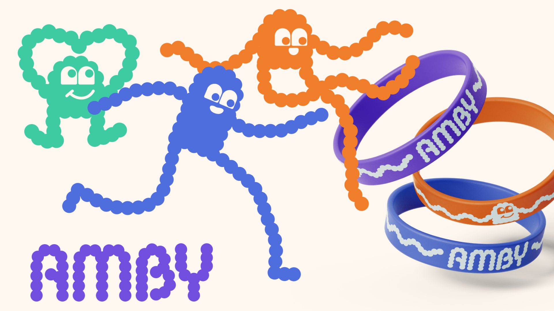
For communication in the paediatric area of the medical centre, characters called «Embiks» were created.
