Partner Pro
New brand
New brand
Partner PRO is a Ukrainian manufacturer of personal protective equipment that meets international quality standards. It works in the field of medicine and industry, and also it develops in the direction of the aerospace and beauty industries.
Create a strategy and visual brand identity that sets it apart from other companies in the market.

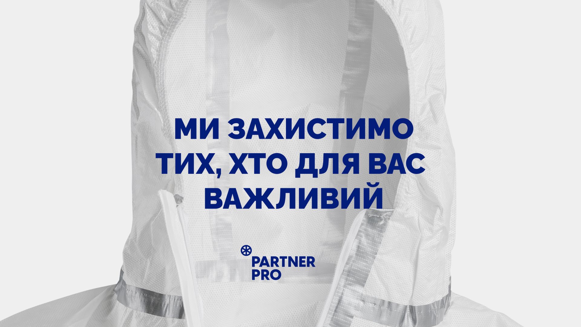
Partner PRO creates personal protective equipment, so we decided to build a strategy and brand identity on the image of security. As a result, we developed the following positioning: Partner PRO — manufacturer of life protection. No matter what happens in the world, Partner PRO will always take care of people who are important to you and will do it professionally, based on international standards.
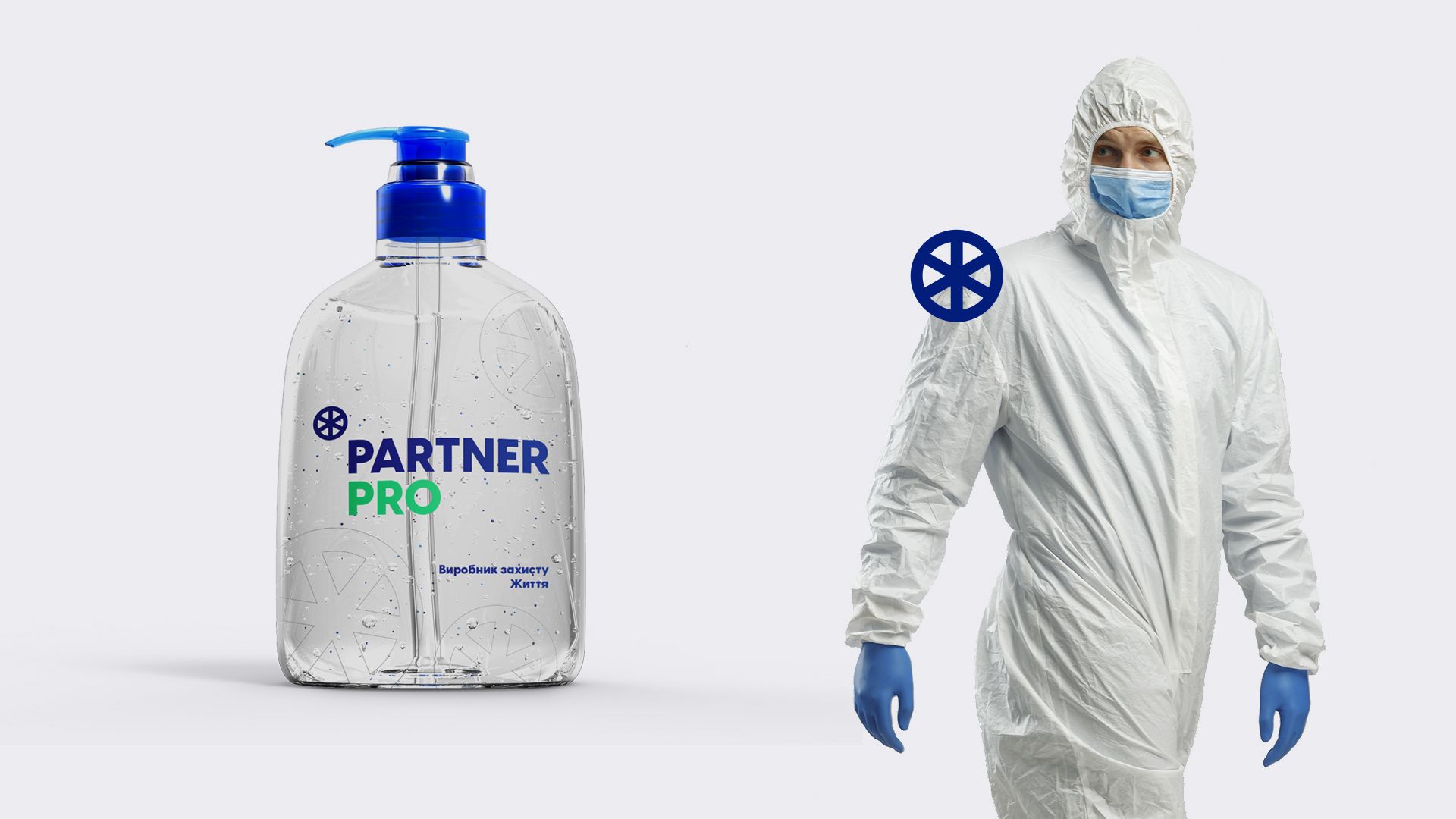
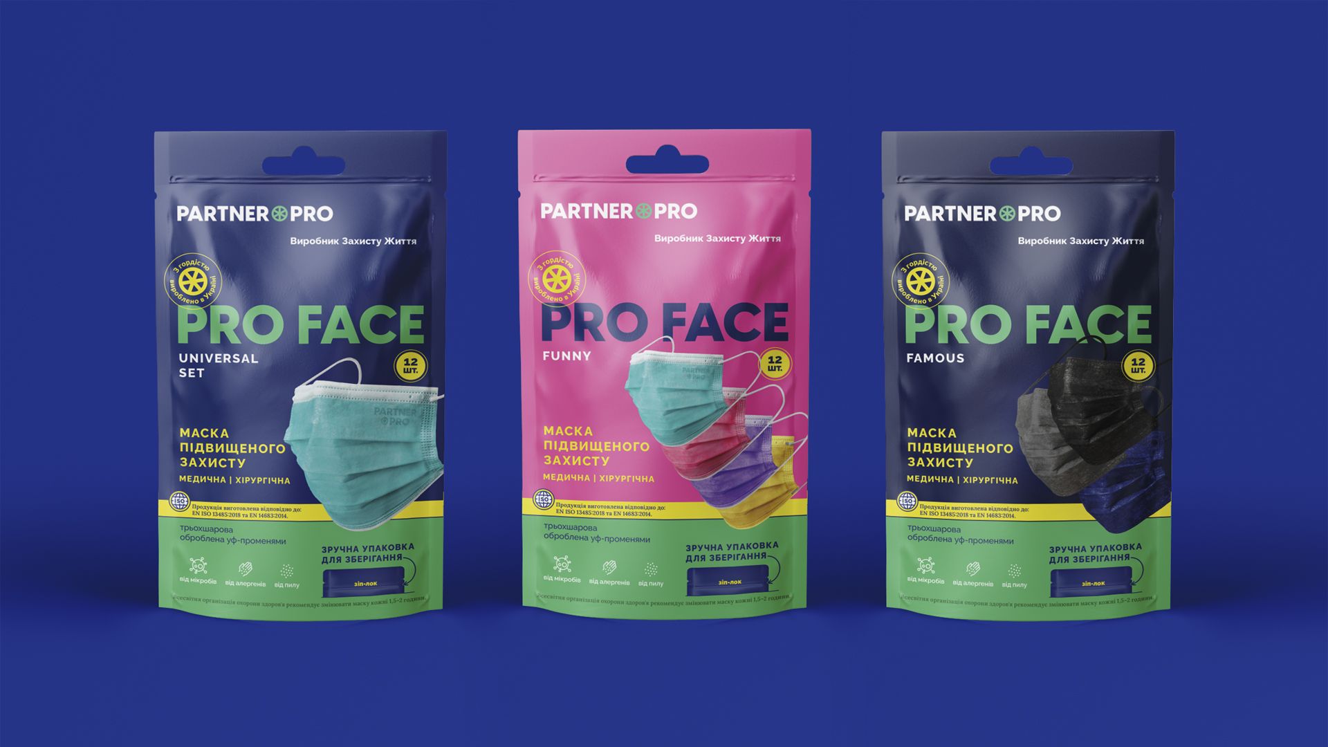
We wanted to distinguish ourselves from most companies working in the field of medicine, already on a visual level. Therefore, instead of the traditional blue, we have chosen a slightly different color palette: mint, yellow and blue. The latest one symbolizes belonging to Ukraine, because Partner PRO is a modern Ukrainian brand. And mint, in turn, embodies the characteristic feature of the product — sterility. We did not stray far from the conditionally "canonical" medical palette, maintaining visual recognition, but we differ from competitors in the market.
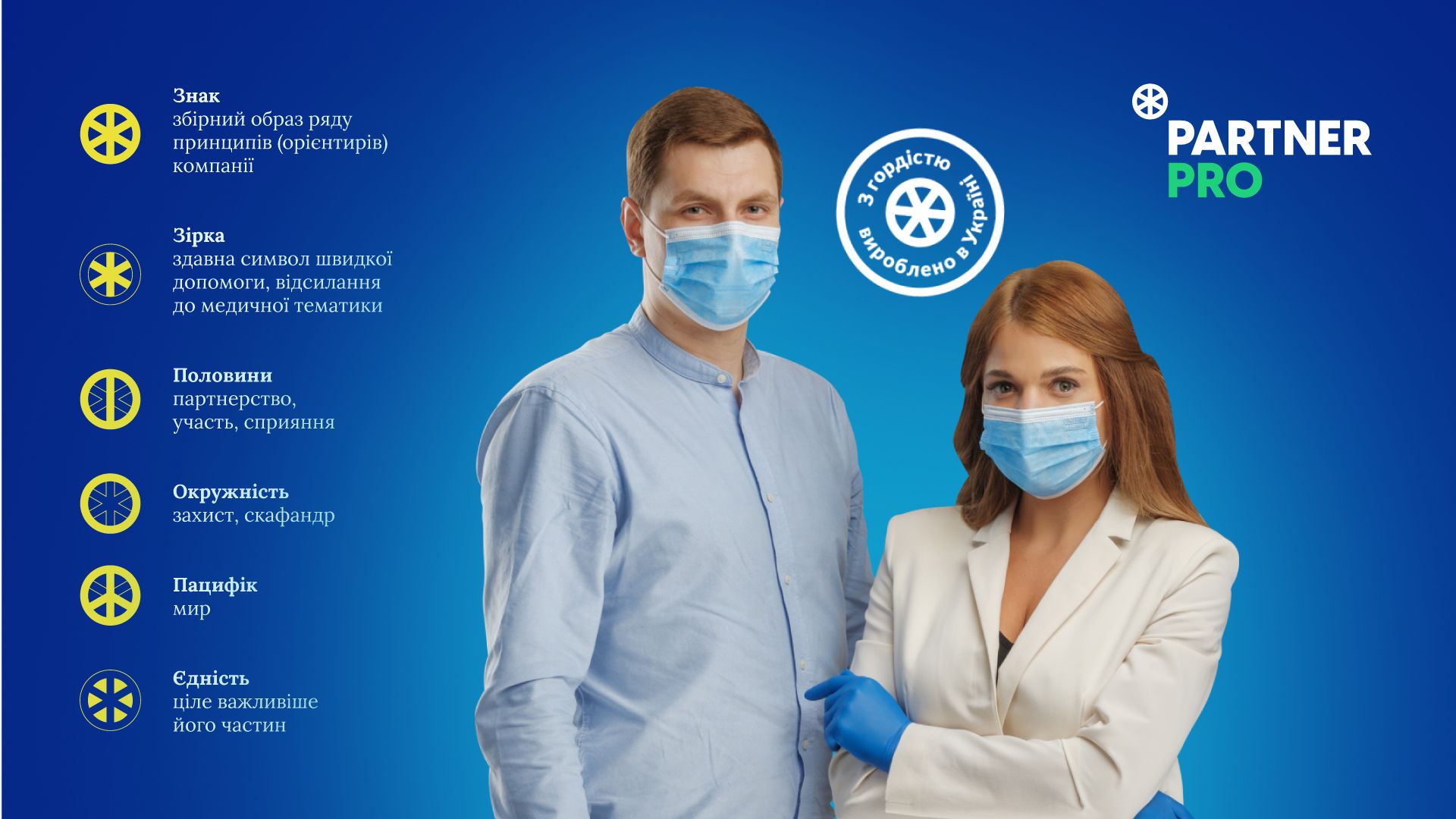
The partner PRO logo is a circle with straight lines intersecting inside it. It means several values. The sign is a collective image of Partner PRO values, the star is one of the symbols of the ambulance, the halves are an image of partnership, the pacifist is about peace and the circle is about protection from surrounding threats. And together they all form a single whole that works only in synergy and is more important than individual units.
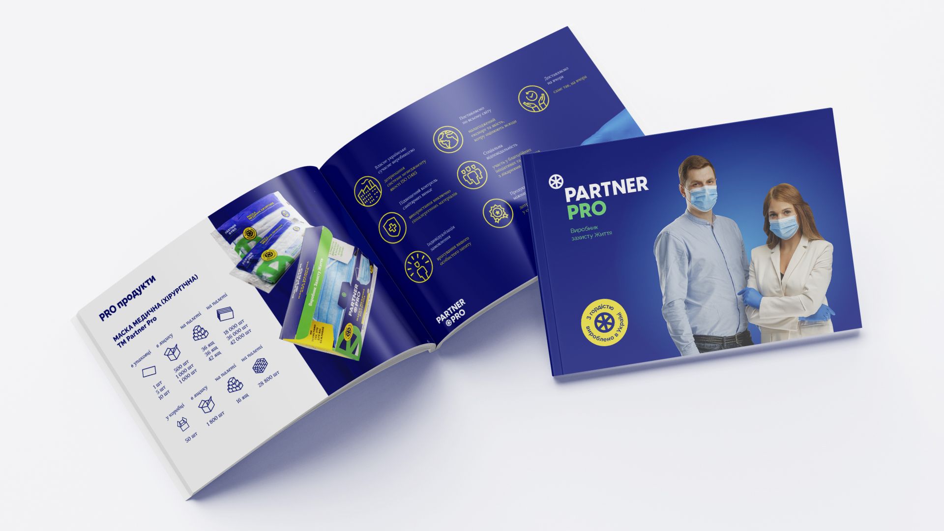
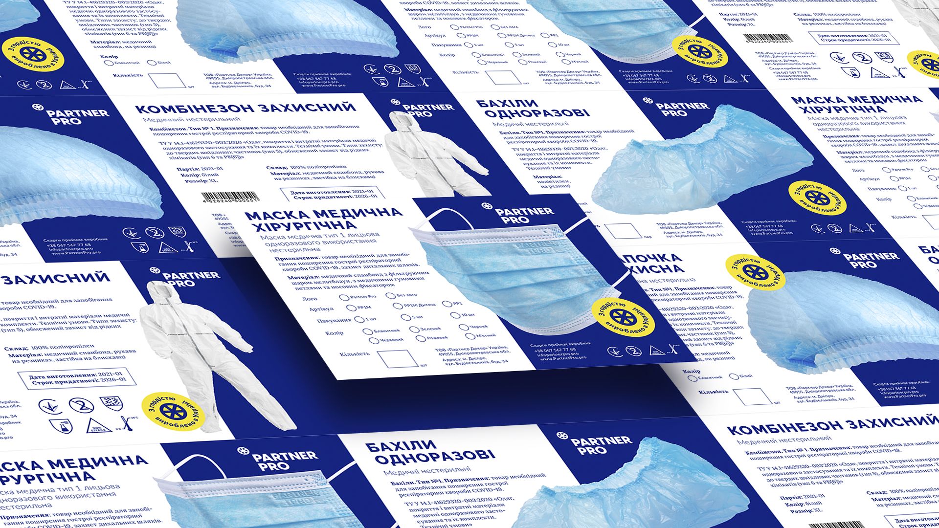
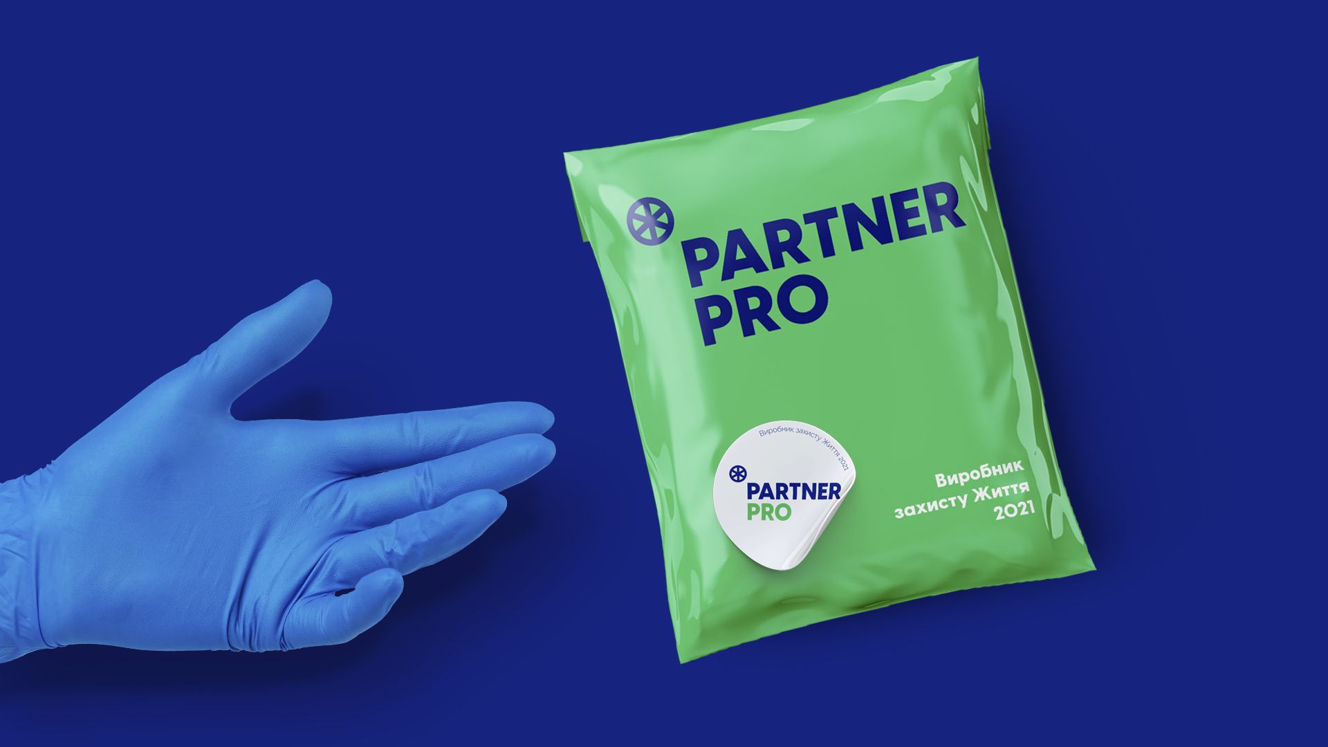
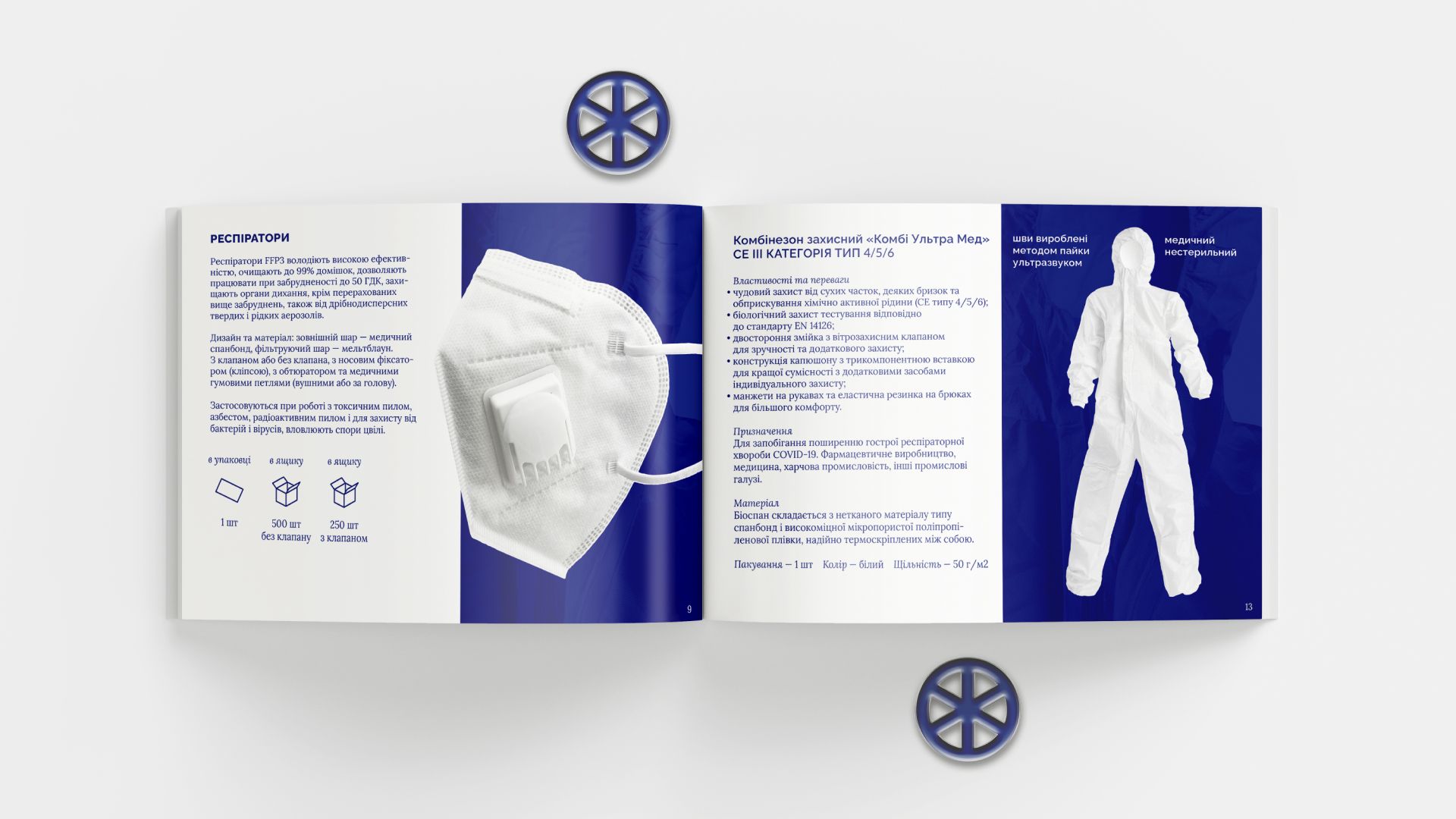
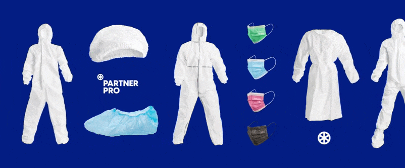
After developing the visual identity, we held a photo session of the products and branded all the media: from stickers to packaging. We also worked on the landing page and texts for it.