My muse
Visual identity

Visual identity
My muse is the production of goods for creativity. In the range there are such sets as paintings by numbers, cross stitch and beadwork, decoupage, painting on wood and other various materials, sets for burning and sawing.
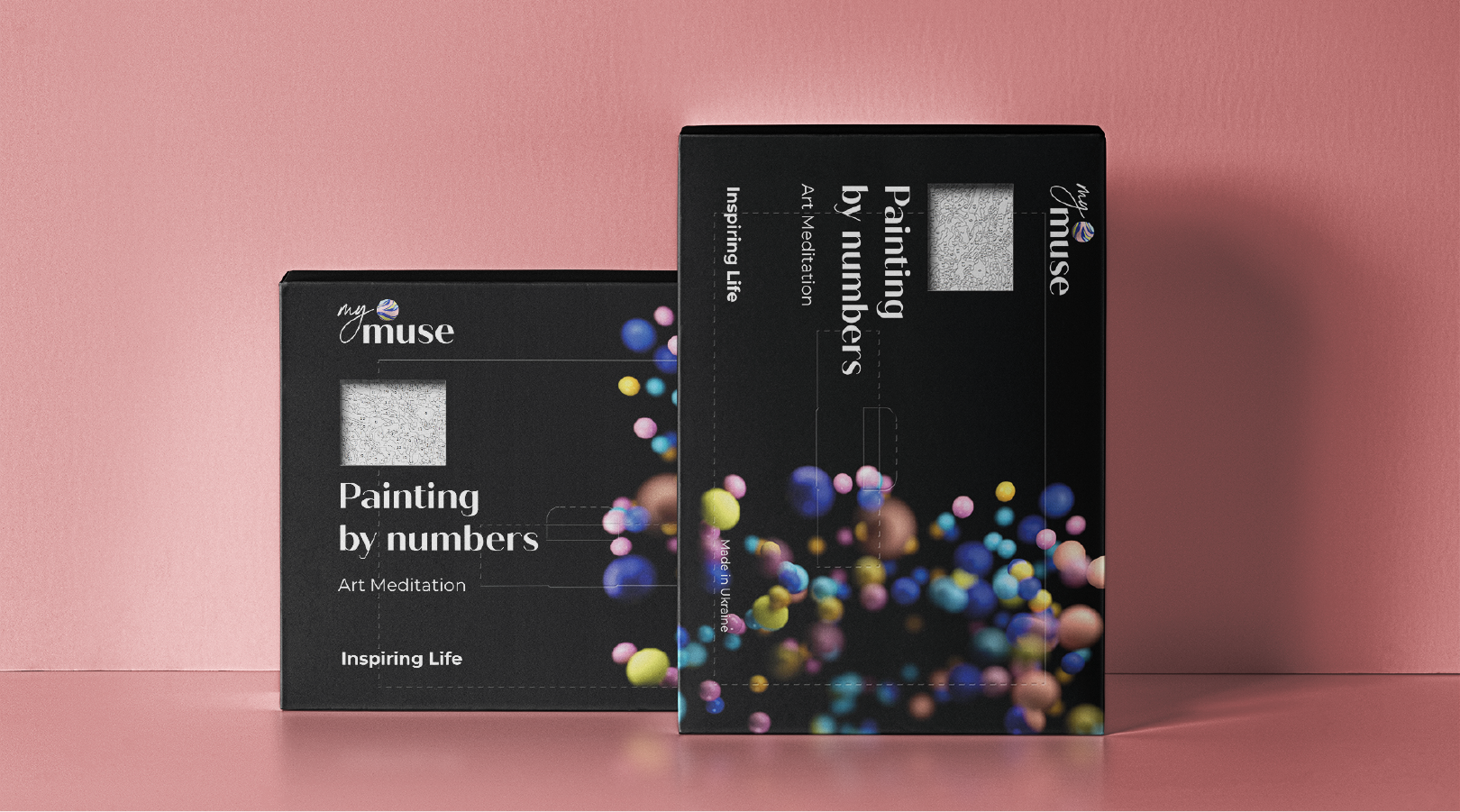
The brand was entering the European market and needed a spectacular packaging, cardinally different from its colleagues. That's why a non-standard black color was chosen.

First, we studied the market and identified the uniformity of the visuals in the niche. Basically, everyone uses bright colors, white packaging, an abundance of red, paint stains, brushes, and everything that is literally connected with creativity.
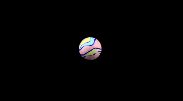
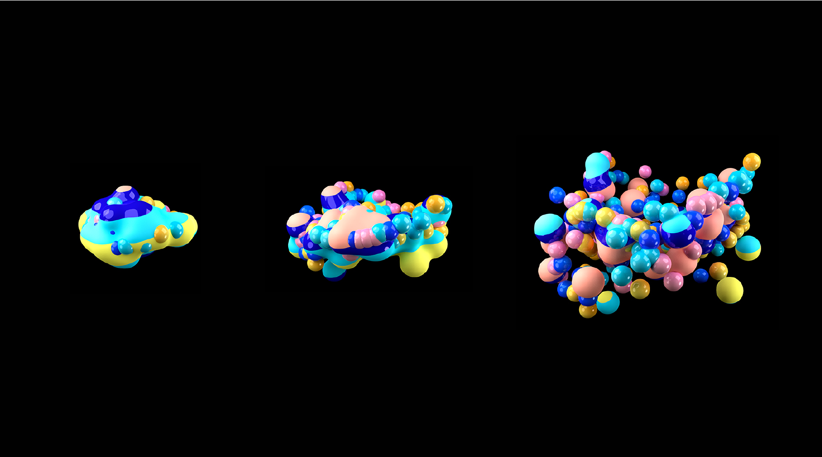
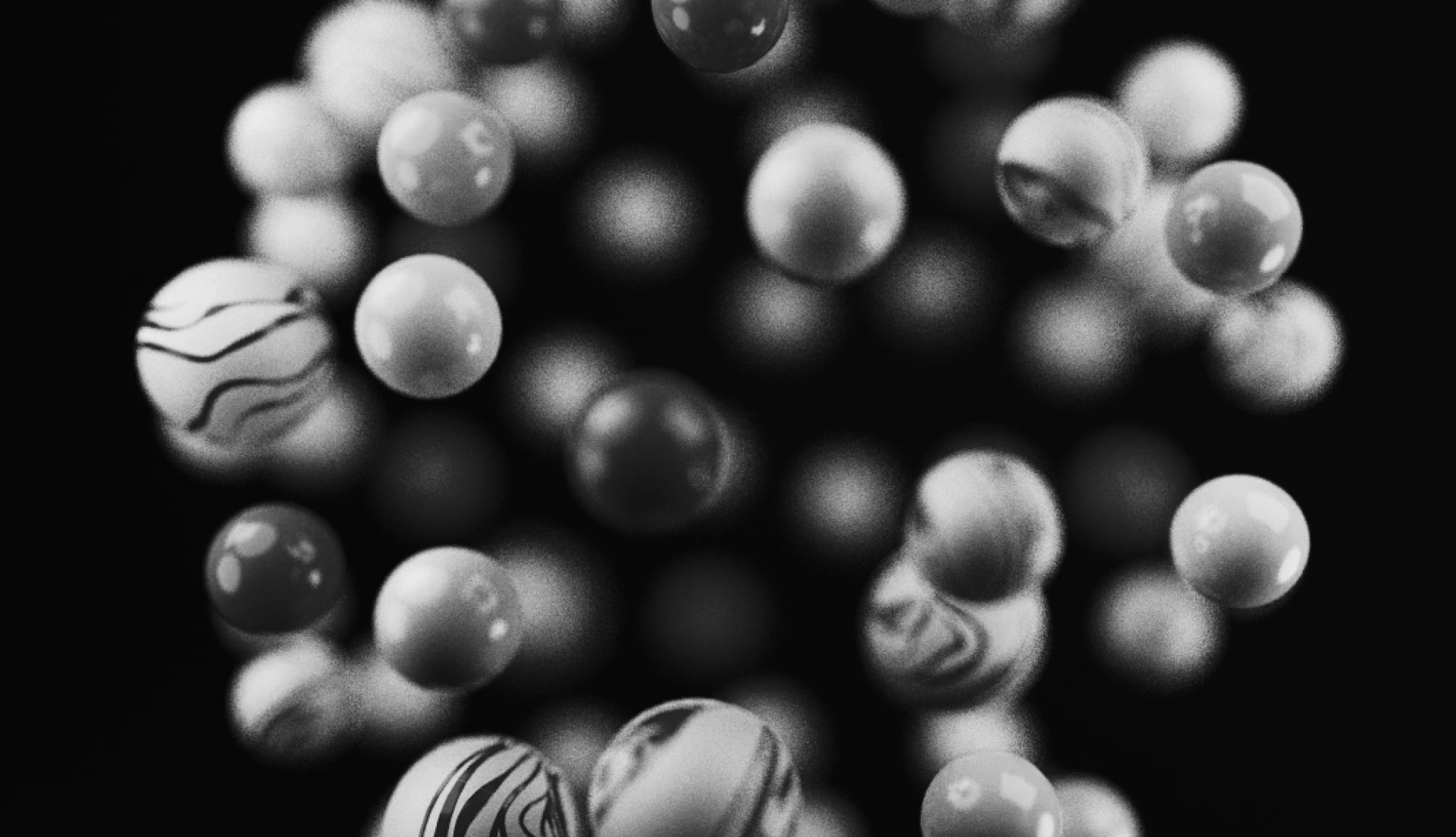
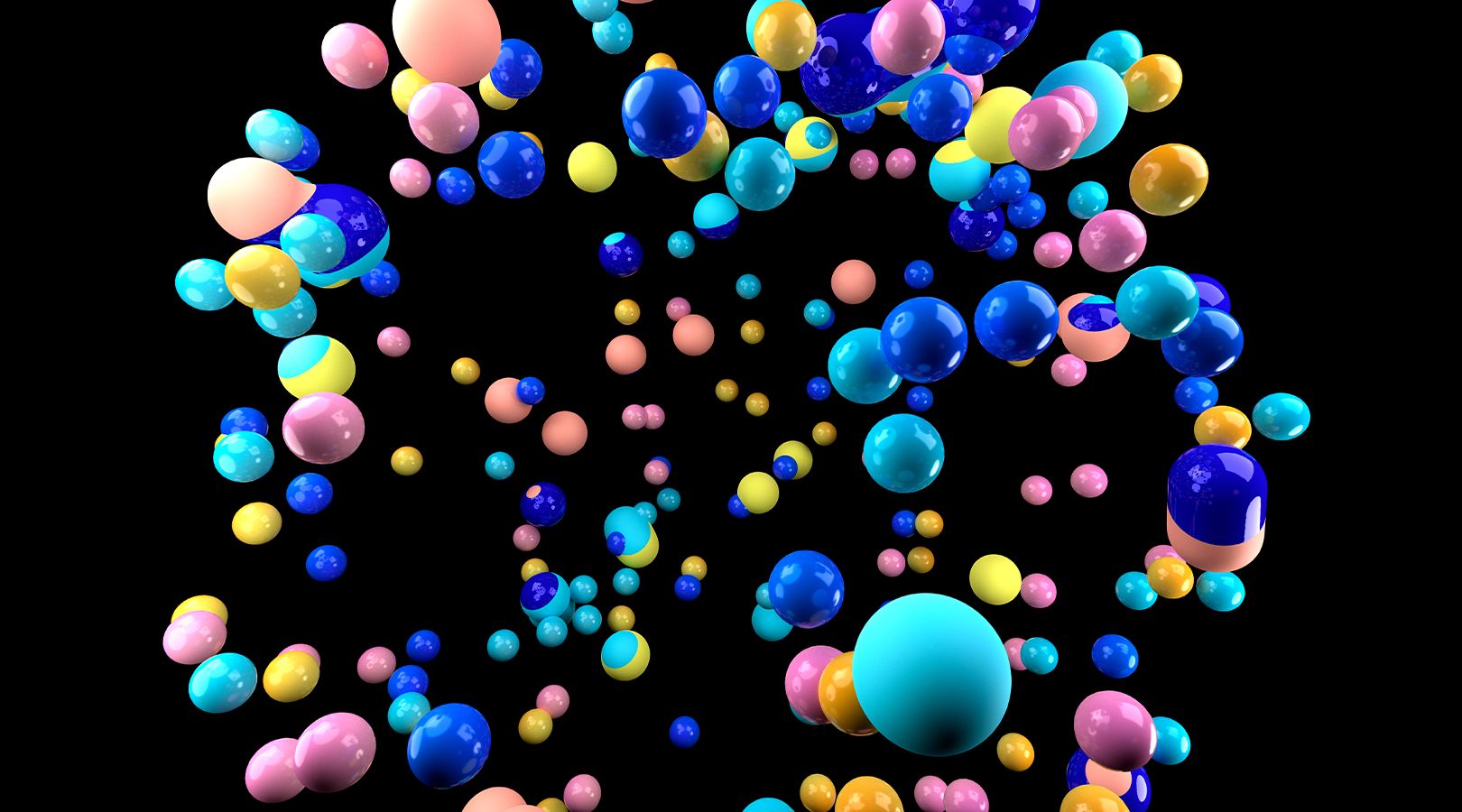
Next, we dipped into the meanings and worked through the audience's needs. A person buys a painting by numbers mainly to give himself time and rest in an alternative way. The hectic everyday life sometimes disrupts the balance, thousands of thoughts scatter in our heads. We need to be alone to recover. Then inner wholeness is regained. So we conveyed this idea in colored balloons that explode and then reassemble. Concentration and reunification of the particles of consciousness.
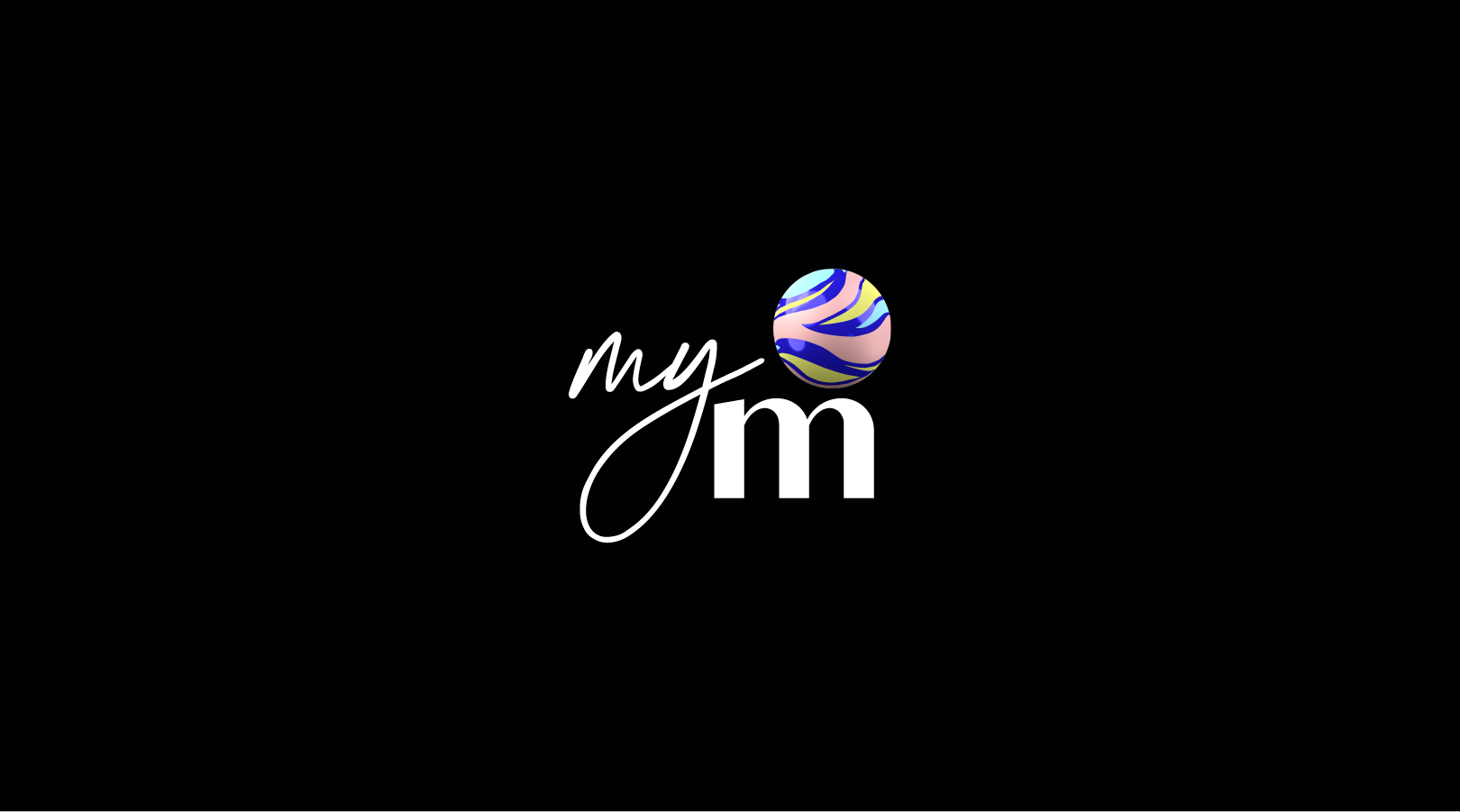
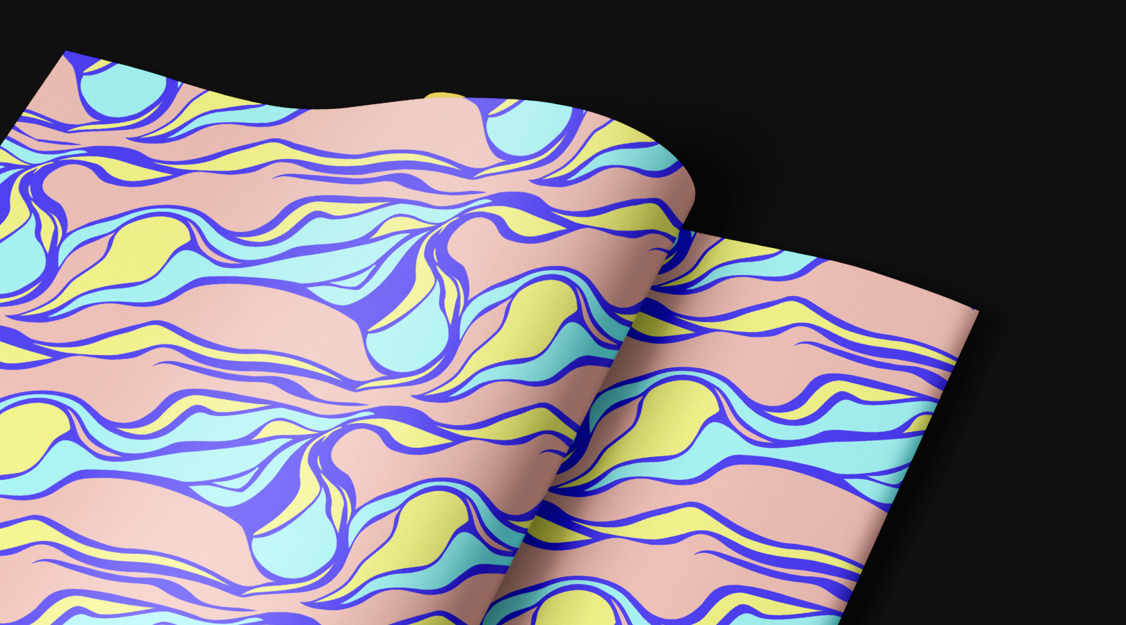
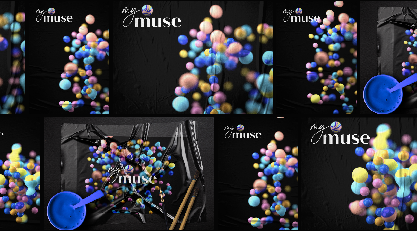
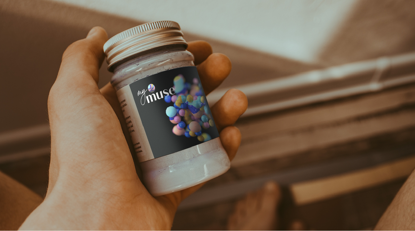
The entire visual identity was based on this metaphor. A black background is a space in the head, balls in calm tones are thoughts, a light logo and a pattern resemble the surface of a motley picture, each particle of which is painted in the desired color. We transferred the whole story to the packaging. According to the idea, the balls on the matte surface are covered with lacquer. As a result, we have successfully visually set aside on the shelf.