OMMA
New brand

New brand
OMMA is an Ukrainian design and architecture studio. It is engaged in subject, industrial and interior design, as well as it creates architectural projects for residential and commercial buildings.
Create a visual identity with cognitive elements that reflect the features of the studio and its activities. Our goal is to create a single visual component that can be used in social networks, customer presentations and another design.
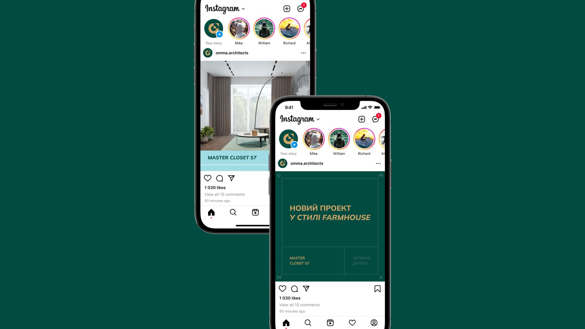
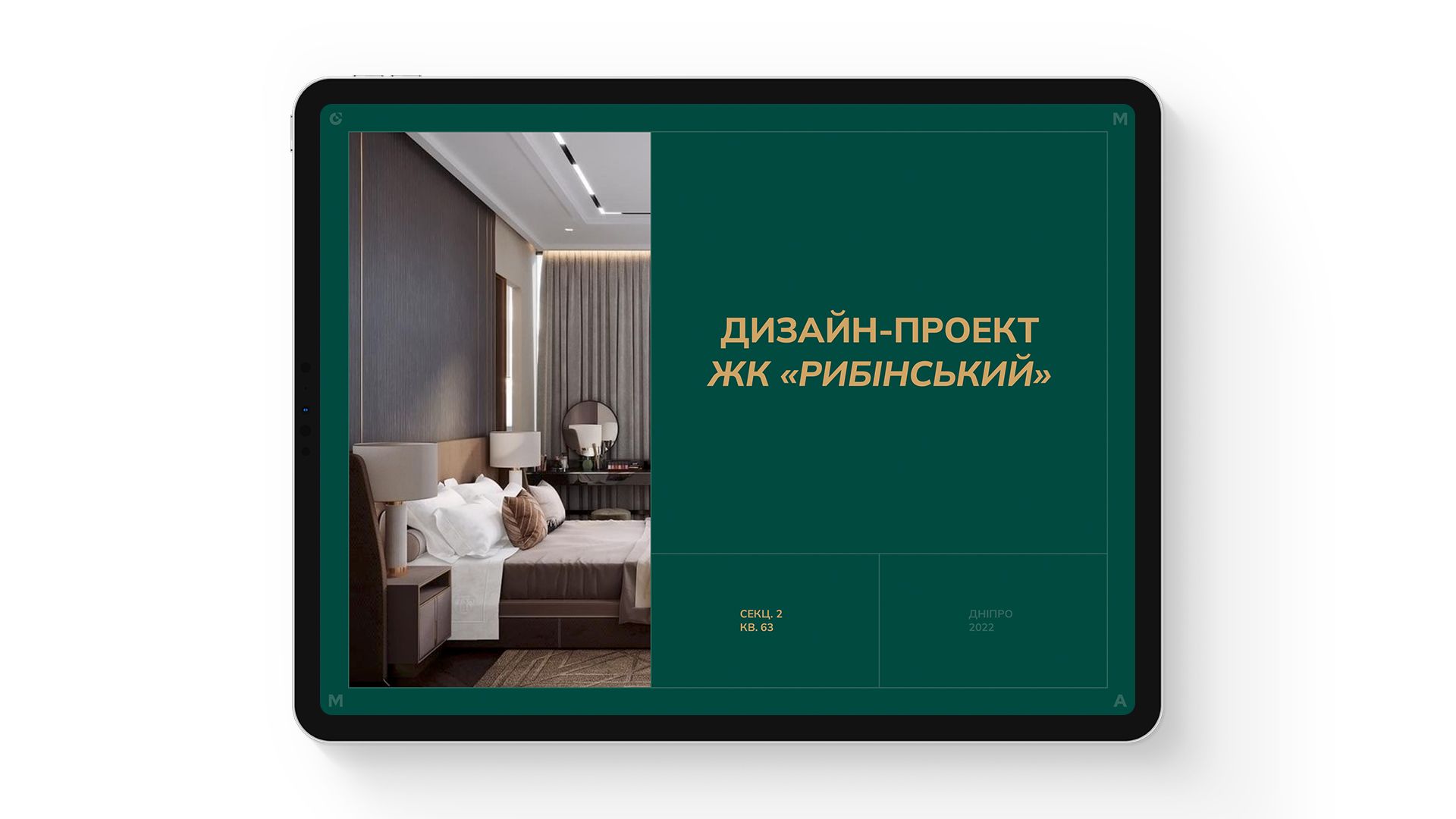
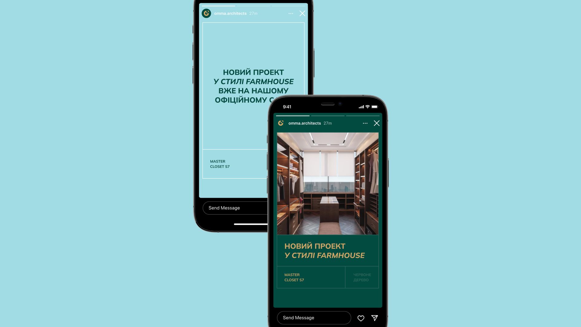
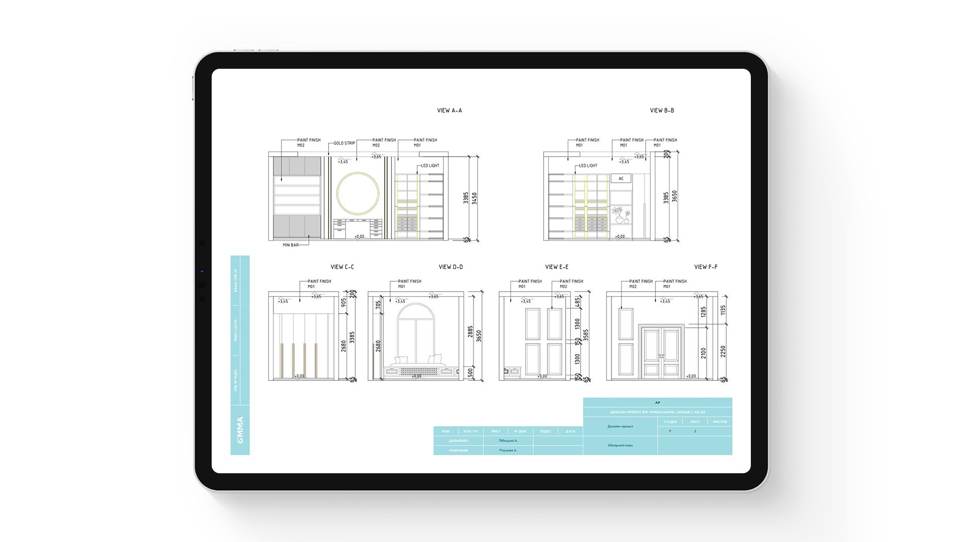
Usually, architectural studios make presentations of their own projects on an ordinary white background, which does not work for brand recognition. While we were working with OMMA, we decided to change this approach with maintaining a minimalist focus, but adding unique elements.
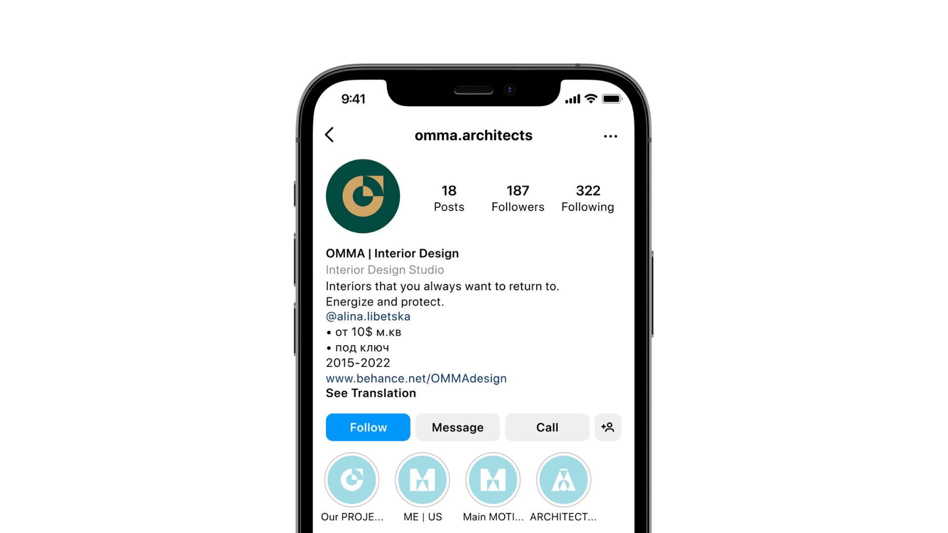
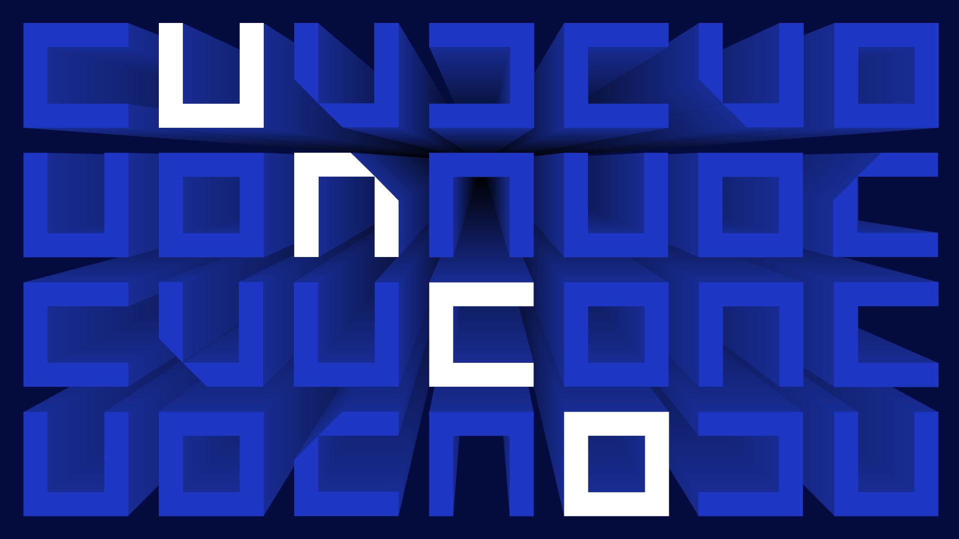
Working at the visual identity, we were inspired by the layout of apartments — their clear and graphic drawing. We wanted lightness and ease of design, which would express the architectural orientation of the studio as accurately as possible. The concept is based on the ideas of cosmology, namely the search for a person's place in the universe. Place as a metaphysical category and a very real physical space. The idea of working with spaces was continued in the font logo. It consists of a typographic inscription with a stylized letter "O", which can also be used as an independent element. This is a volume game where a circle can be part of a square and vice versa. For Instagram highlights, we have developed separate icons, stylizing the letters from the studio's name.
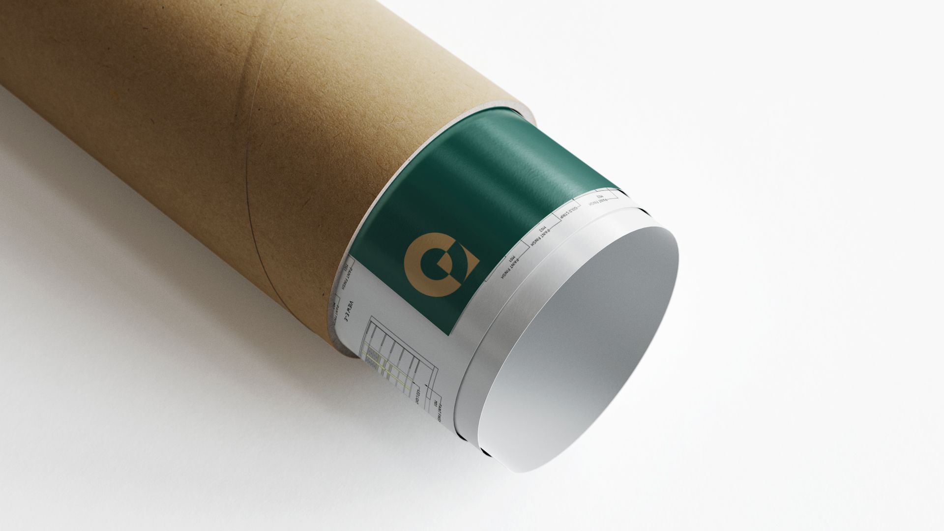
The favorite color of the founder of the studio is green, so it was chosen as the main one in the design. Additional colors: golden and pale blue. Thus, the visual identity of the studio "OMMA" successfully combines the individual needs of the studio owner and the idea of working with spaces, and also it helps to distinguish itself from other architectural bureaus on the Ukrainian market.