Dance project
Rebranding
Rebranding
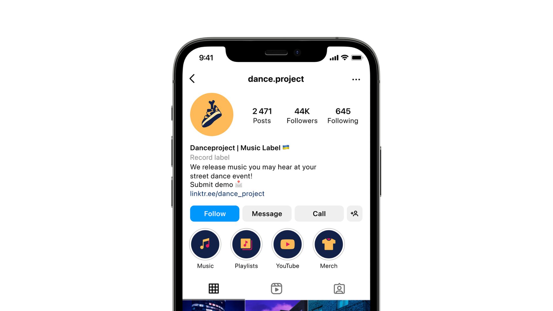
Dance project is an independent music label that works in the field of dance music, in particular Hip-Hop and Funky Electronic. Dance project creates content that will make you shake your head at a minimum, and dance until dawn at a maximum.
Redesign of the logo and develop own visual identity of the label. Our goal was to combine the old logo with the new brand history.
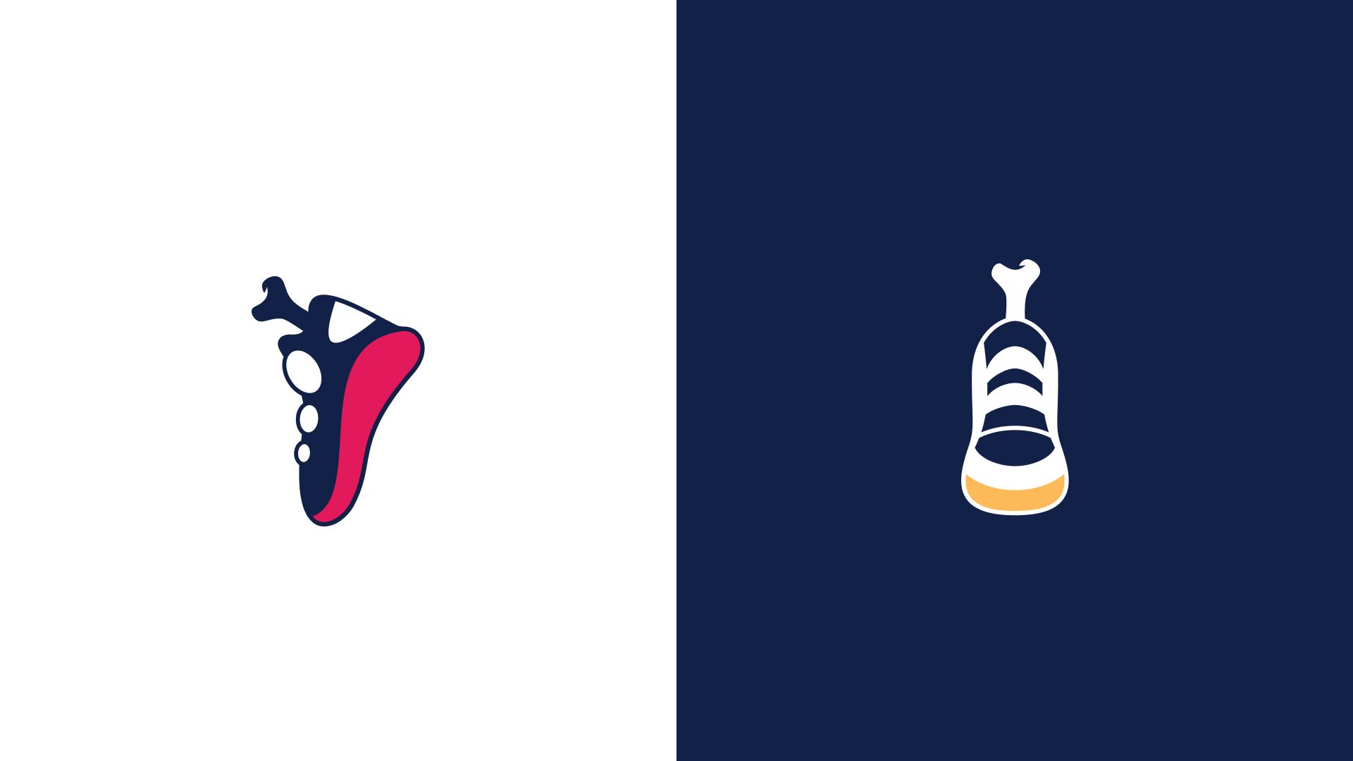
What did we have at the beginning? An existing, but somewhat outdated logo, which we started from in order to form a complete identity.
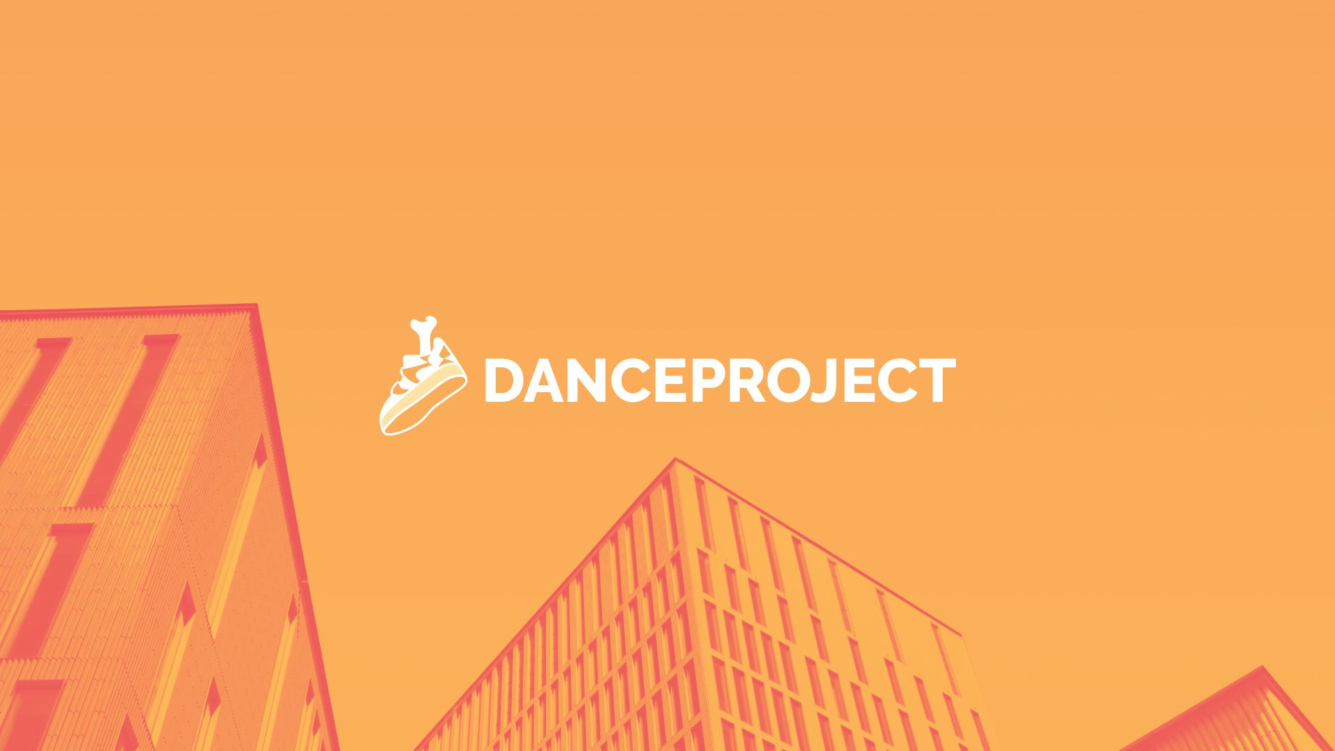
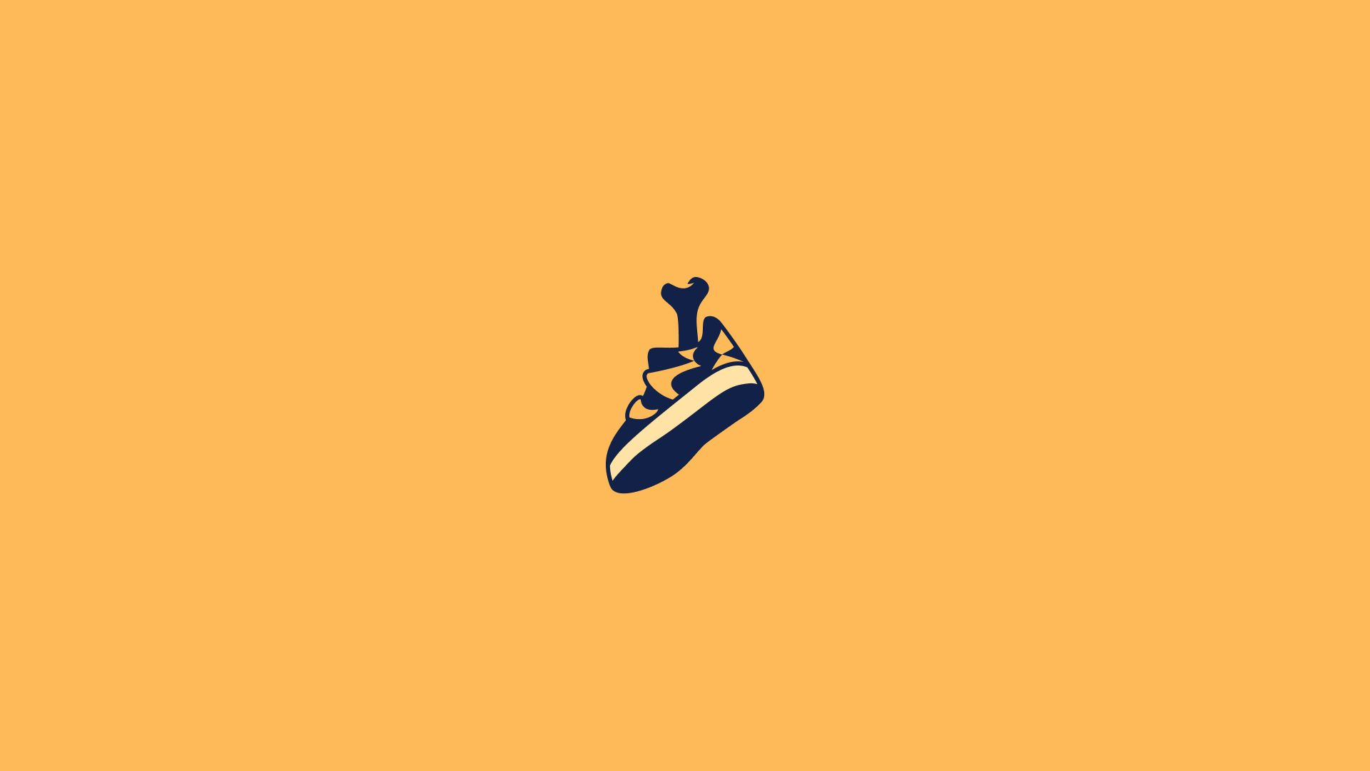
While working with this case, we tried to imagine what kind of personage is seen by the client when mentioning the brand. As a result, they determined that this is young people from 15 to 25 years old—active guys and girls who knock down sneakers at parties and are always ready to start dancing. Therefore, the Dance Project logo is a sneaker with a bone sticking out of it, which is a kind of metaphor for the statement "dance your feet to the bone".
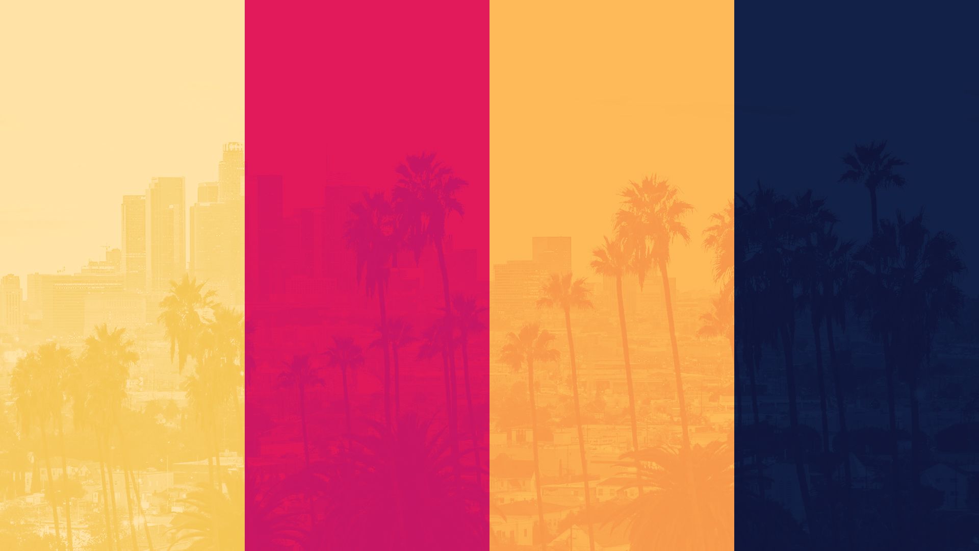
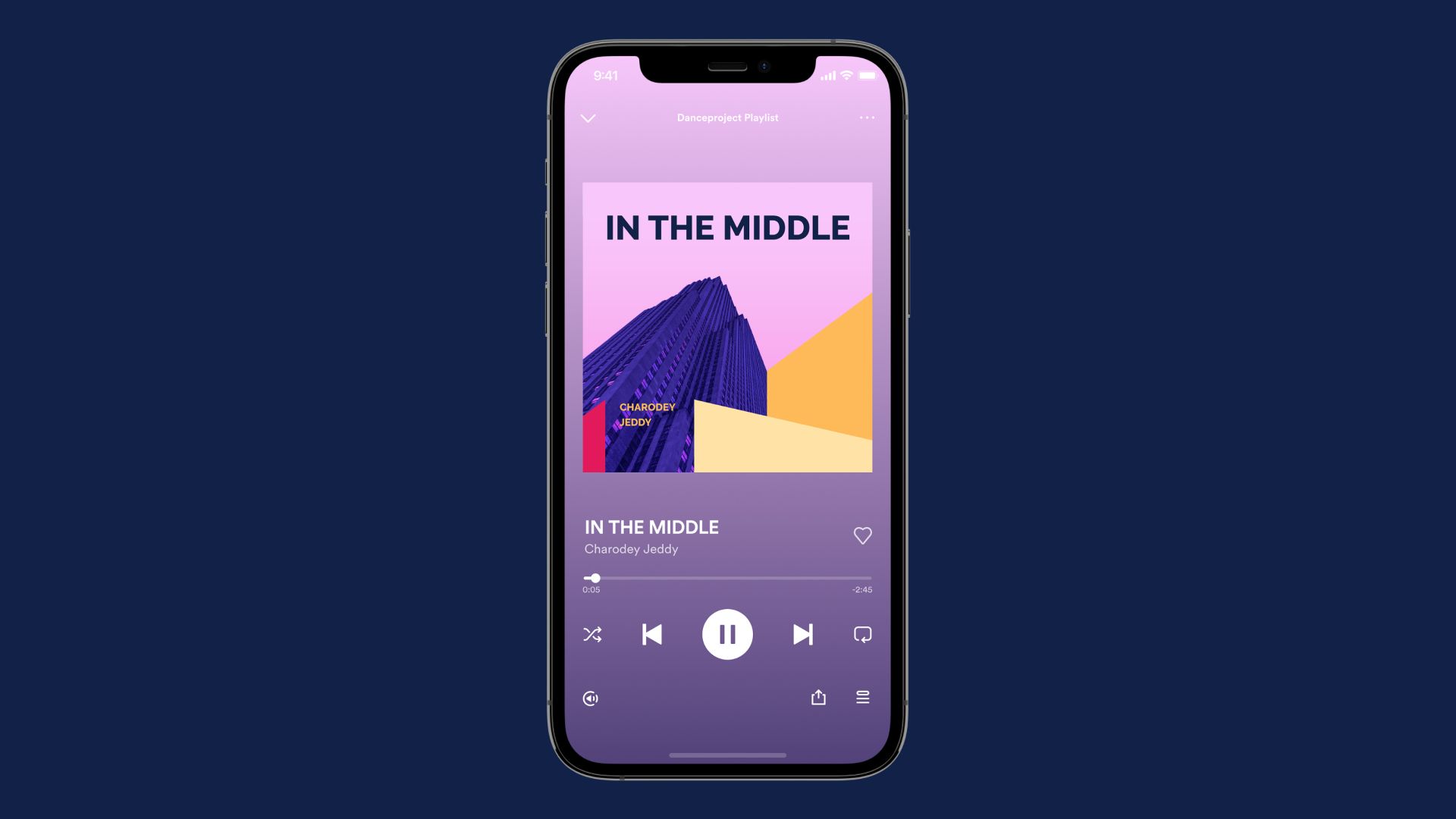
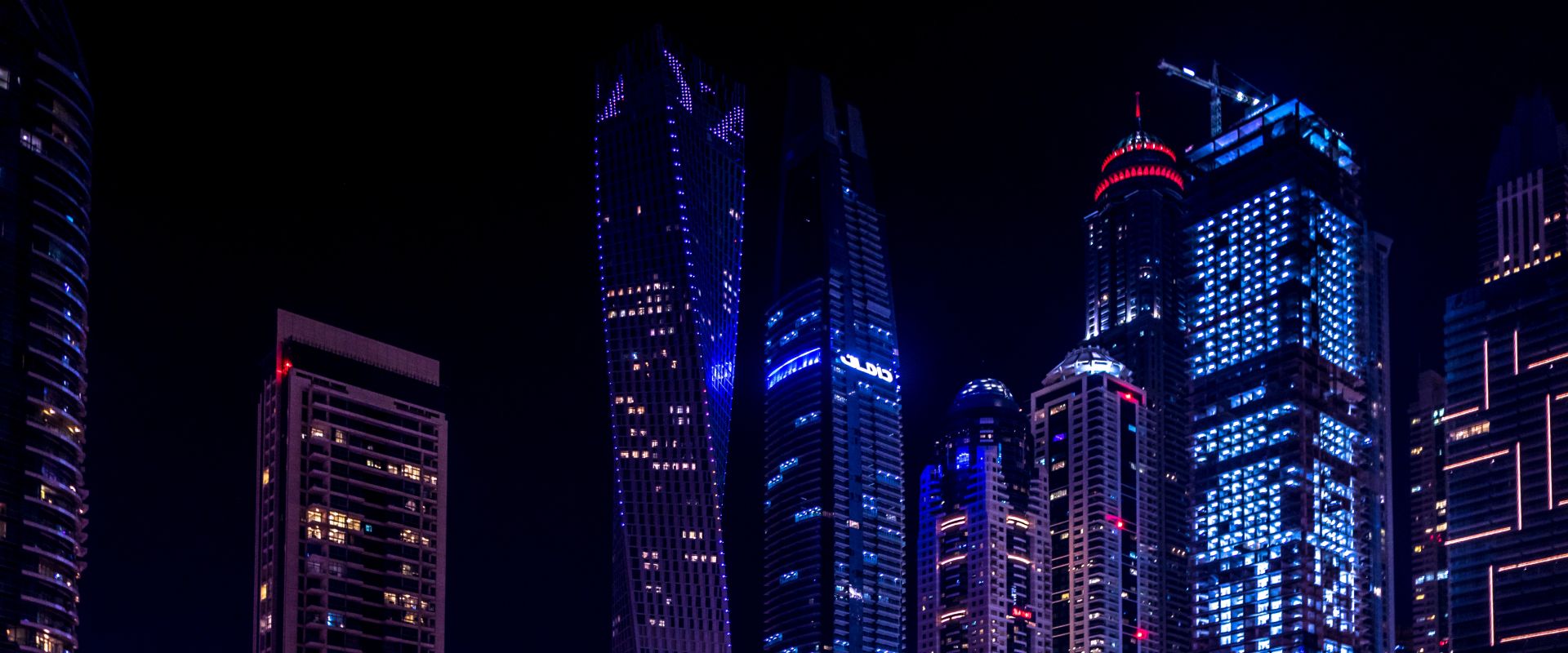
We decided not to abandon the original idea and continue it, namely, to modernize the logo and find a visual frame for this story. Moreover, to do this as simply and clearly as possible, but not to cross the line with banality. So we came up with an analogy with evenings in a big city. Imagine Southern California in the evening, the last rays of the sun fall on skyscrapers, lights are turned on, people go to the streets, terraces of houses and turn on music to relax from the noisy rhythm of the city. Music unites, makes life bright and inspired.
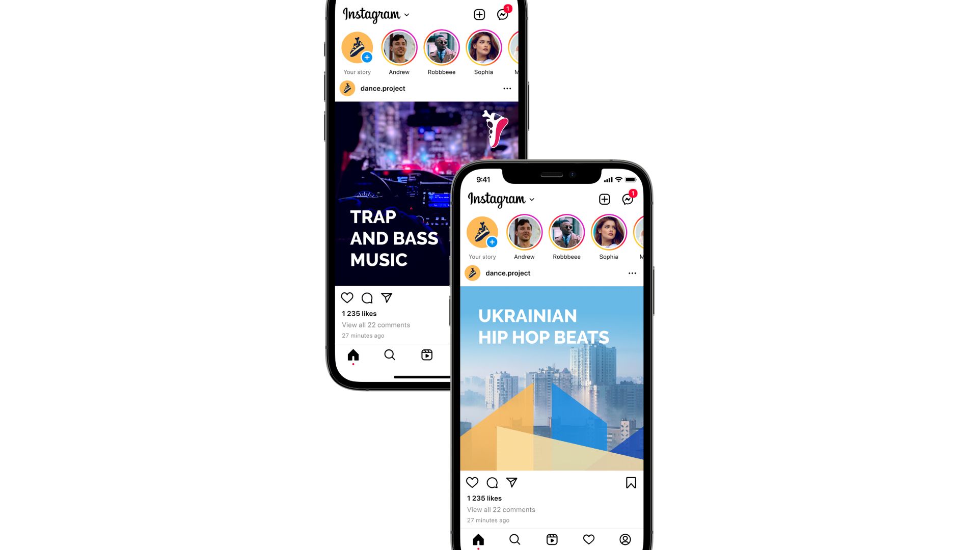
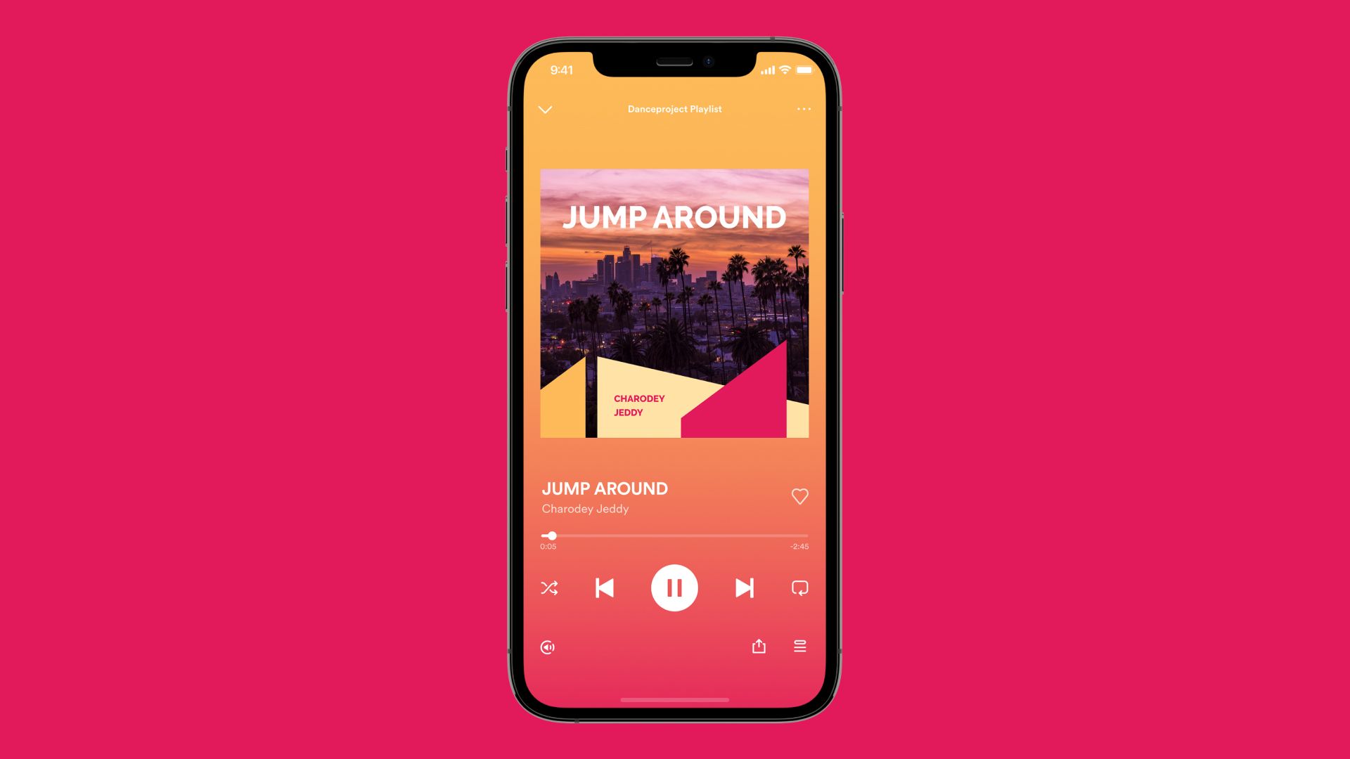
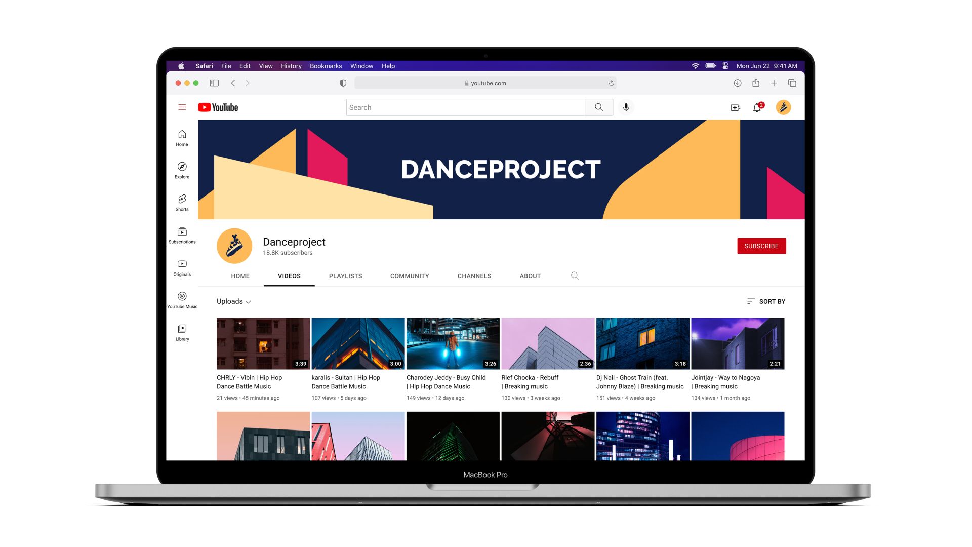
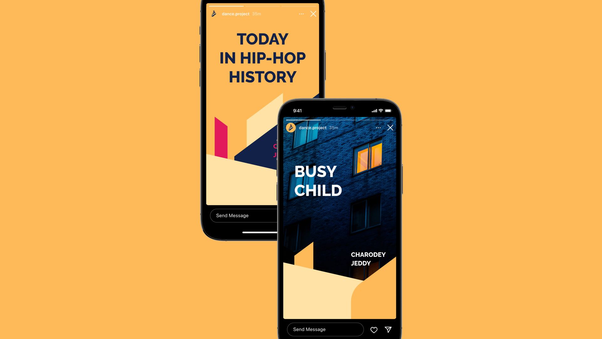
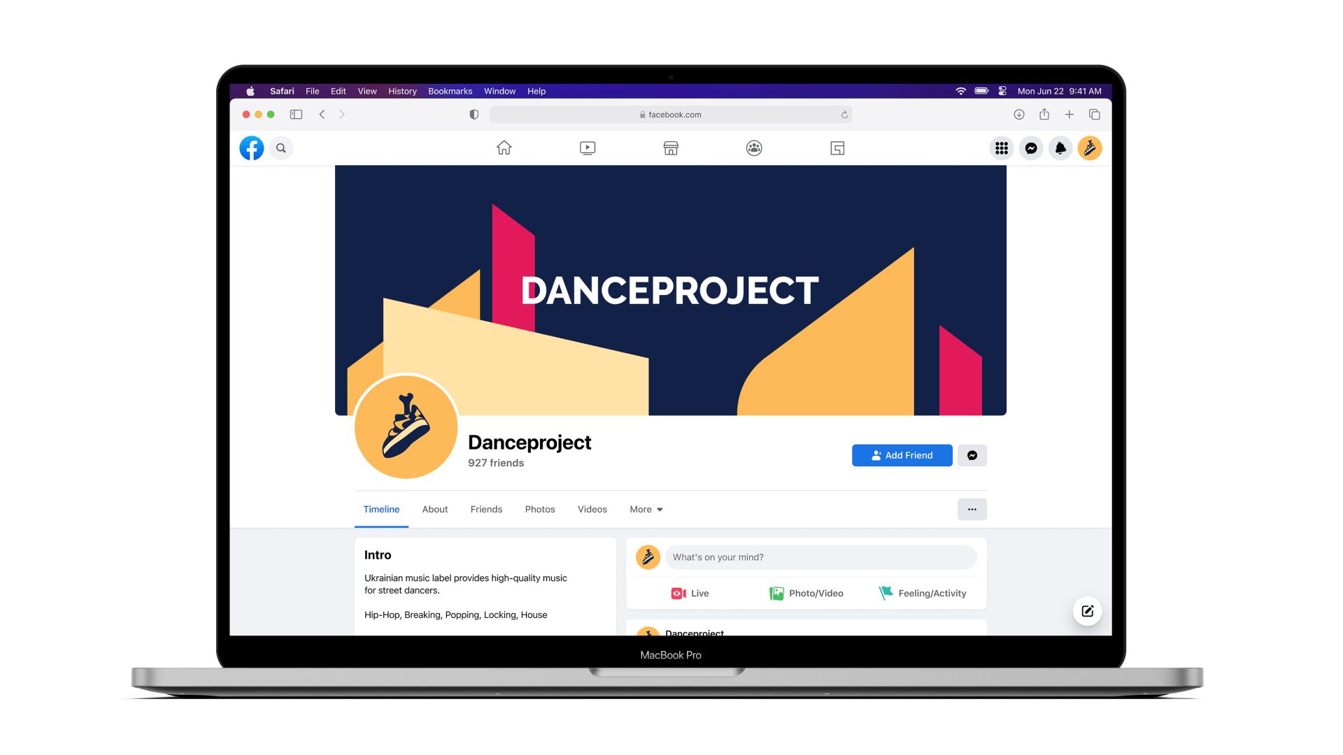
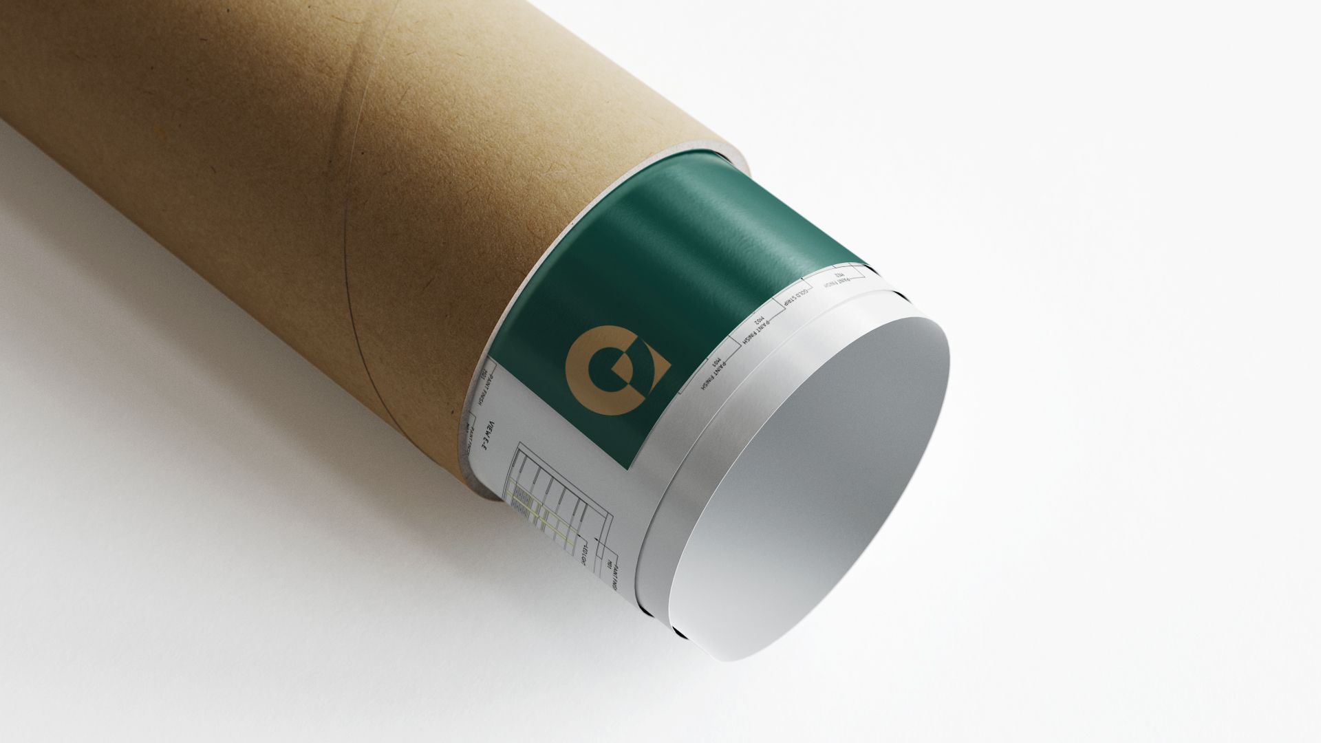
Using silhouettes of city blocks and roofs, we created graphic elements for the Dance project. The palette is reminiscent of the same California in the evening: blue, yellow, pink—night sky, lights and sunset. We also decided to add an updated logo to some of the design elements, which has several image options. Thus, the logo becomes more "lively" and indicates the presence of a person in the design media.