Moods Place
New brand

New brand
Energy. Vibration. Power.
Three elements of life. Three concept benchmarks. Moods Place.
The concept is built right on these three pillars: individuality, personal creative manner and unique vibrations of every human.
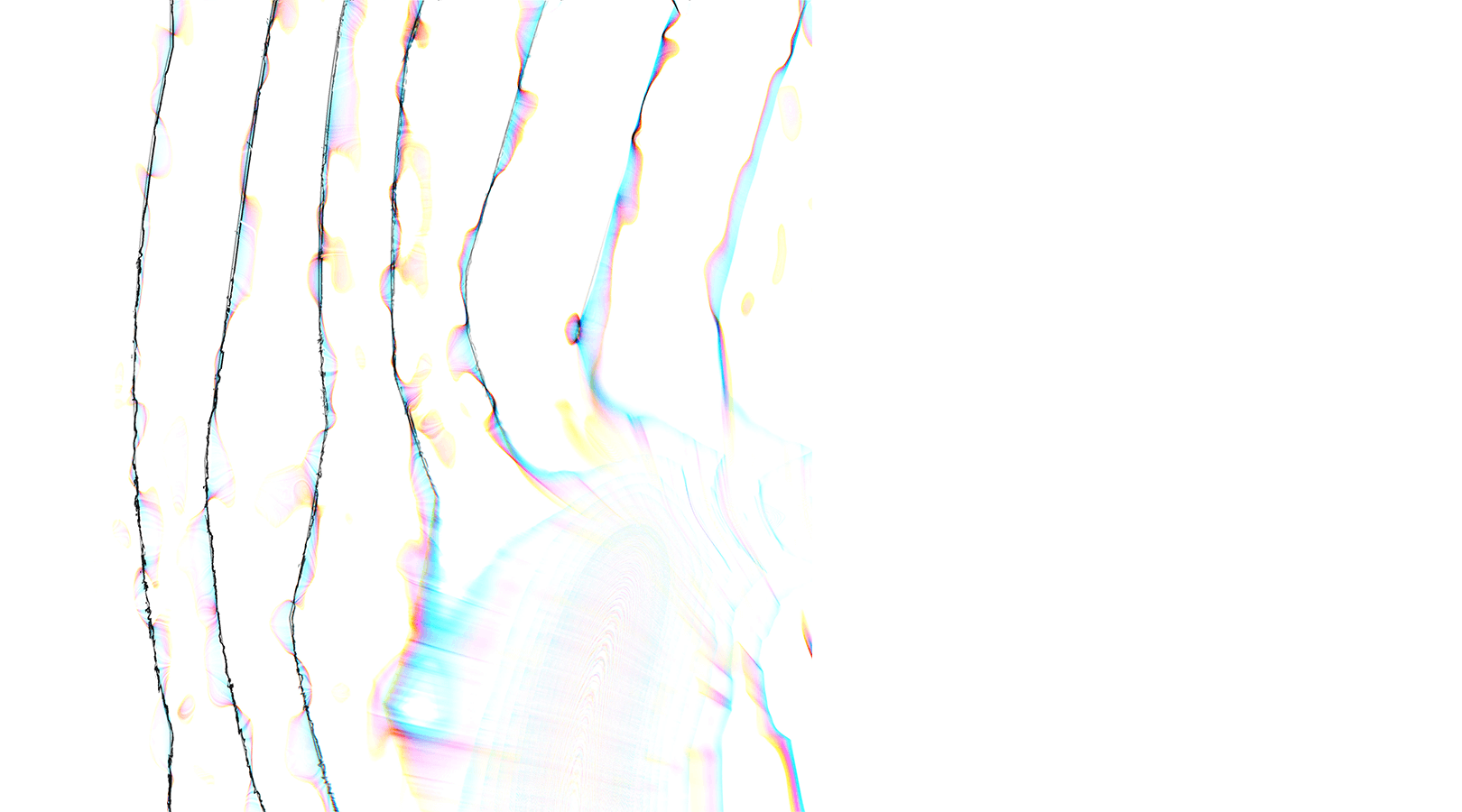
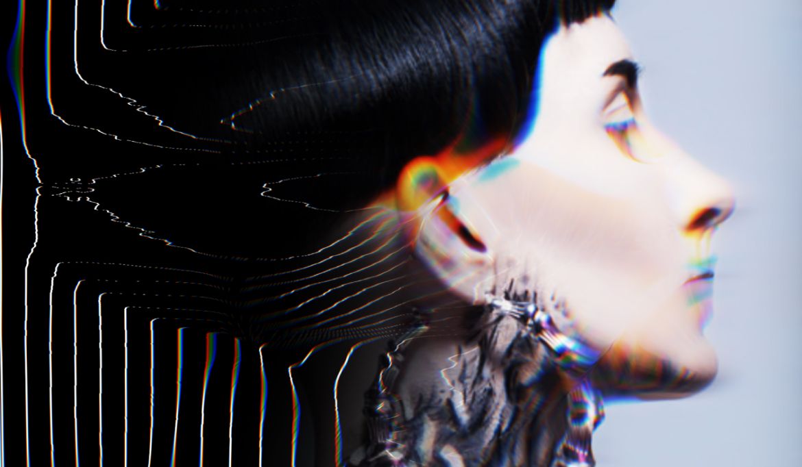
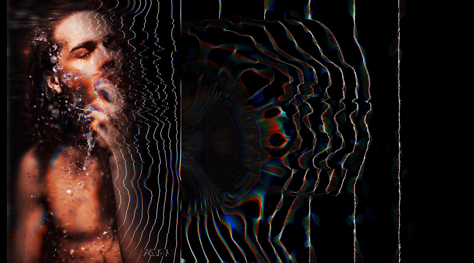
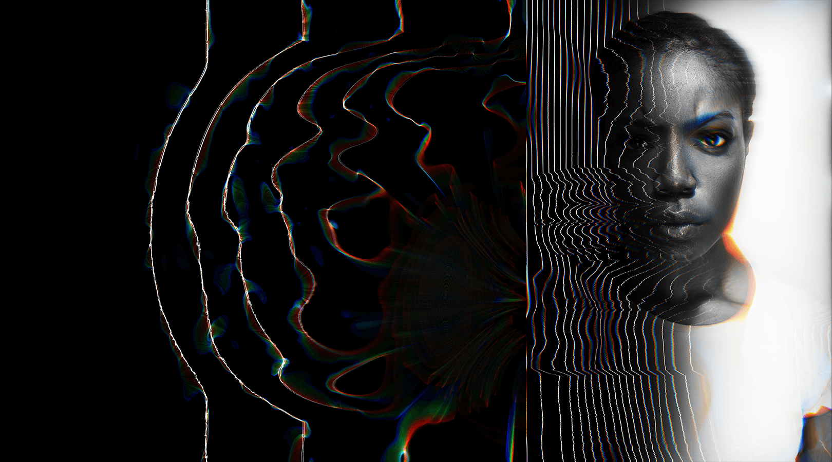
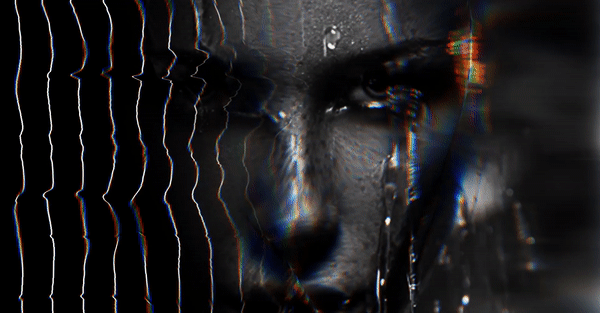
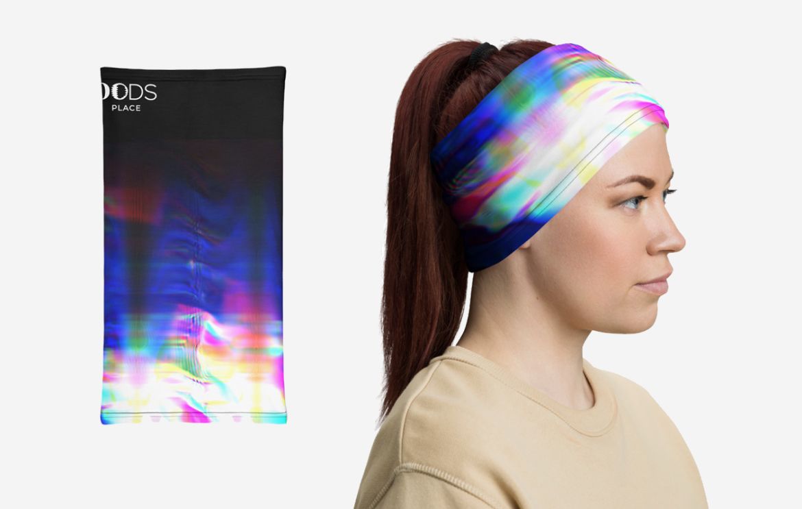
The logo embodies a “charged nucleus” quintessence, with waves of creative energy emanating from it like ripples or space oscillations.
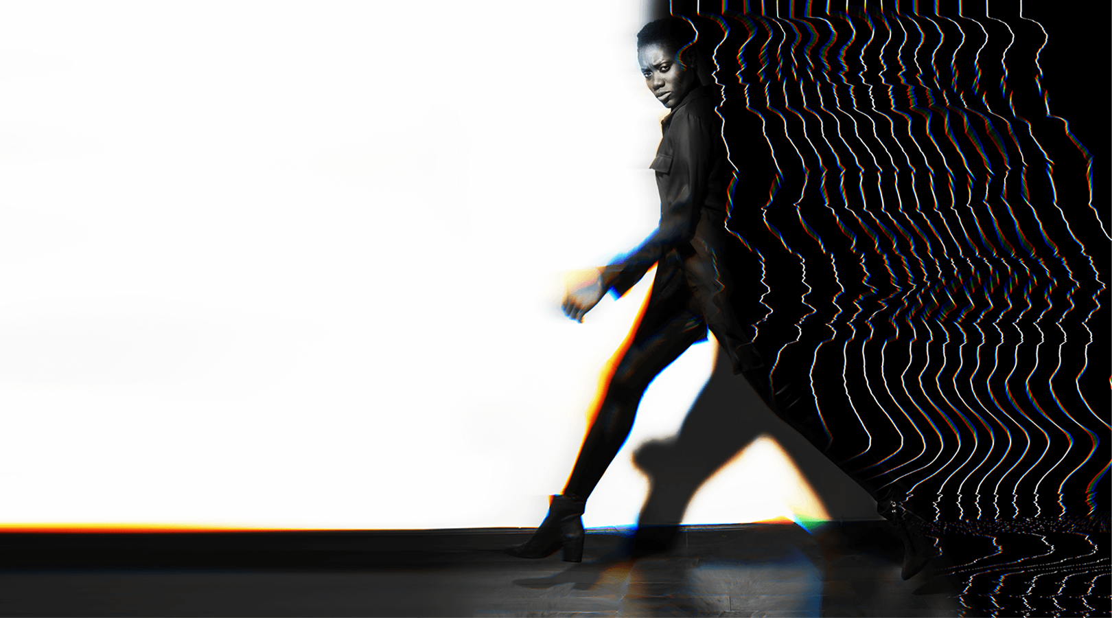
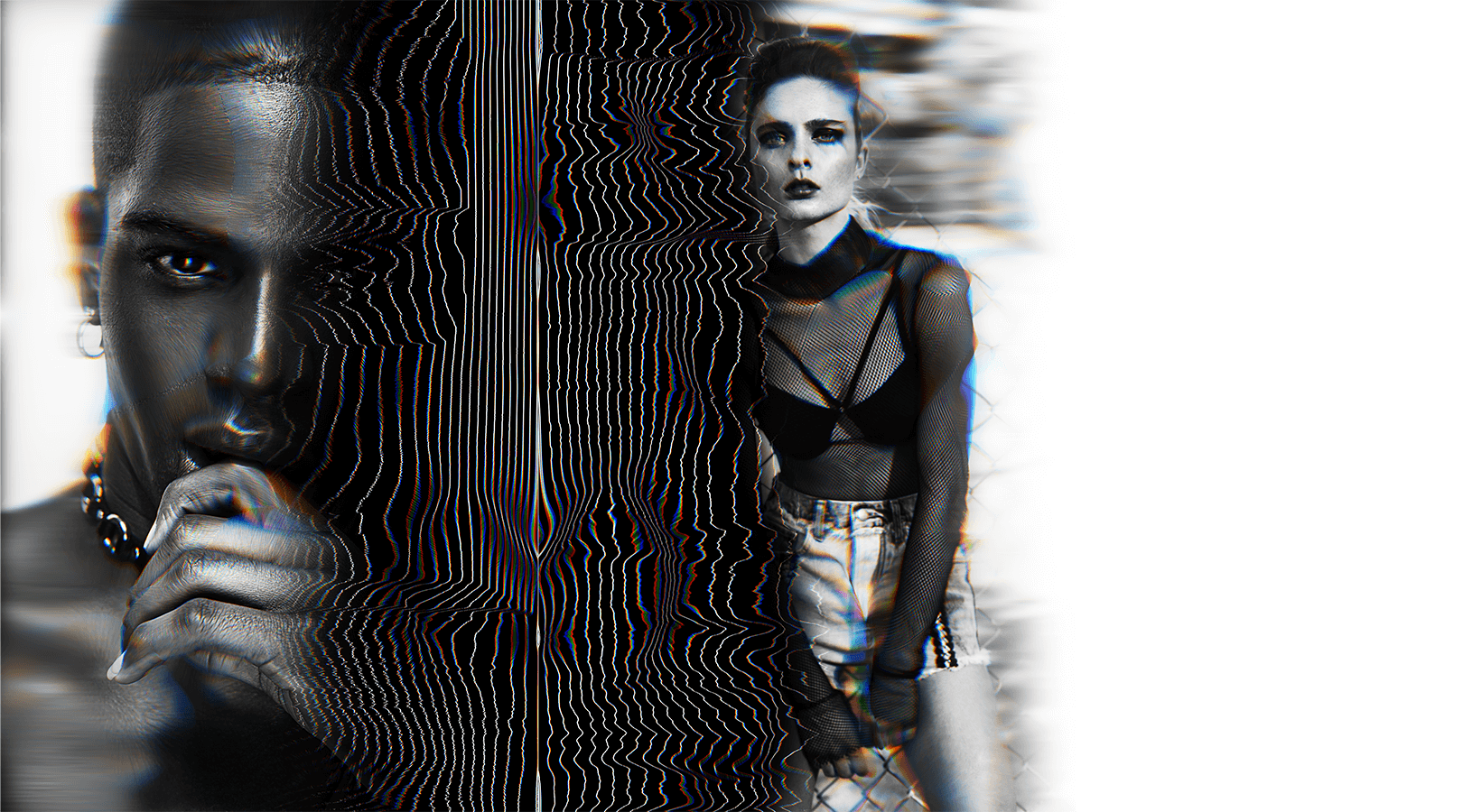
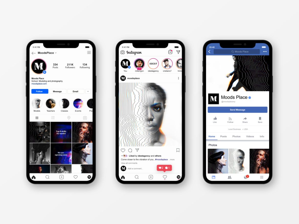
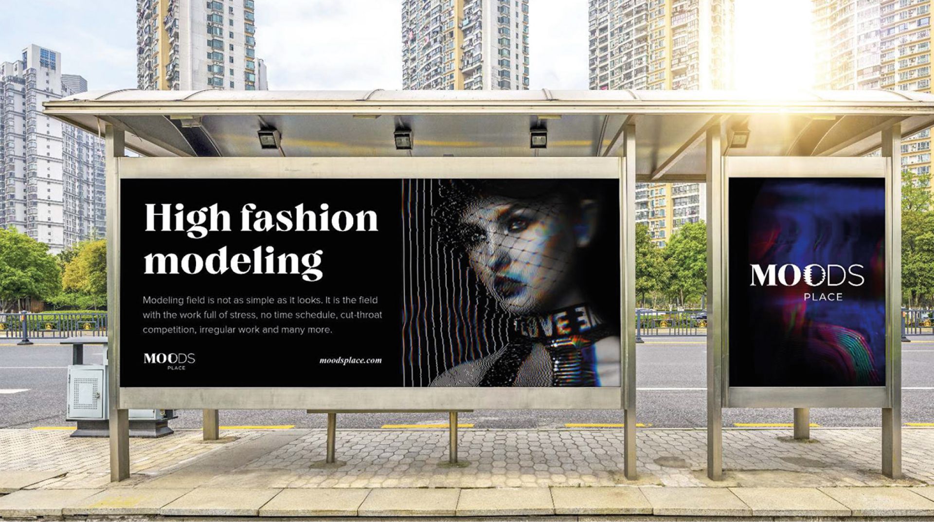
Visual solutions by Moods Place portray how the right vibrations help every human reveal their superpower and then create their unique work style.
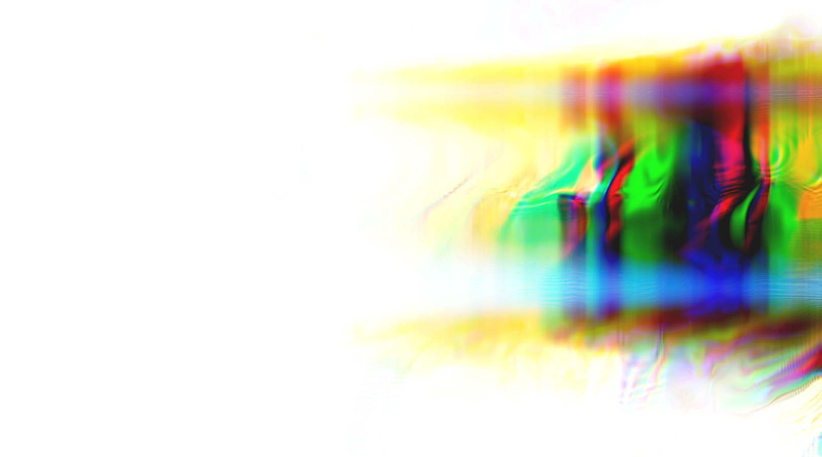
The color scheme pulsates and expands too, capturing the surroundings. Starting with monochrome, it then gains color splashes that vibrate and scatter across the screen like waves. They first replicate the initial silhouette, later transforming into new forms and creating unique abstract or real visual figures.
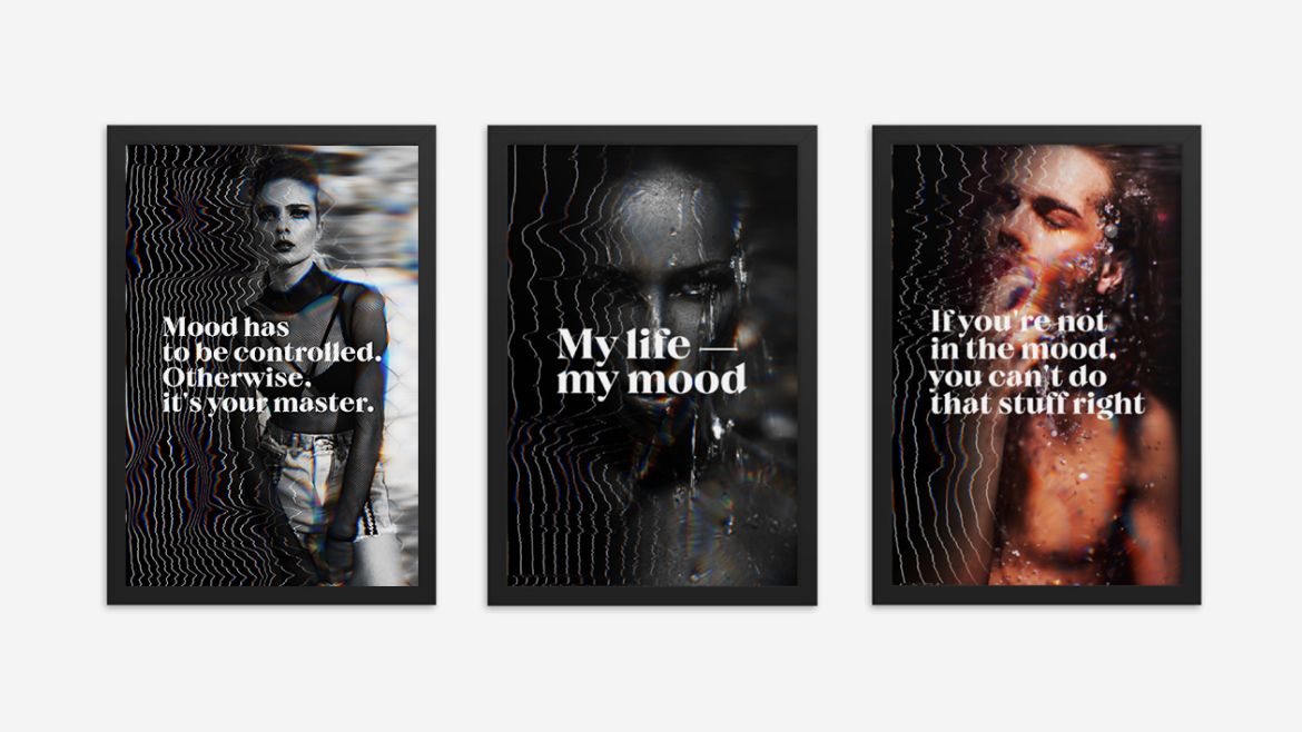
Graphic elements of Moods Place identity:
Explicitly yours. Without compromise. But with readiness to face discovery and renewal, as well as unleash one’s potential on all energetic levels.