Amel medical group
New brand
New brand
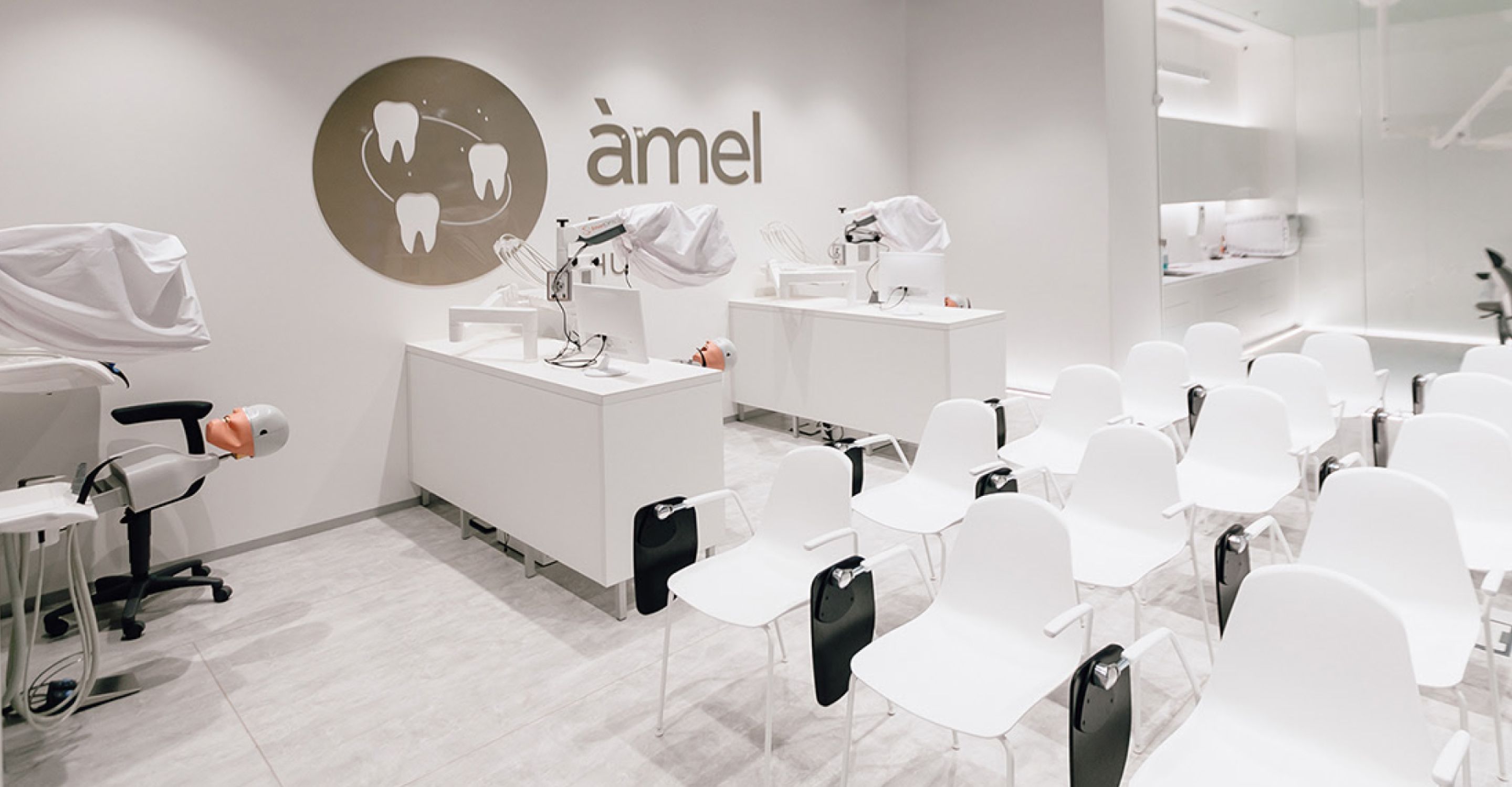
Amel Medical Group is a multidirectional platform that realizes complex tasks in the field of dentistry. Dental Clinic and Dental Smart Clinic were created to solve individual customer needs, as well as a digital dental laboratory CAD / CAM Lab, which works on CAD / CAM equipment. Professional dentists can find everything they need in the Dental Store and receive additional training at the Dental Academy.
Amel creates solutions for employees and customers by looking at each problem globally, in the context of the entire body, not just one part of it. Amel combines cutting-edge technology, precision equipment and the experience and expertise of subject matter experts to harmonize the human ecosystem.
Create an overall concept expressing harmony between the multiple areas of the company’s activity. Show their connection in a way that preserves each area’s specialization, yet where that essential overlap, a story they share, and a common background remain.
The client already had a basis for their corporate identity: the Amel Medical Group logo as well as the logo of a business branch — Amel Dental Clinic.
Abandoning any of that was not a plan, but further fine-tuning and corrections were required to upgrade the design while preserving the core emerald colour.
Made changes:
METAPHOR
The idea came from the observations of all daily clinic operations, which was its objective value along with the visual aesthetics.
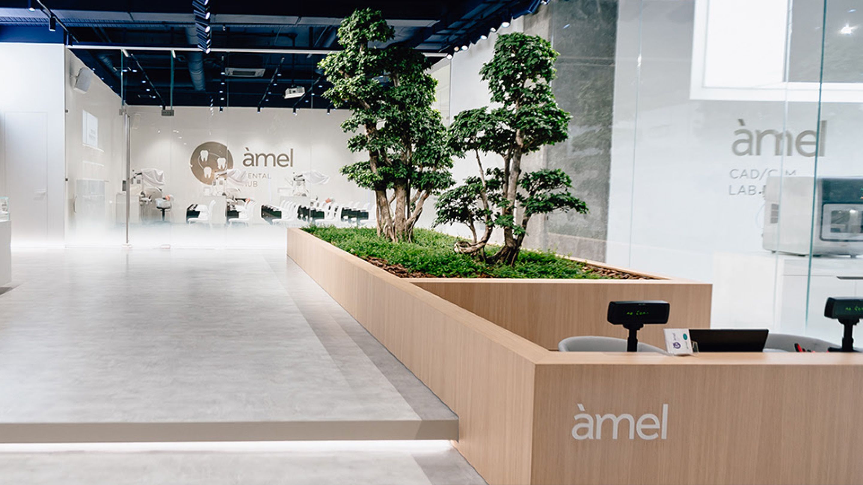
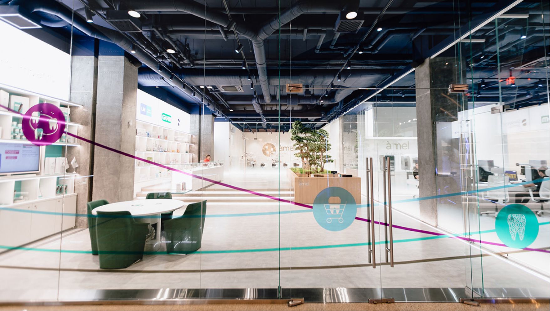
‘It’s just unbelievable, like being in space!’ exclaim those entering the clinic for the first time. That’s how the decision was made: the brand would reflect the conclusions patients reach after visiting the clinic: cutting-edge technology, medical staff expertise, equipment reliability and advanced opportunities.
Translated from Greek, the word ‘space’ means order. The world is harmonious and operates in accordance with its own laws. We learn such laws and make use of them for our benefit, using the developments of medicine, technology and innovations.
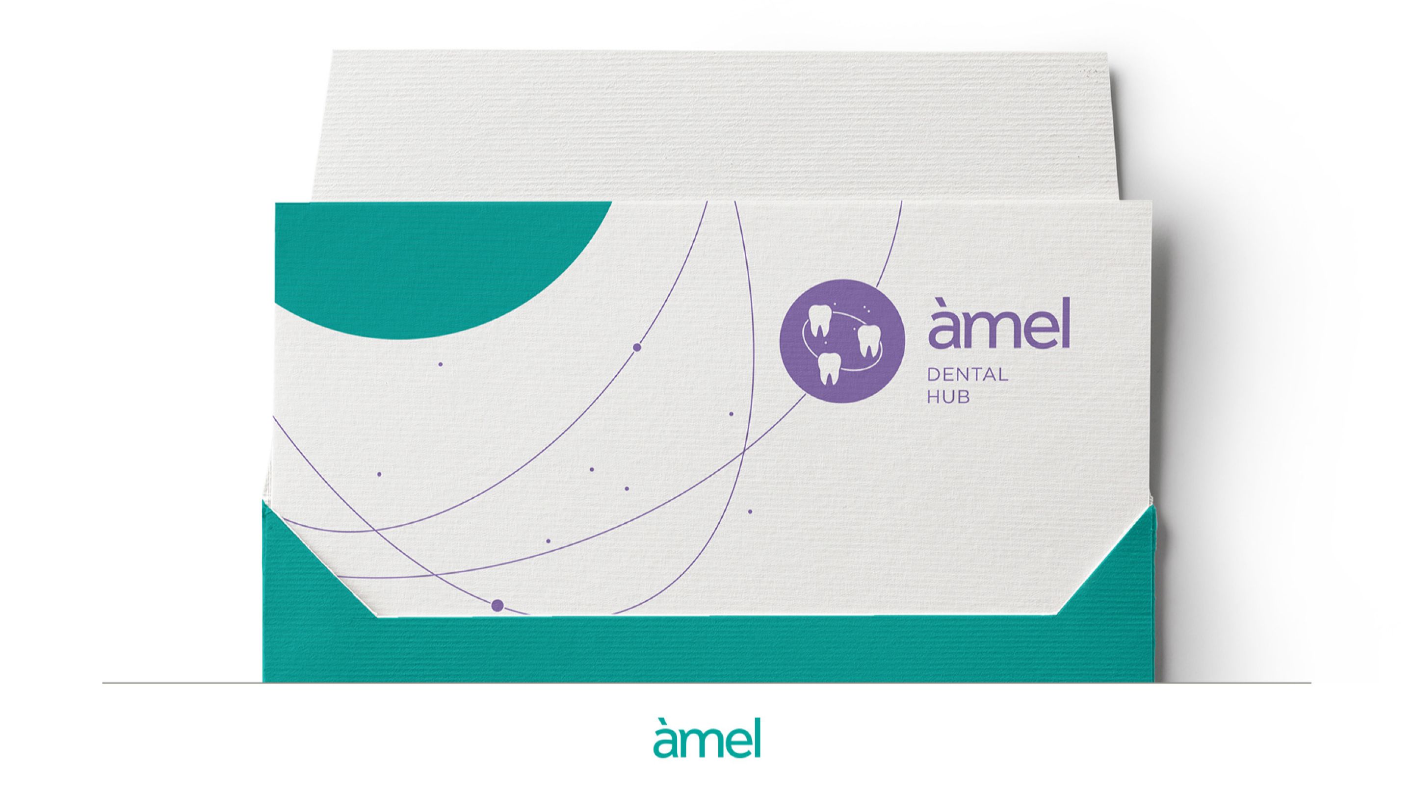
The concept involves the core proportionate design of all logos — a circle as the ideal shape and representation of cosmic harmony. Then, the plot unfolds according to the rules of the real story.
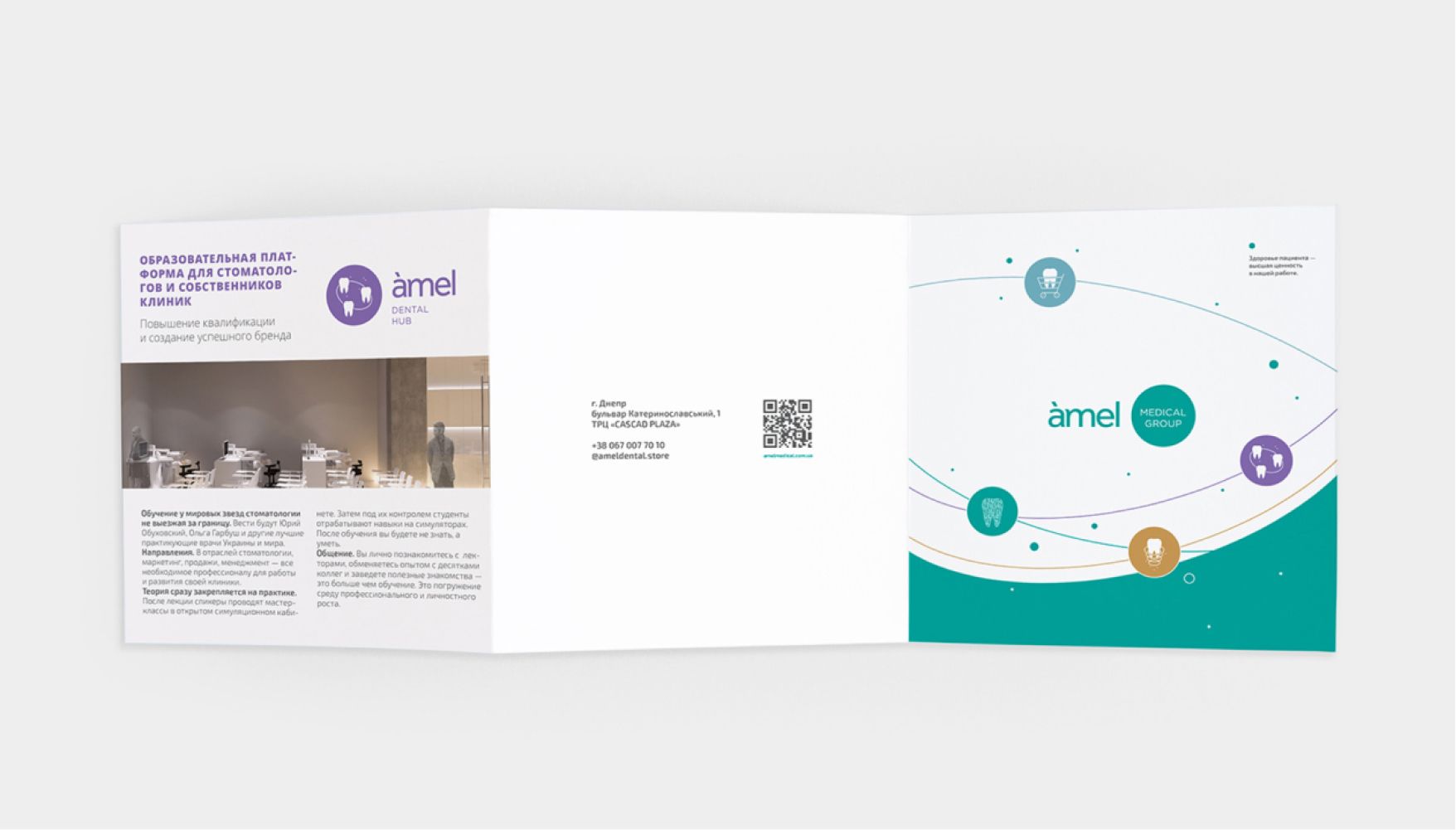
The Amel Universe: the Sun is Amel Medical Group logo, the center orbited by 4 planets are areas of business (Dental Clinic, Dental Store, CAD/CAM Lab, Dental Hub). The prospects for future development are perfectly integrated into this appealing, well-thought-out and rounded diagram: it’s the opening and exploration of new planets.
GRAPHICS
COLOR SCHEME
These basic, in some ways even archetypal colors and shapes convey the solid scale of the brand, the hierarchy of departments, as well as a deep understanding of the needs of patients as space and quality conditions for a healthy life.

