GOLDEN5 event agency
Rebranding
Rebranding
Golden5 is a high—class event agency aimed at leaving golden imprints in the memory of solemn events and special events.
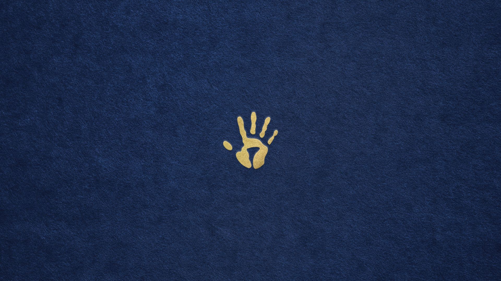
Update the visual identity of the company, retaining the familiar symbolism — the palm — and the beloved blue color combined with gold. In other words, the concept should remain the same, but become fresher and more harmonious.
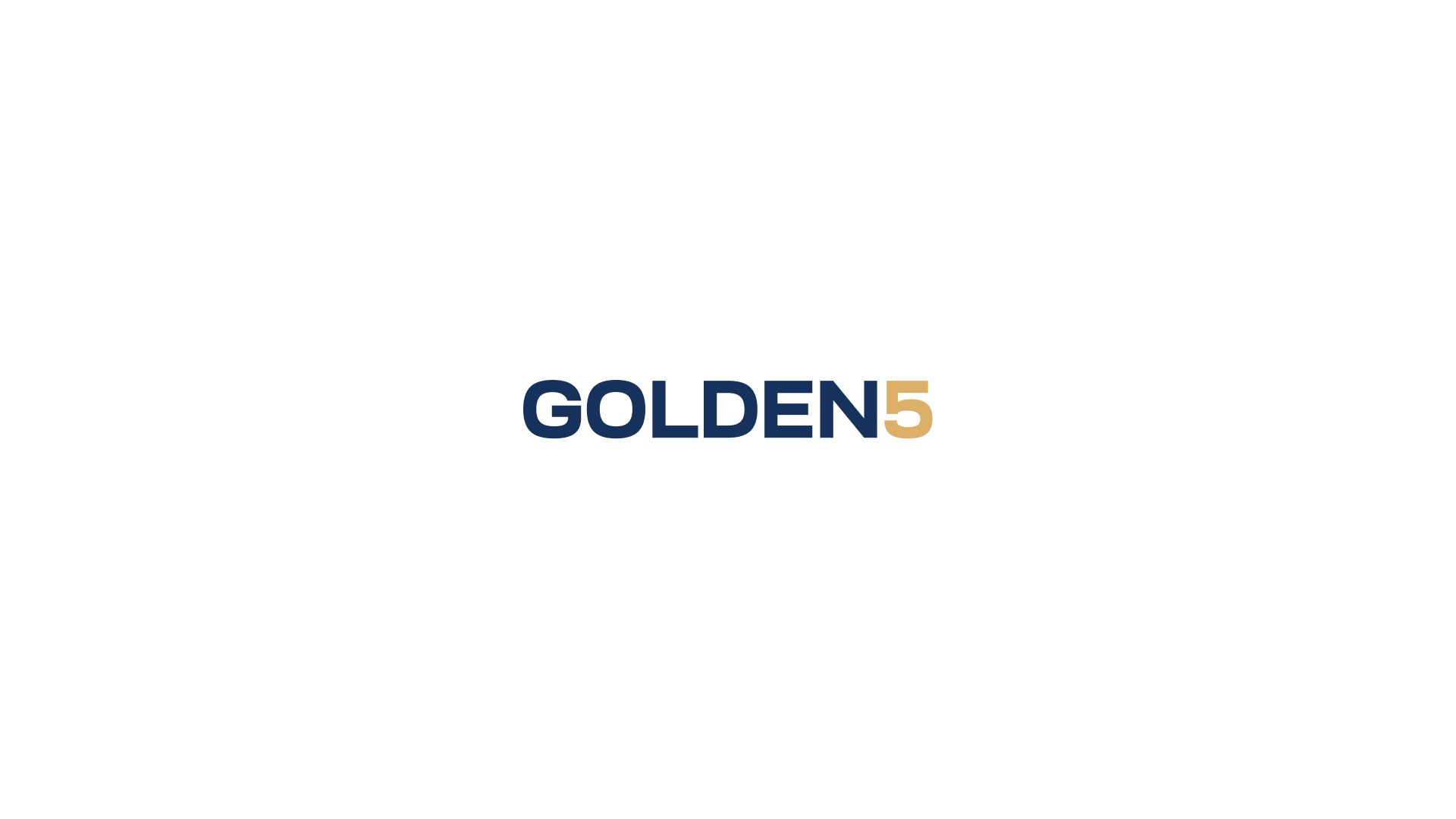
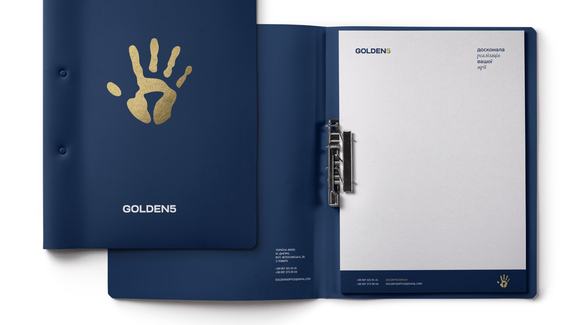
One of the first decisions was the separation of the icon and the font part of the logo. We updated the "golden print" and began to use it as an independent unit. In the spelling of "GOLDEN5" the space between the word and the number disappeared, as a result the inscription looked more complete. The new font looks more confident and it is easy read from a distance.
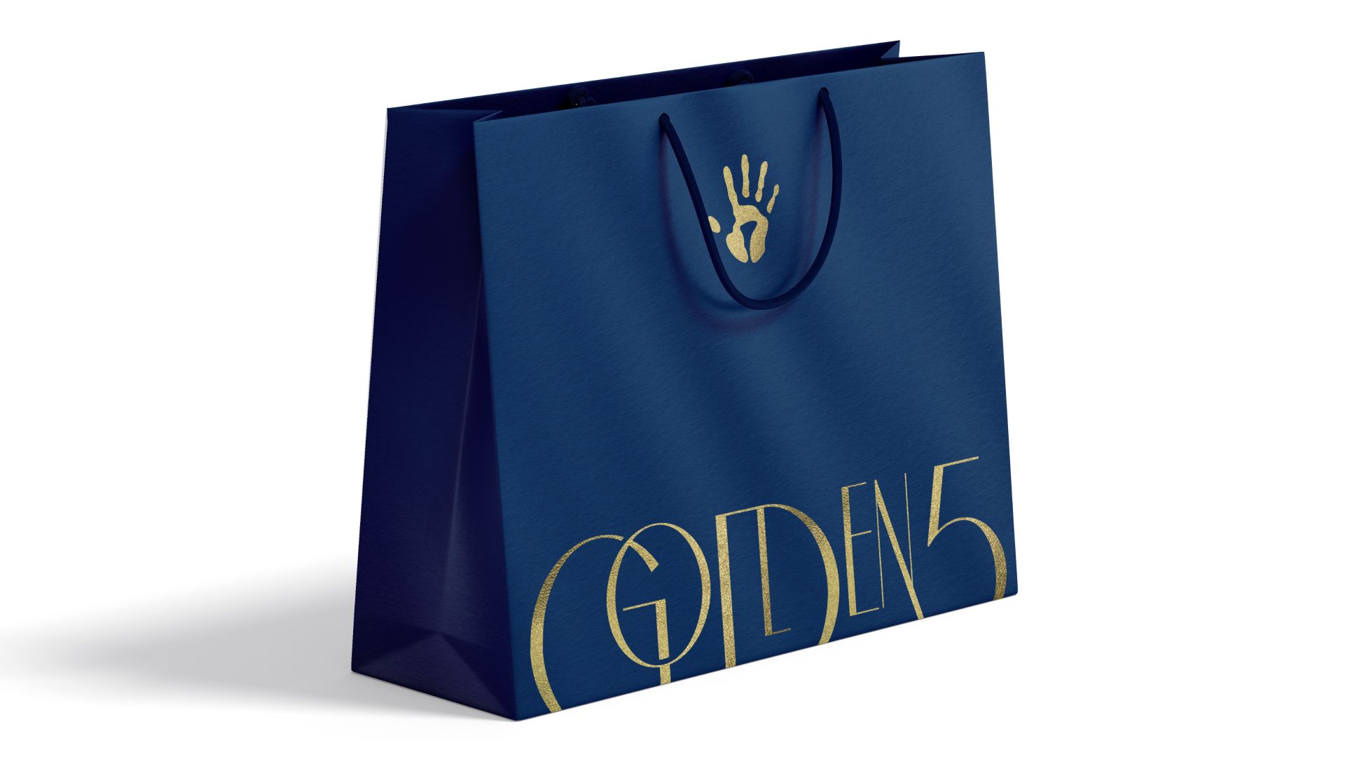
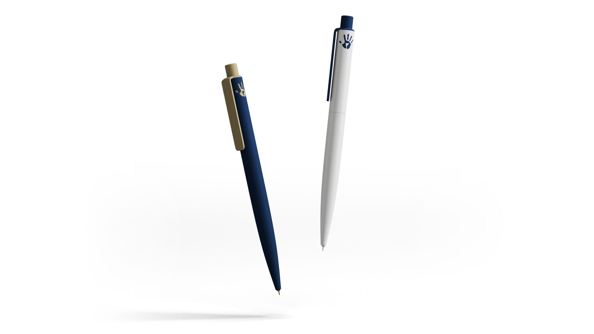
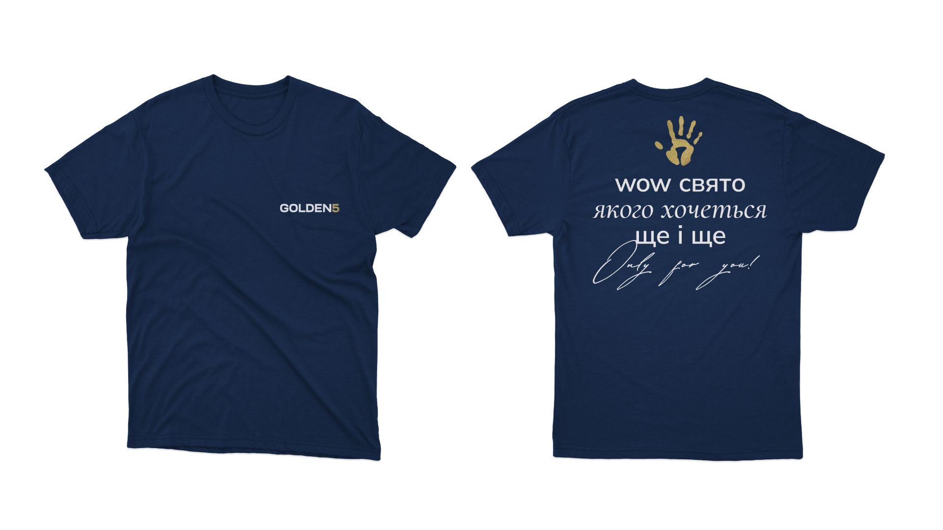
The blue color has become muted, deeper and nobler. The gold managed to be transferred through a restrained sand. At the same time, it is recommended to use a foil gold texture when applied to branded materials, which would contrast with the matte blue surface. The visualization of the idea is especially well conveyed on the branded package.
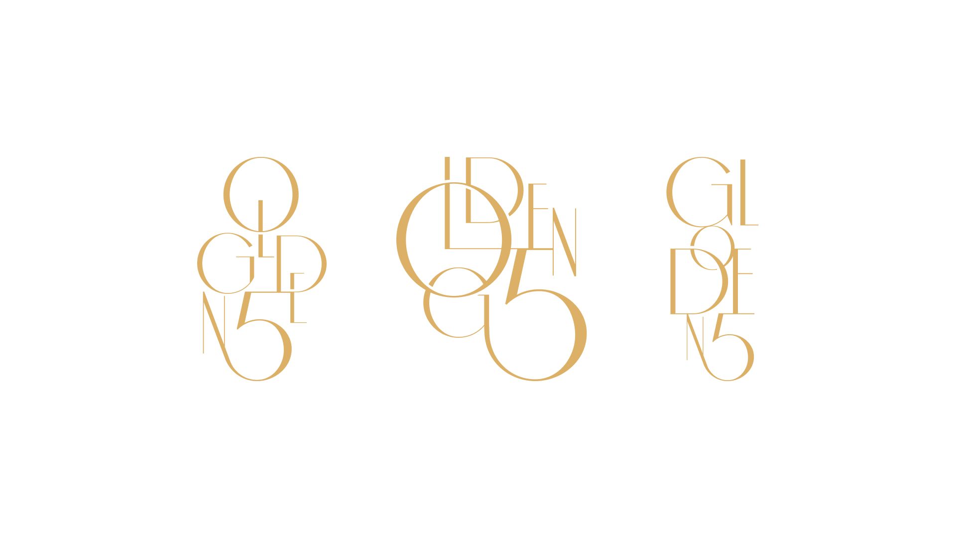
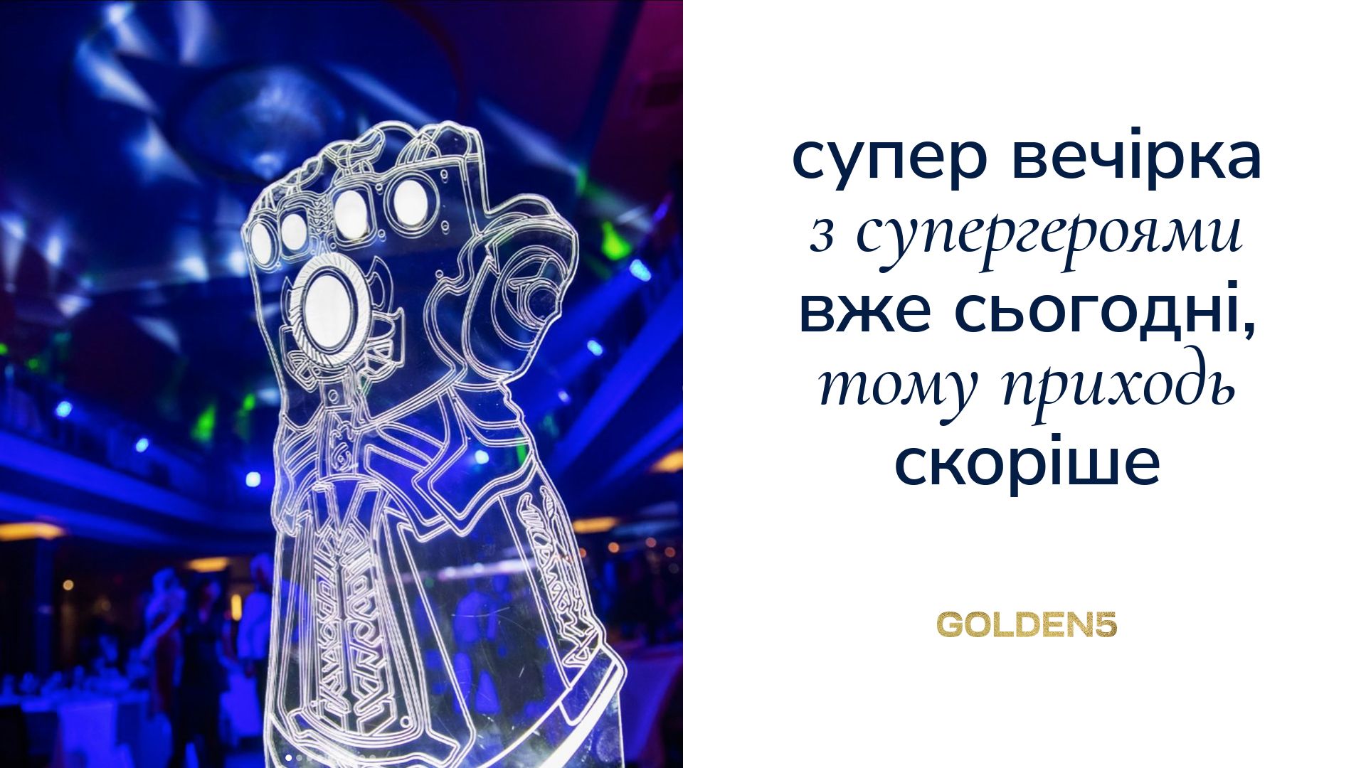
As an accompanying graphic, a series of compositions was developed, which contains the title. Each of the compositions, due to the “festive” font, plays mainly the role of decor than the word for reading. The difference in size and the broken order of the letters are deliberate. Thus, the composition looks dynamic and leaves opportunity for further development in animation. Elements are zoomed, moved, conveying the intense, but pleasant bustle of the holiday.
The font pair is built on a combination of contrasts. We exclude selections in bold styles. Accents are placed using a classic, italic font.
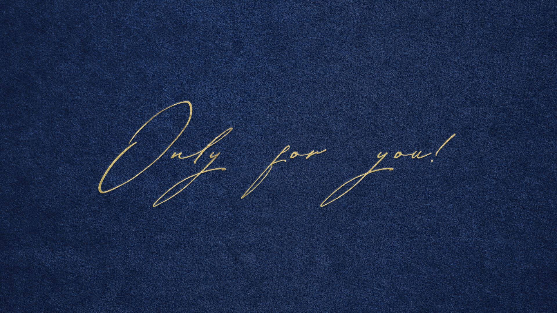
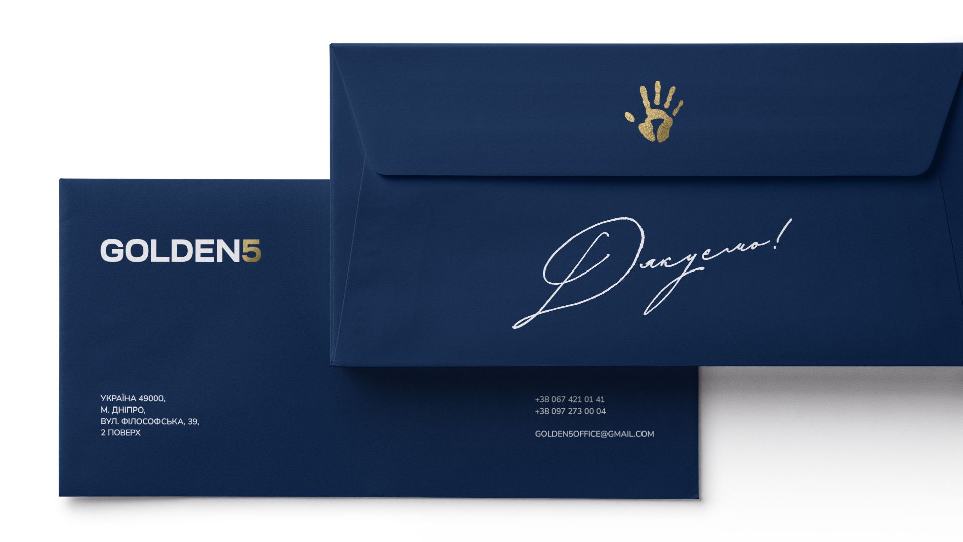
An additional nuance is handwritten inserts. According to the plan, in the future, the phrases will be written and digitized by members of the agency team. With this detail, we would like to bring a literal contribution of everyone to the image of the company.
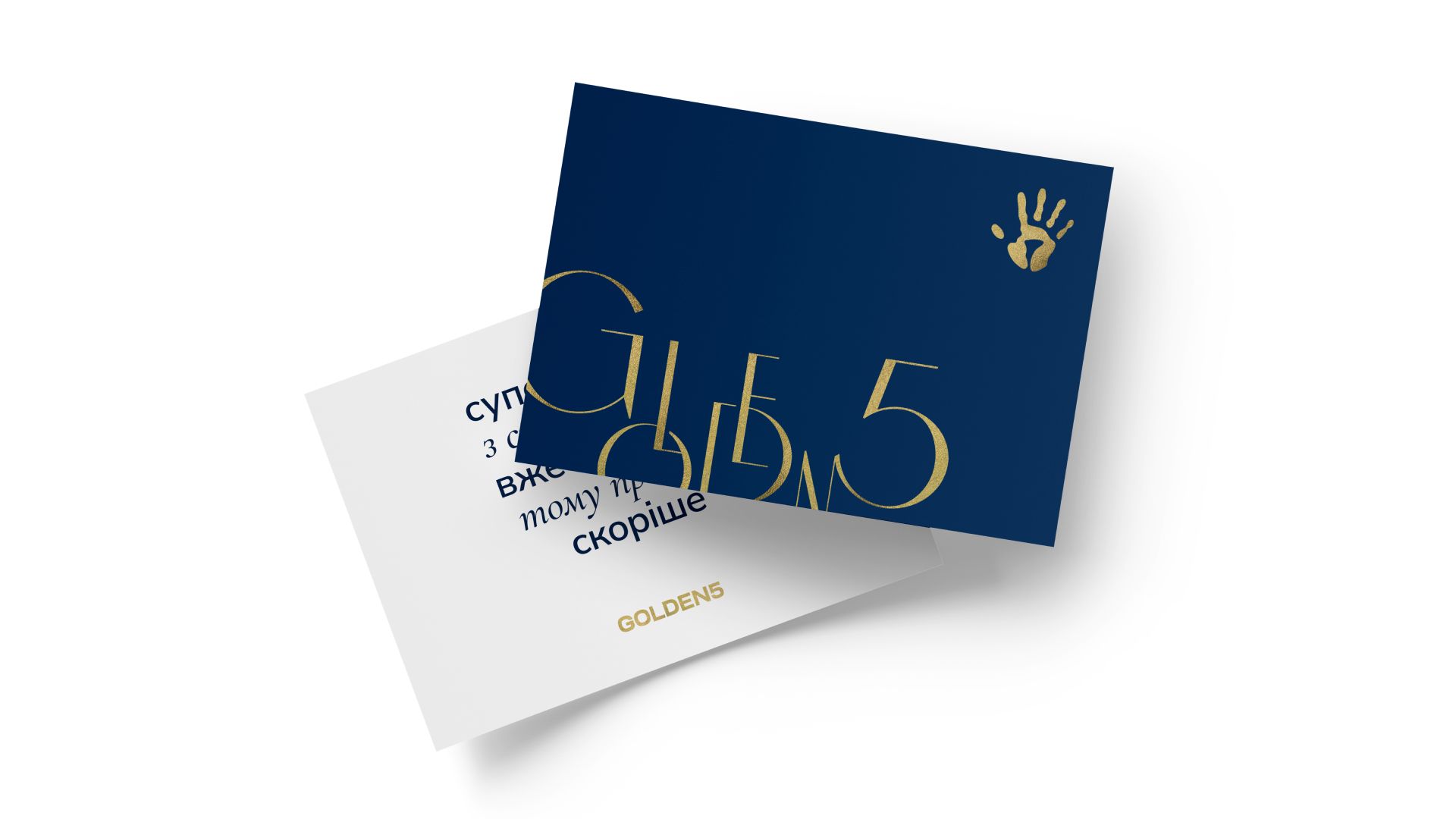
It was important for us to develop a variety of visual tools so that when designing new branded media, we would not get hung up on the banal replication of the logo. However, we wanted to do this so that in total everything looks like a continuation of each other.
