TSUNAMI
Restyling
Restyling

TSUNAMI is a leisure complex comprising a five-star hotel, SPA, and fitness facilities.
In connection with the renovation of the fitness area, conduct a complete rebranding of the company, give each of its activities a visual identity, creating a unified and cohesive image of the company. One condition: to maintain a reference to the original logo.
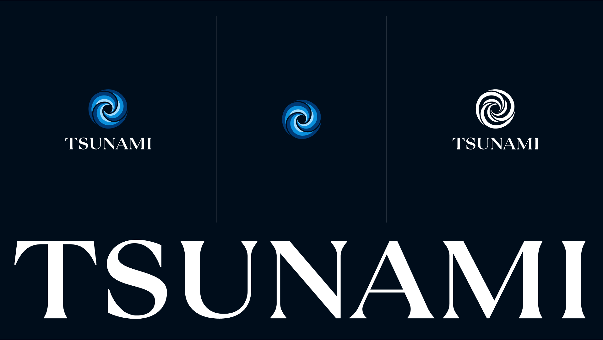
First of all, we worked on the logo. In the updated version, it was important to convey the united strength of each of the company's divisions, their energy, as if they are the elements. Another priority was to ensure that the new logo sets the tone for a unified identity system, creating a clear and recognizable image.
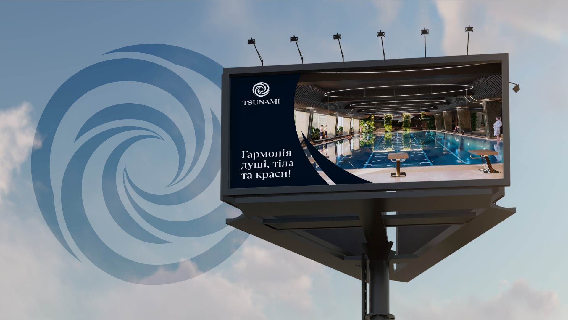
We retained the key symbol of the company - waves - but updated it, making the shapes simpler and clearer. In the new logo, the three swirls represent the harmony of soul, body, and beauty that visitors to the complex experience.
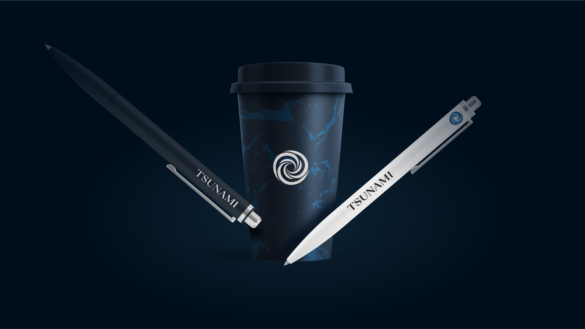
For the choice of typography, we settled on an antique style with serifs to convey history: TSUNAMI is already a whole culture that occupies a significant part of its visitors' lives.
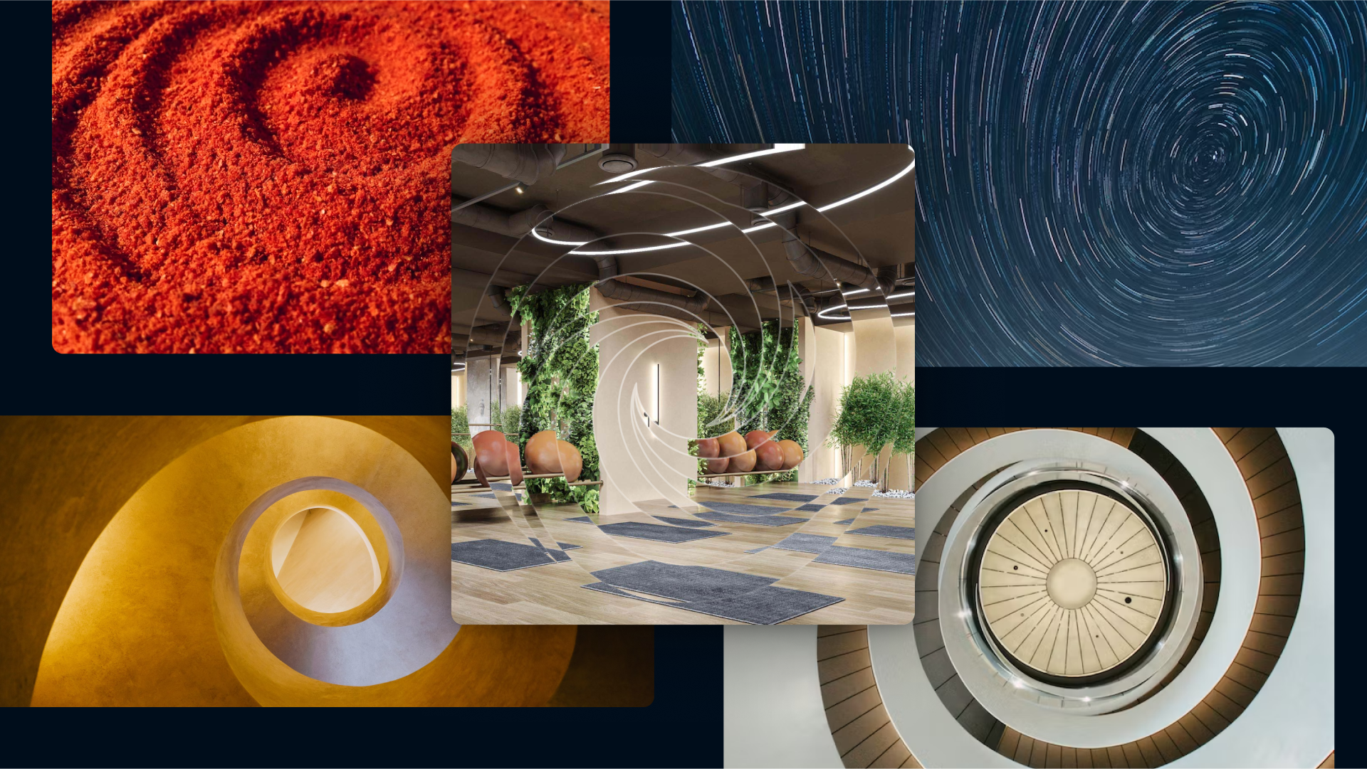
Next, we defined the main principles on which the identity would be built:
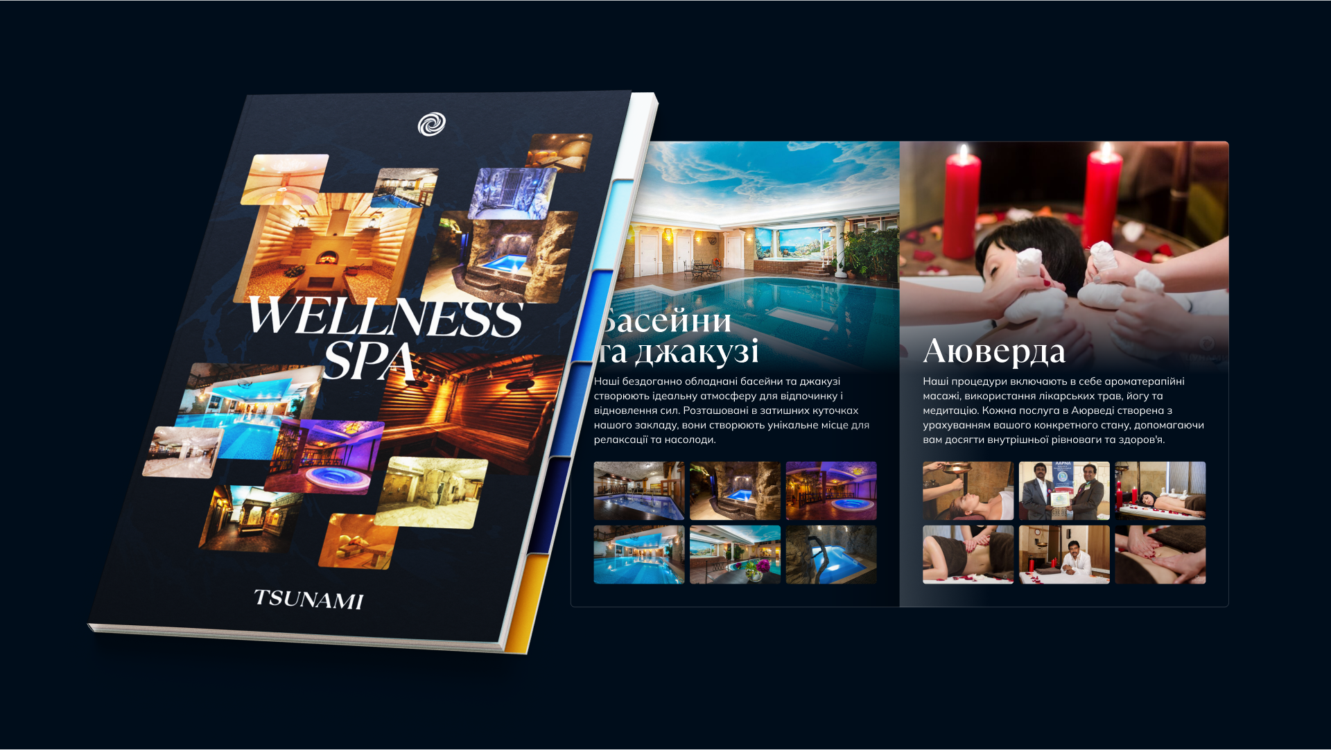
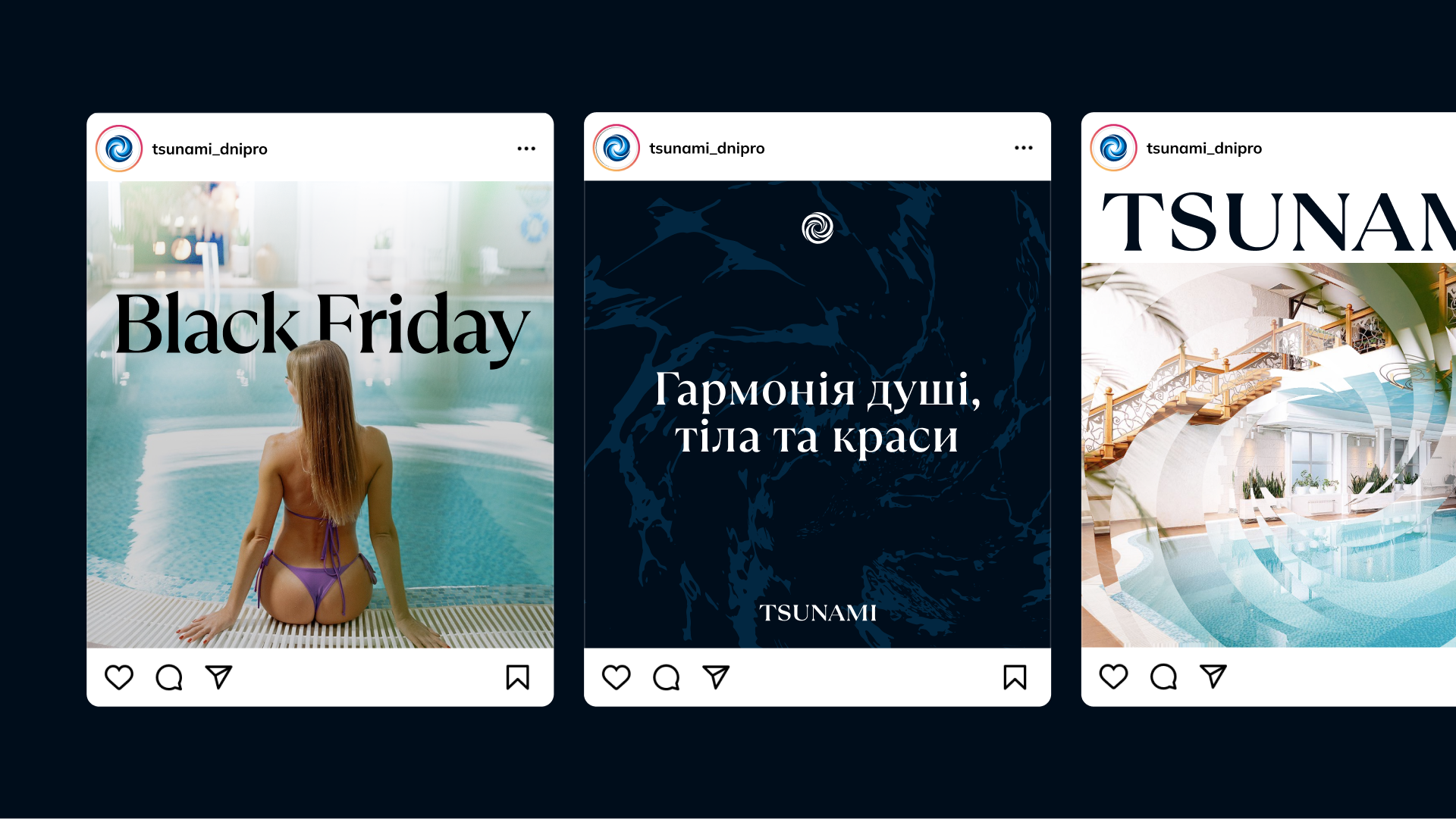
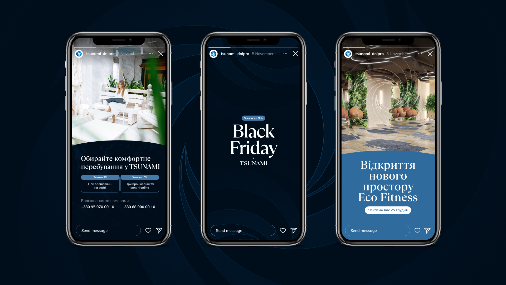
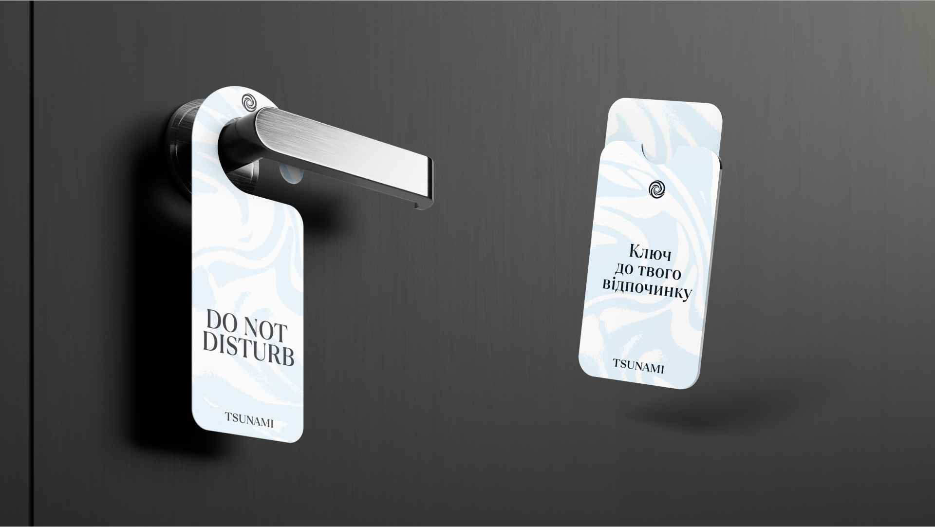
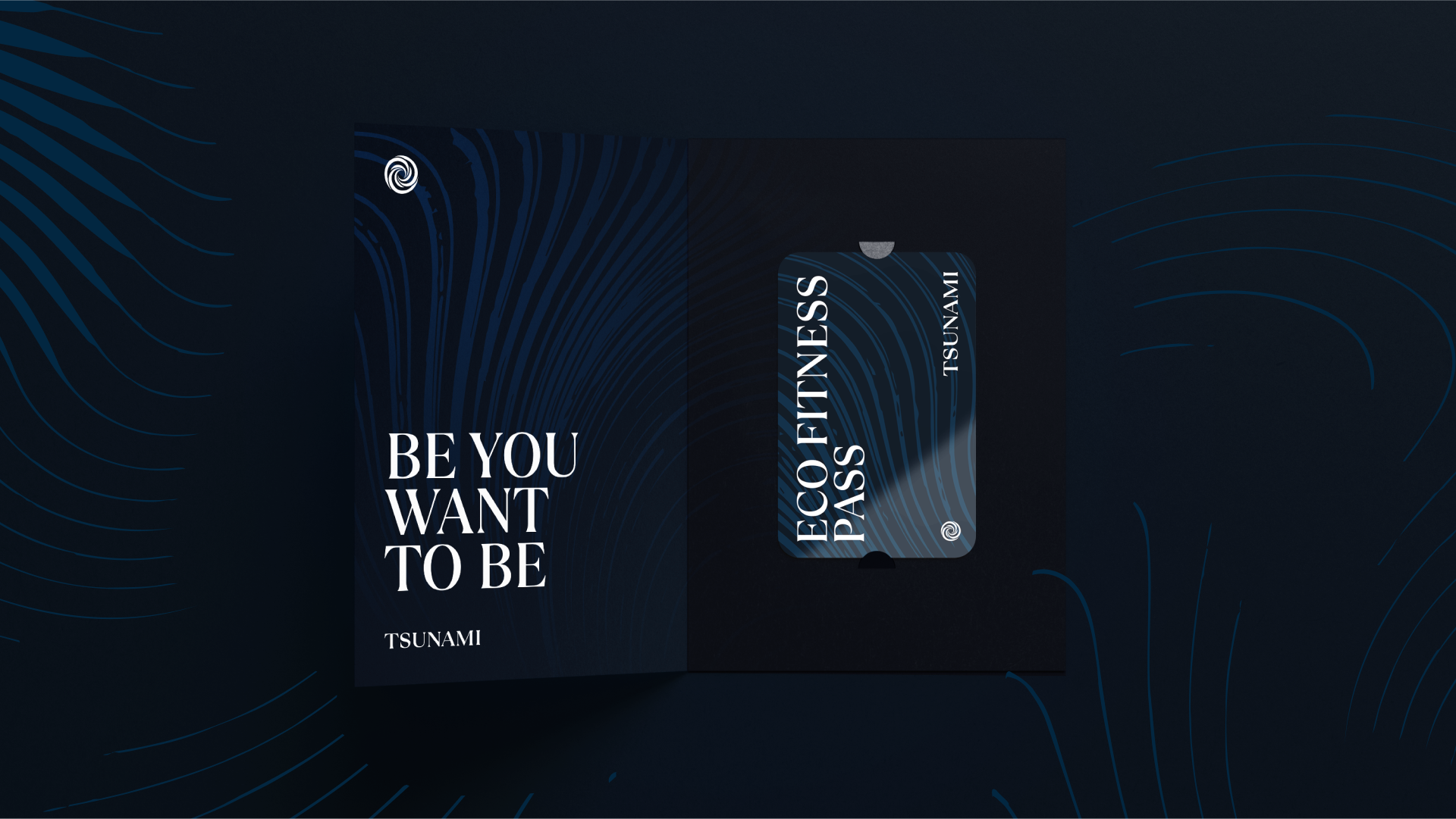
As a result, we developed the following images for the TSUNAMI divisions:
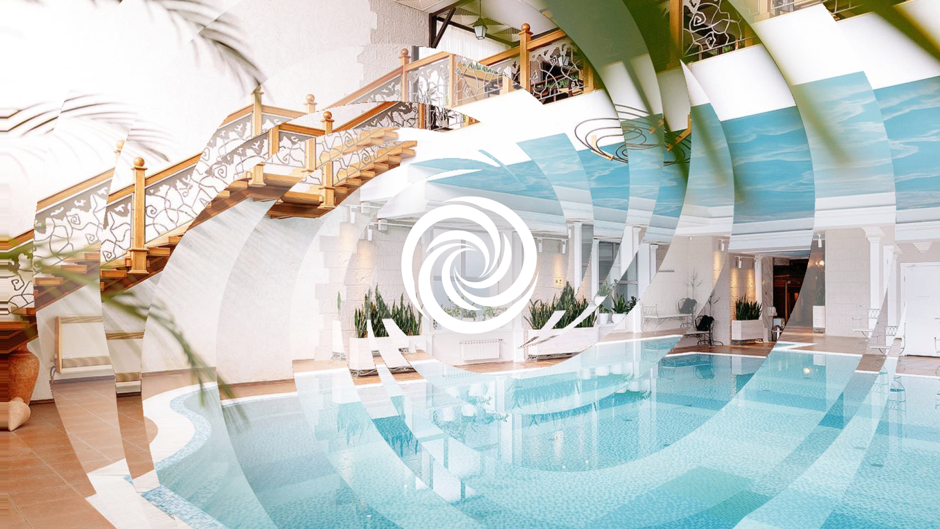
A special component was the photo processing effect resembling the company's logo, which depicts a whirlwind of energies visible through the image
